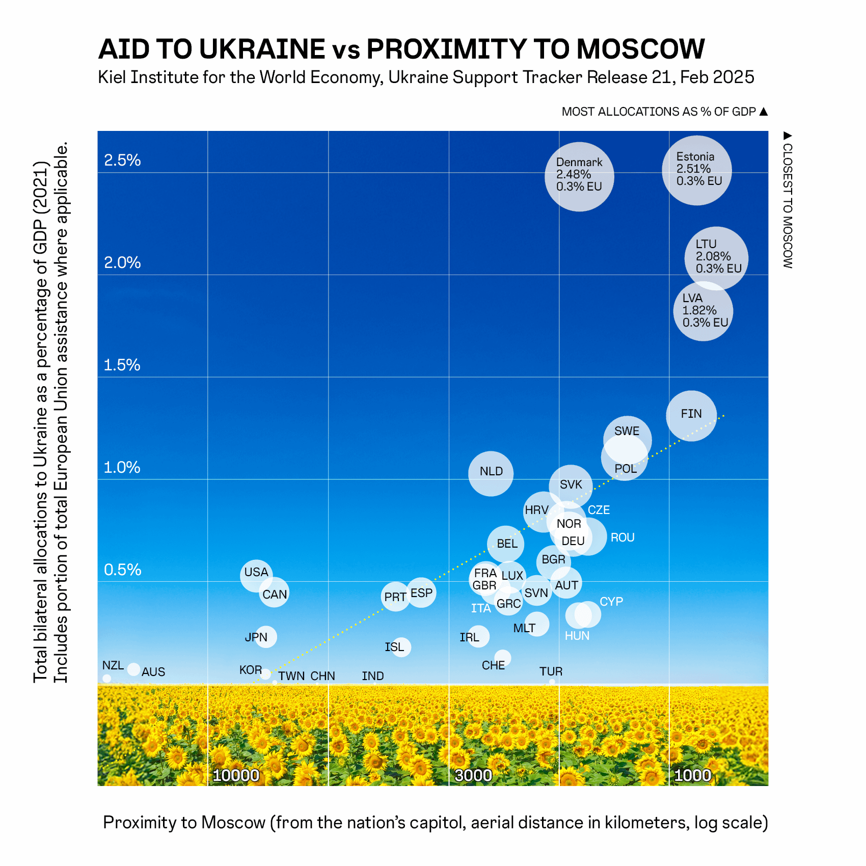
Total bilateral allocations to Ukraine as a percentage of GDP (2021), including portion of total European Union assistance (where applicable), as relation to Proximity to Moscow, Russia (from nation’s capitol, aerial distance in kilometers, log scale).
Note (from Kiel Institute): Includes bilateral allocations to Ukraine, as a percentage of 2021 GDP. Does not include private donations, support for refugees outside of Ukraine, and aid by international organizations. Allocations by EU Institutions include Commission and Council, MFA, and EIB funds and can also be added to individual EU countries. Financial allocations that are made explicitly for military and weapons purchases are counted as military aid.
Data coalesced in MacOS Numbers, then plotted in R (ggplot), exported via SVG device, and then assembly refined in Adobe Illustrator.
I dont think a log scale is intuitive to understand here. Just use a map if you want to actually compare this stuff.
Y axis is too wordy and the sunflowers (while a fun touch) makes viewing the data difficult. But I really like what is conveyed here
Using “distance from nation’s capital” seems silly from a US and Canada standpoint. Yeah the capitals are far apart, but the land masses themselves are way closer (50 miles from Alaska and 800 miles from Canada). I’m sure there are some similar examples over in Europe too, but just not as extreme.
I get that “distance from Russia” is not nearly as easy to calculate unless they are bordering countries where distance=0.
I’d like to see this with the vertical being a net amount rather than a percentage of GDP.
Capitol != Capital.
And CHE has neither
The graph makes a point. I think the relationship between distance and investment is kind of obvious, but it’s nice to validate it properly like you did.
However – some constructive critiscism for this graph
– wtf are the sunflowers for? Just remove them, they impair readability
– the spending is visibe from the y-axis AND the bubbles’ sizes? That looks redundant, and possibly misleading. Choose either, not both!
– given your data points, the linear regression does not look appropriate. Find a better regression or remove it altogether.
Anyway – thanks for this picture, and for providing the dataset in comments.
Edited – added some items to the bullet list.
I have to wonder if the people complaining about the sunflowers never read memes or simply have bad eyesight. They’re an excellent design decision and don’t impact readability because they’re below the actual data and the grid line labels are clearly legible against them.
It’s crazy (but understandable of course) how the US has given so little in terms of GDP, but without that tiny far-away bubble, all others are essentially for nothing. :-/
To me it seems like the relation might be more than linear from this.
How can Denmark, Estonia, Lithuania and Latvia all be 0.3% EU?
Annual GDP or average annual gdp vs Annual average support I think would be more appropriate. These numbers fluctuate and suggest that all countries are donating more than they actually are.
I like the flowers and sky background. F the haters.
I took a data visualization class with a professor who said he would fail any graph submitted with loud, abrasive, distracting background image like this. Not even sure why we are using an image of flowers for this specific topic.
Is this military aid or just aid?
The former is expected to be much more influenced by proximity when your neighbor is belligerent. Other foreign aid could be due to random events not related to a belligerent neighbor.
Where is Ukraine on this map?
I think the Baltic states’ capitals are closer.
The x axis surely should be flipped?
That can’t be right. Trump said they spent over 350billion dollars on dildos in the White House alone for Ukraine.
![[OC] Aid to Ukraine vs. Proximity to Moscow](https://www.europesays.com/wp-content/uploads/2025/03/tnjliixh7ime1-1700x1024.png)
18 comments
Total bilateral allocations to Ukraine as a percentage of GDP (2021), including portion of total European Union assistance (where applicable), as relation to Proximity to Moscow, Russia (from nation’s capitol, aerial distance in kilometers, log scale).
Note (from Kiel Institute): Includes bilateral allocations to Ukraine, as a percentage of 2021 GDP. Does not include private donations, support for refugees outside of Ukraine, and aid by international organizations. Allocations by EU Institutions include Commission and Council, MFA, and EIB funds and can also be added to individual EU countries. Financial allocations that are made explicitly for military and weapons purchases are counted as military aid.
Data coalesced in MacOS Numbers, then plotted in R (ggplot), exported via SVG device, and then assembly refined in Adobe Illustrator.
Source: Kiel Institute for the World Economy:
Ukraine Support Tracker Release 21 (f319e1c8-5654-4cd6-b4c7-5722ae437d30):
https://www.ifw-kiel.de/publications/ukraine-support-tracker-data-20758/
**TBA%GDP** Total bilateral allocations as percentage of Gross Domestic Product (GDP,2021)
**EU%GDP** Share in total European Union allocations as percentage of GDP (2021)
Data:
|COUNTRY |ISO|KM |TBA%GDP|EU%GDP |TOTAL |
|————–|—|—–|——-|——-|——-|
|Australia |AUS|14469|0.07019|0.00000|0.07019|
|Austria |AUT|1673 |0.18086|0.31390|0.49476|
|Belgium |BEL|2262 |0.33839|0.34411|0.68250|
|Bulgaria |BGR|1780 |0.30528|0.28714|0.59242|
|Canada |CAN|7180 |0.44787|0.00000|0.44787|
|Croatia |HRV|1871 |0.52695|0.31285|0.83980|
|Cyprus |CYP|1501 |0.01515|0.32383|0.33898|
|Czechia |CZE|1670 |0.49759|0.29801|0.79560|
|Denmark |DNK|1565 |2.17382|0.30572|2.47954|
|Estonia |EST|871 |2.20398|0.30656|2.51053|
|European Union|EUU|0 |0.30657|0.00000|0.30657|
|Finland |FIN|895 |0.98102|0.32885|1.30987|
|France |FRA|2494 |0.17794|0.34195|0.51988|
|Germany |DEU|1614 |0.43598|0.27851|0.71448|
|Greece |GRC|2231 |0.07438|0.33044|0.40482|
|Hungary |HUN|1572 |0.03185|0.30142|0.33328|
|Iceland |ISL|3806 |0.17831|0.00000|0.17831|
|Ireland |IRL|2590 |0.03817|0.19325|0.23142|
|Italy |ITA|2379 |0.11546|0.34532|0.46078|
|Japan |JPN|7478 |0.22920|0.00000|0.22920|
|Latvia |LVA|844 |1.52677|0.29519|1.82196|
|Lithuania |LTU|790 |1.80132|0.27868|2.08001|
|Luxembourg |LUX|2214 |0.33437|0.18674|0.52111|
|Malta |MLT|1935 |0.01283|0.27914|0.29197|
|Netherlands |NLD|2435 |0.77866|0.24836|1.02702|
|New Zealand |NZL|16547|0.02541|0.00000|0.02541|
|Norway |NOR|1649 |0.74688|0.00000|0.74688|
|Poland |POL|1250 |0.79715|0.31023|1.10739|
|Portugal |PRT|3914 |0.09731|0.32898|0.42630|
|South Korea |KOR|7501 |0.04683|0.00000|0.04683|
|Romania |ROU|1500 |0.42327|0.29679|0.72007|
|Slovakia |SVK|1634 |0.65369|0.30984|0.96353|
|Slovenia |SVN|1936 |0.14514|0.31147|0.45662|
|Spain |ESP|3448 |0.10976|0.33624|0.44600|
|Sweden |SWE|1231 |0.91488|0.27629|1.19117|
|Switzerland |CHE|2295 |0.12563|0.00000|0.12563|
|Türkiye |TUR|1794 |0.00930|0.00000|0.00930|
|United Kingdom|GBR|2508 |0.50871|0.00000|0.50871|
|United States |USA|7842 |0.52675|0.00000|0.52675|
|China |CHN|5794 |0.00001|0.00000|0.00001|
|Taiwan |TWN|7158 |0.00568|0.00000|0.00568|
|India |IND|4346 |0.00009|0.00000|0.00009|
I dont think a log scale is intuitive to understand here. Just use a map if you want to actually compare this stuff.
Y axis is too wordy and the sunflowers (while a fun touch) makes viewing the data difficult. But I really like what is conveyed here
Using “distance from nation’s capital” seems silly from a US and Canada standpoint. Yeah the capitals are far apart, but the land masses themselves are way closer (50 miles from Alaska and 800 miles from Canada). I’m sure there are some similar examples over in Europe too, but just not as extreme.
I get that “distance from Russia” is not nearly as easy to calculate unless they are bordering countries where distance=0.
I’d like to see this with the vertical being a net amount rather than a percentage of GDP.
Capitol != Capital.
And CHE has neither
The graph makes a point. I think the relationship between distance and investment is kind of obvious, but it’s nice to validate it properly like you did.
However – some constructive critiscism for this graph
– wtf are the sunflowers for? Just remove them, they impair readability
– the spending is visibe from the y-axis AND the bubbles’ sizes? That looks redundant, and possibly misleading. Choose either, not both!
– given your data points, the linear regression does not look appropriate. Find a better regression or remove it altogether.
Anyway – thanks for this picture, and for providing the dataset in comments.
Edited – added some items to the bullet list.
I have to wonder if the people complaining about the sunflowers never read memes or simply have bad eyesight. They’re an excellent design decision and don’t impact readability because they’re below the actual data and the grid line labels are clearly legible against them.
It’s crazy (but understandable of course) how the US has given so little in terms of GDP, but without that tiny far-away bubble, all others are essentially for nothing. :-/
To me it seems like the relation might be more than linear from this.
How can Denmark, Estonia, Lithuania and Latvia all be 0.3% EU?
Annual GDP or average annual gdp vs Annual average support I think would be more appropriate. These numbers fluctuate and suggest that all countries are donating more than they actually are.
I like the flowers and sky background. F the haters.
I took a data visualization class with a professor who said he would fail any graph submitted with loud, abrasive, distracting background image like this. Not even sure why we are using an image of flowers for this specific topic.
Is this military aid or just aid?
The former is expected to be much more influenced by proximity when your neighbor is belligerent. Other foreign aid could be due to random events not related to a belligerent neighbor.
Where is Ukraine on this map?
I think the Baltic states’ capitals are closer.
The x axis surely should be flipped?
That can’t be right. Trump said they spent over 350billion dollars on dildos in the White House alone for Ukraine.
I think exponetial curve would fit better
Comments are closed.