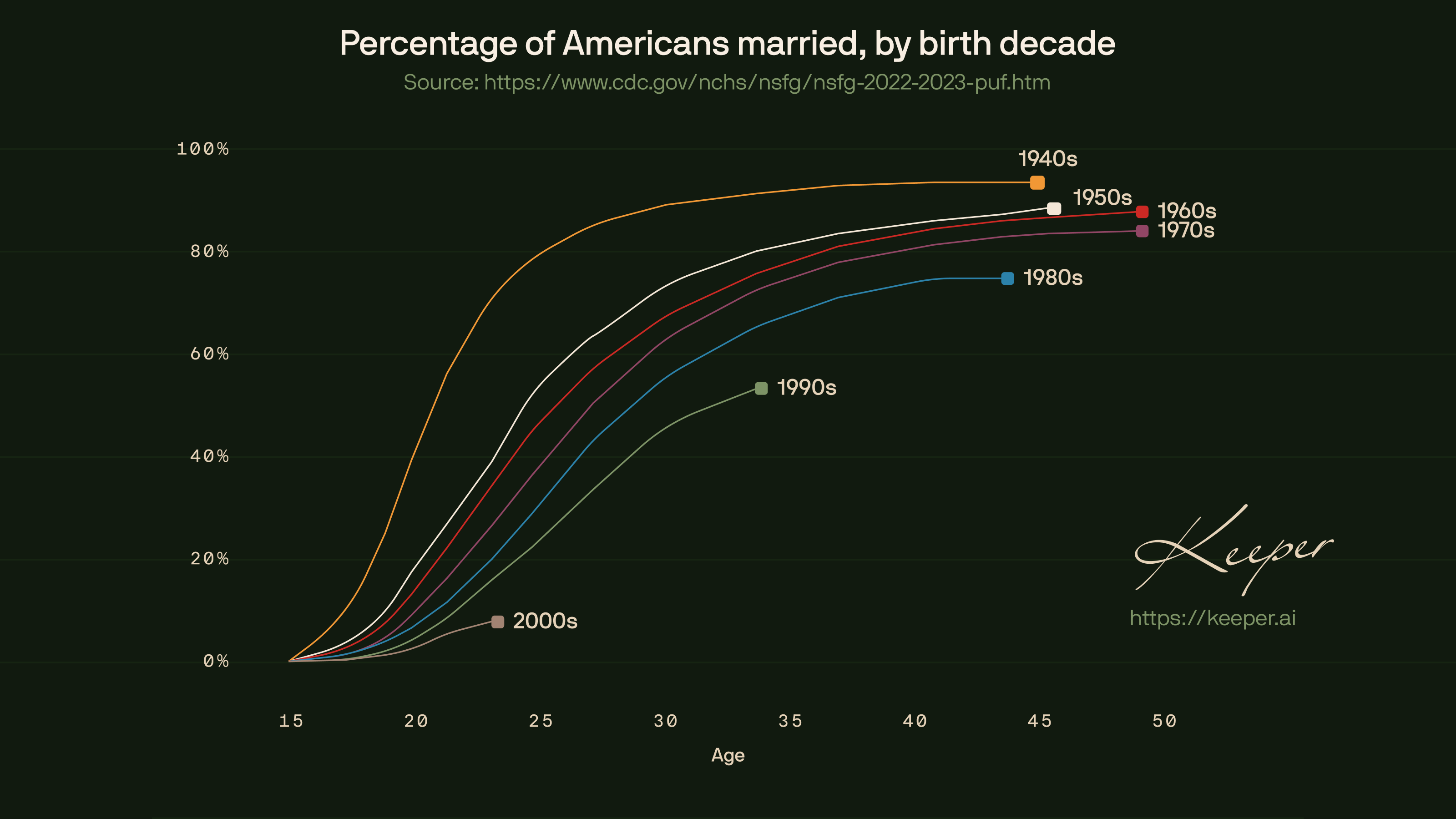
Updated “Percentage of Americans Married, by Birth Decade” chart, incorporating the latest CDC survey data (2022–2023). [OC]
Posted by kiver16
![Updated “Percentage of Americans Married, by Birth Decade” chart, incorporating the latest CDC survey data (2022–2023). [OC]](https://www.europesays.com/wp-content/uploads/2025/03/91h6aue1nqme1-1920x1024.png)
Updated “Percentage of Americans Married, by Birth Decade” chart, incorporating the latest CDC survey data (2022–2023). [OC]
Posted by kiver16
21 comments
Source: [https://www.cdc.gov/nchs/nsfg/nsfg-2022-2023-puf.htm](https://www.cdc.gov/nchs/nsfg/nsfg-2022-2023-puf.htm)
Created in Figma
Not looking good for zoomers!
Is age the age they got married? I’m not sure it makes sense any way I look at it (as far as bottom goes).
Cheers
I assume this us age at first marriage?
So the boomers were actually the biggest drop? I know the overall numbers are lower as you go but they seem to be dropping at a fairly consistent rate generation to generation.
Just a reminder that a woman couldn’t have a checking account without a man’s name on it until 1976 and couldn’t get a business loan without a man cosigner until 1988. The rates of marriage largely reflect these facts.
What is Age on the x-axis?
It would be interesting to see % cohabitating, though I’m not sure the data exists – certainly not back in the 50’s and 60’s. 2 person HH is probably the closest you’d get and that could clearly be a single adult and child.
I think it’s more to do with an overall drop in religion.
If you take God out of the picture marriage is just a way to get the government involved in your relationship.
Marriage is a luxury item and times are tough.
Why do the 40s and 50s stop early? If anything they should be the longest lines on this graph..
I guess everybody dies when they turn 50.
Get rid of the tax benefits of marriage and I bet you’ll see a further drop.
80% of people my age are married? Shit I feel like I’ve barely started dating
80% of people from the 40’s were married before turning 25 (so married in the 60’s or early 70’s). That’s wild.
Man, if you hit 41 as an 80s baby you really just tap out. Absolute flatlined.
“Marriage? I’m only 27. What am I? A child bride?”
married?! in this economy?!
Cool how you can apply your age, use your corresponding decade, and can find what % of your peers are married today. If I’m reading this correctly.
Wow. Actually beautiful data. No stupid unnecessary animations, color delineations, and the trend is visible easily at a glance.
I like the presentation – in my opinion, given the comments about Boomers, Zoomers and whatnot, this should be broken up by generally-accepted definitions of generations – Boomers (1946-1964), Gen X (1965-1980), Millenials (1981-1996), Gen Z (1997-2012).
Comments are closed.