[OC] Visualization of subreddit moderation team overlap between Reddit’s top 500 most popular subs
Posted by The_IT_Dude_
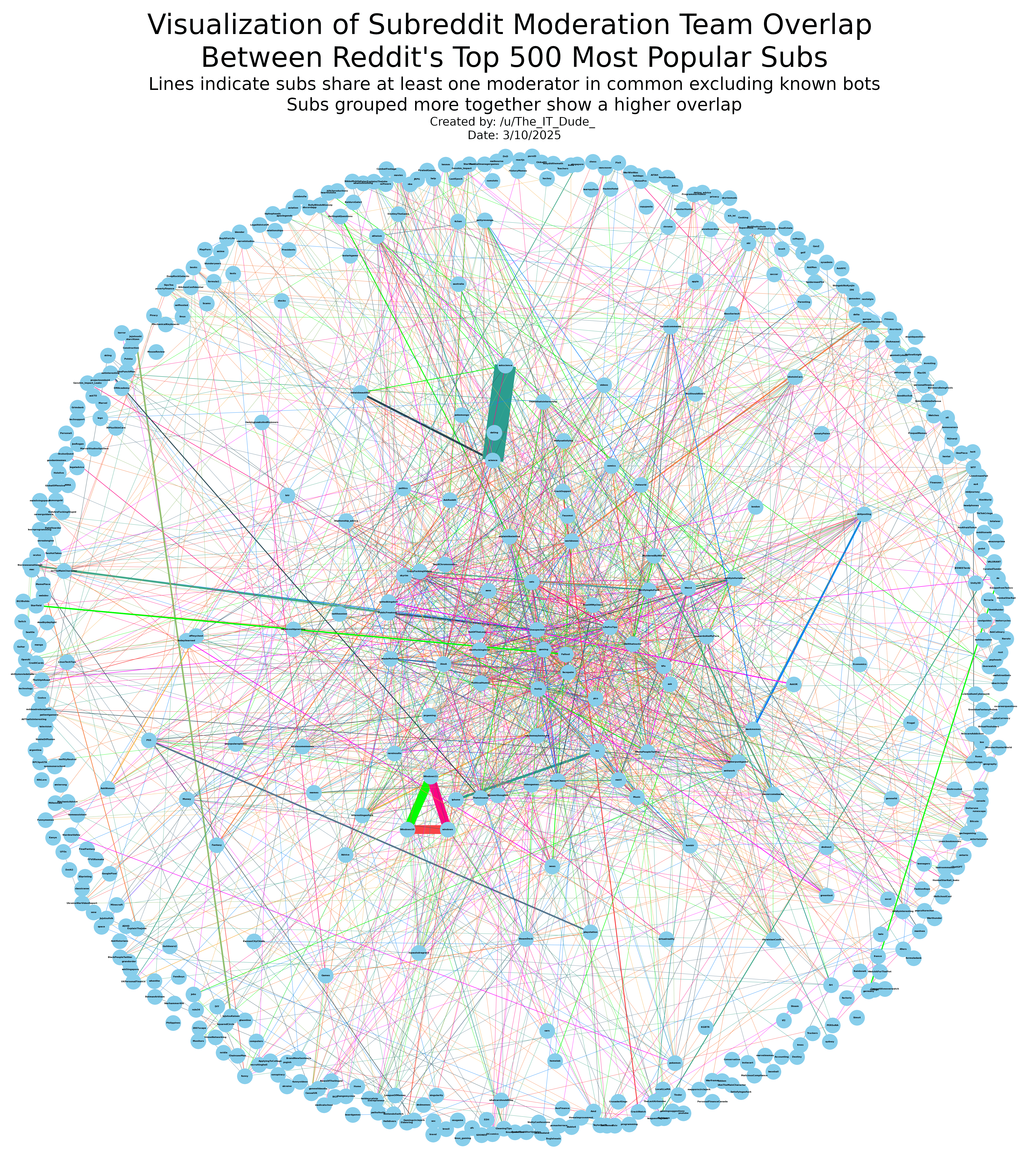
![[OC] Visualization of subreddit moderation team overlap between Reddit's top 500 most popular subs](https://www.europesays.com/wp-content/uploads/2025/03/1741774817_rev5s1p6kxne1-1920x1024.png)
[OC] Visualization of subreddit moderation team overlap between Reddit’s top 500 most popular subs
Posted by The_IT_Dude_
17 comments
Why even have text if it’s completely unreadable
Maybe it’s because I’m on my phone, but I can’t see the names of the subs.
Unreadable when zoomed in
https://preview.redd.it/iqrlt260mxne1.png?width=1440&format=png&auto=webp&s=f1fb81ad48cf9da8ecafe19f672f6376f92a0245
That’s how it looks at the furthest I can zoom in
Text is perfectly readable when zoomed in.
Take your complaints up with the reddit mobile app instead of the creator.
On the other hand, the middle part is pretty much impossible to actually track the thinner lines from one sub to another even with the color coding.
Looks fine on PC.
It says subs group together show a higher overlap. What about the thickness of the lines? I thought that shows higher overlap but they are sometimes between subs that are placed further apart
https://preview.redd.it/s0tr8o84pxne1.jpeg?width=416&format=pjpg&auto=webp&s=e073ca6128b42a5d895758d6ca540bfa5ec4bb8f
RIP to everyone trying to get good advice from r /dating_advice o7
Even zoomed in, this is completely useless as a representation — trying to follow a line beyond its immediate neighborhood is impossible unless it’s along the edges, and even then it’s a difficult to maintain focus while scrolling. Plus the clusters around the edges overlap, so there’s no way to tell if two adjacent subs are connected or not. And there’s no scale for the lines — the broadest lines might show 3 mods in common, or 50, and there’d be no way to tell.
If you want to make an actually useful visualization, first group related subs together into smaller clusters, then make connections between them. Then find some way to indicate the number of mods per sub — either size or color, depending on how many there are.
And, if you insist on top 500 (which is ridiculous), try to make it so that groupings of subs that are a smaller, closed network are clustered and isolated (e.g. if subs, A, B, C, and D are only related to each other, they should be off to the side). Then, for “hubs” (i.e. subs that have many connections), centralize them. Look at some representations of social-network analysis if you want some inspiration.
I do agree that I think this would be way better with maybe like the top 50 subs.
However, I love the Windows triad and the dankmemes / shitposting duo 😂
my favorite is the connection between 30+skincare and piracy
Good job, it’s cool – but I wasn’t able to get single piece of information from this.
Maybe you can remove some edges and reduce number of nodes ? Also you can look into centrality measures and find something interesting.
Lot of effort! commendable.
How do u ppl get such data? Does reddit provide it or do u just scrape it?
wow! how did you make this?
Perfectly visualizes our 1984 overlords of information at Reddit.
1. thank you for the effort. it is great work.
2. it actual makes sense for many of those as to what crowd it attracts (meaning who posts, comments etc)
This is a fascinating way to see how moderation teams are interconnected across different communities. Did you find any surprising overlaps?
Comments are closed.