I don’t think this vis is very readable, to figure out which direction a particular line represents you have to follow the line to one end and check if there’s an arrow-head. Having two arrows between each pair of counties also adds to the clutter.
IMO this would work better as an animated graphic, where the pairs of arrows are replaced with a single animated dashed line flowing in the direction of net migration.
I like the visual itself but the data seems to simply be a reflection of which counties have the largest populations.
A more interesting data set would be what percentage of the county’s population are migrants
9 comments
Any more info on the data I am looking at?
It’s like a Petri dish of the US.
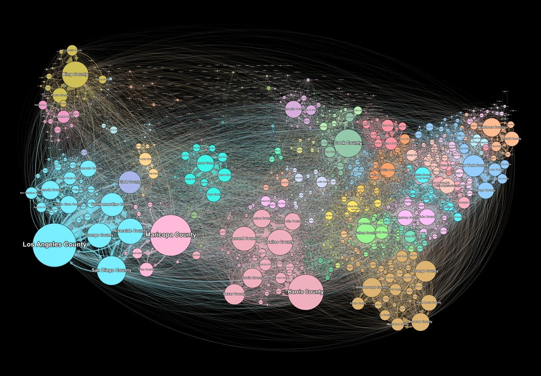
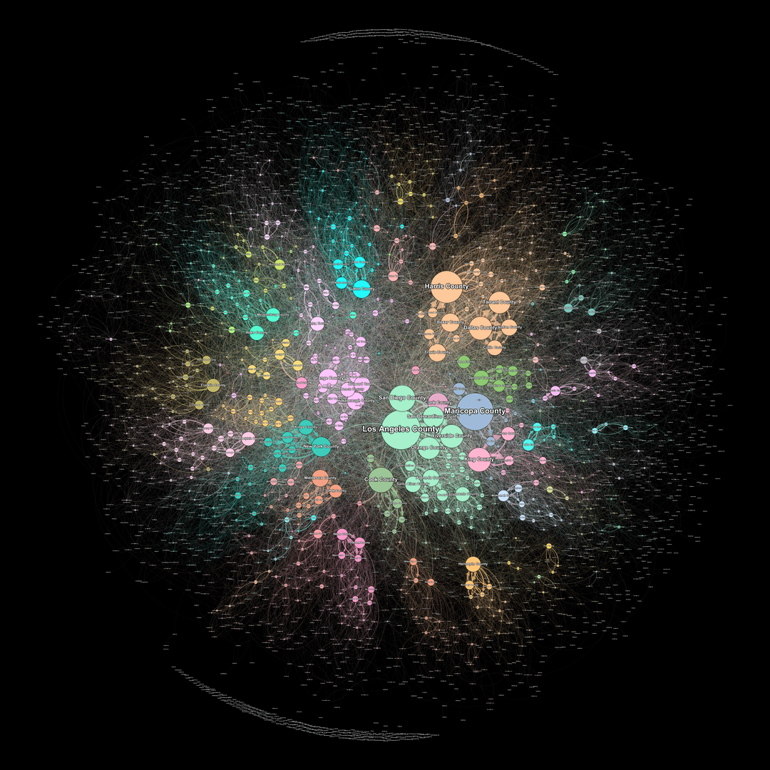
Data is from [united states census bureau](https://www.census.gov/topics/population/migration/guidance/county-to-county-migration-flows.html).
Used a python script to turn the data into useable csv’s, then moved into gephi for visualization.
Did this for a school project.
The size of the node represents how many people moved to that county (ie. bigger node = more people moved there).
The nodes are colored based on the state, but I could not get the same colors for the two graphs which was a bummer.
The first one has nodes placed close to their actual locations in geography, the second one used an algorithm (ForceAtlas) to create the node layout.
Generally, the closer they are the more connections they share.
[Here](https://github.com/yiboooooooo/usa-county-migration-data-graph-2020-2016-.git) is a github repository with the .svg data for both of the visualizations since these raster images have low quality.
I don’t think this vis is very readable, to figure out which direction a particular line represents you have to follow the line to one end and check if there’s an arrow-head. Having two arrows between each pair of counties also adds to the clutter.
IMO this would work better as an animated graphic, where the pairs of arrows are replaced with a single animated dashed line flowing in the direction of net migration.
I like the visual itself but the data seems to simply be a reflection of which counties have the largest populations.
A more interesting data set would be what percentage of the county’s population are migrants
Could you make it less legible please
I love this. It isn’t readable but it looks cool.
https://preview.redd.it/p0fbrmtf1eoe1.png?width=504&format=png&auto=webp&s=70a3e27f9d57ce12af872b700ab7e2e5516dcd84
Now its more clear and understandable
Not especially functional, but the beautiful loves you to the name lol
Comments are closed.