[OC] US population history, split by age group Posted by GraphCog Tags:DataData Is BeautifulDataIsBeautiful 4 comments Interactive graph: [US population by age group](http://graphcog.com/us-population) Use the controls to change the number of age groups, or toggle between ratios, growth rates, and totals. Some observations: – Over 65s now account for almost 17% of the population, compared to less than 5% 100 years ago. – Total population is three times higher than 100 years ago. – Population growth has been steadily declining, to its lowest rate since World War II. Source of data: [census.gov](http://census.gov) Tool: Chart.js Beautiful graph to show exactly why social security rules needs to be constantly adjusted for life expectancy. 1900: 60% of population supports 6% 2000: 60% of population supports 22% There are fewer and fewer children being born to support those collecting. So less babies while living longer? It would be nice if the inset key has the colors in the same order of the graph. Comments are closed.
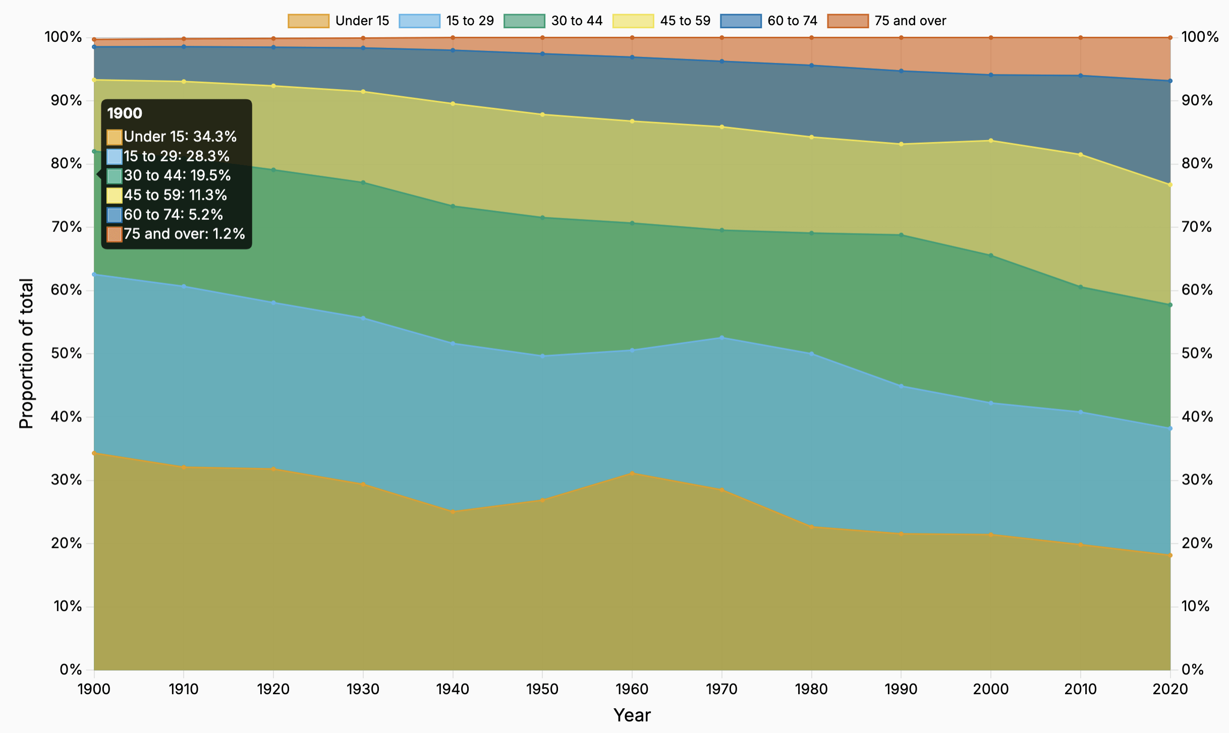
Interactive graph: [US population by age group](http://graphcog.com/us-population) Use the controls to change the number of age groups, or toggle between ratios, growth rates, and totals. Some observations: – Over 65s now account for almost 17% of the population, compared to less than 5% 100 years ago. – Total population is three times higher than 100 years ago. – Population growth has been steadily declining, to its lowest rate since World War II. Source of data: [census.gov](http://census.gov) Tool: Chart.js
Beautiful graph to show exactly why social security rules needs to be constantly adjusted for life expectancy. 1900: 60% of population supports 6% 2000: 60% of population supports 22% There are fewer and fewer children being born to support those collecting.
![[OC] US population history, split by age group](https://www.europesays.com/wp-content/uploads/2025/03/n29duxjiavoe1-1920x1024.png)
4 comments
Interactive graph: [US population by age group](http://graphcog.com/us-population)
Use the controls to change the number of age groups, or toggle between ratios, growth rates, and totals.
Some observations:
– Over 65s now account for almost 17% of the population, compared to less than 5% 100 years ago.
– Total population is three times higher than 100 years ago.
– Population growth has been steadily declining, to its lowest rate since World War II.
Source of data: [census.gov](http://census.gov)
Tool: Chart.js
Beautiful graph to show exactly why social security rules needs to be constantly adjusted for life expectancy.
1900: 60% of population supports 6%
2000: 60% of population supports 22%
There are fewer and fewer children being born to support those collecting.
So less babies while living longer?
It would be nice if the inset key has the colors in the same order of the graph.
Comments are closed.