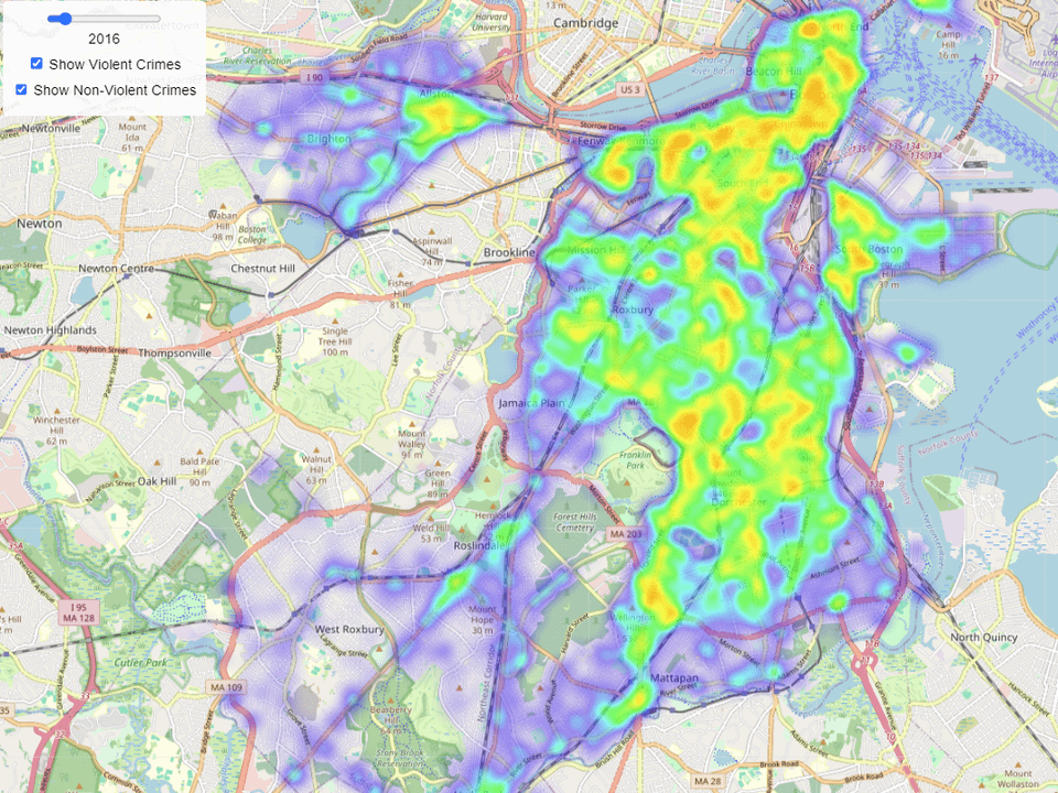
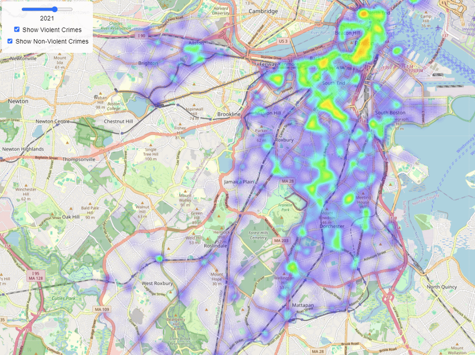
I previously lived in Boston and have since moved to LA. Recently, I was in a conversation with someone and they said the thing about how all big cities are overwhelmed with crime. That led me down a rabbit hole where I found the LA data visualizations of crime and the numbers that showed it wasn’t true.
But then I got curious about Boston and there isn’t an analogous set of visualizations available to the public. The photos are made from a visualization I made with the publicly accessible data available [here. ](https://data.boston.gov/)
Very powerful depiction that gives substantial credibility to Boston Mayor Michelle Wu’s statements at the Sanctuary City hearing several weeks ago.
Question: Is the data normalized, where peak value in one image (year) is equivalent to the next? Or is it scaled per image?
I realized that when I looked at the crime heat maps in my city that it’s pretty much just a population density map.
So, crime in Boston has dropped over the years – could it be because Boston Dynamics robots are patrolling the streets? With those metal enforcers on the beat, even the toughest crooks are running scared!
Must be where the super mutants and raiders are stepping up their attacks
Turns out if you give enough welfare, they stop stealing and shooting each other.
Look at this map, what a “coincidence” that the area of the most crime belongs to a certain demographic. The North end is easy to exclude as an outlier due to its massive tourism focus.


11 comments
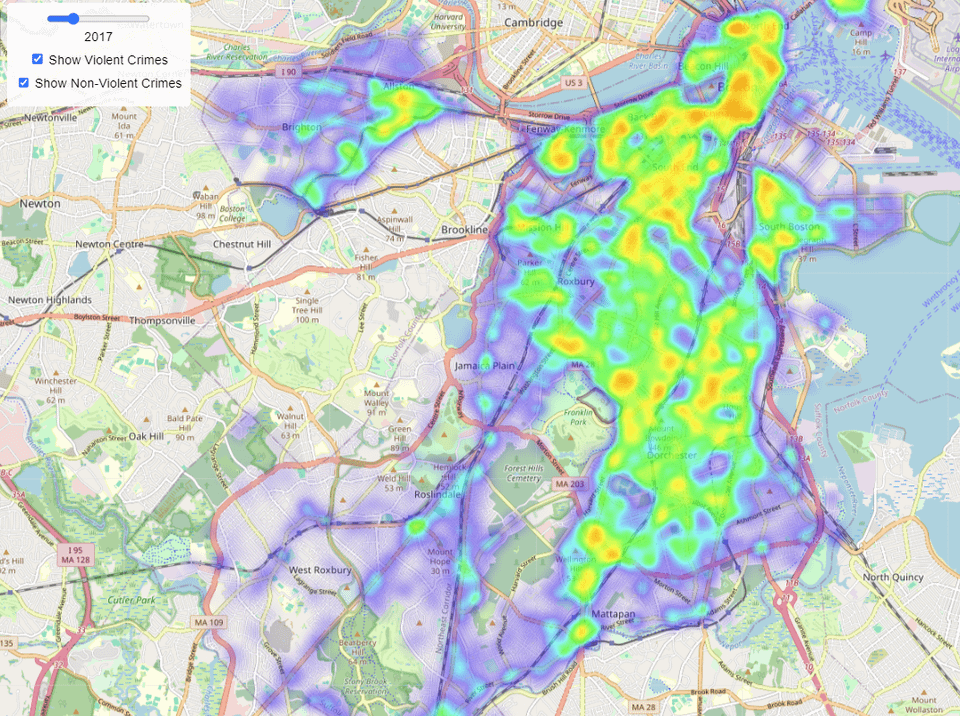
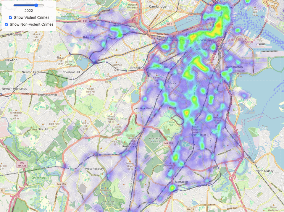
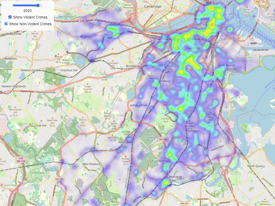
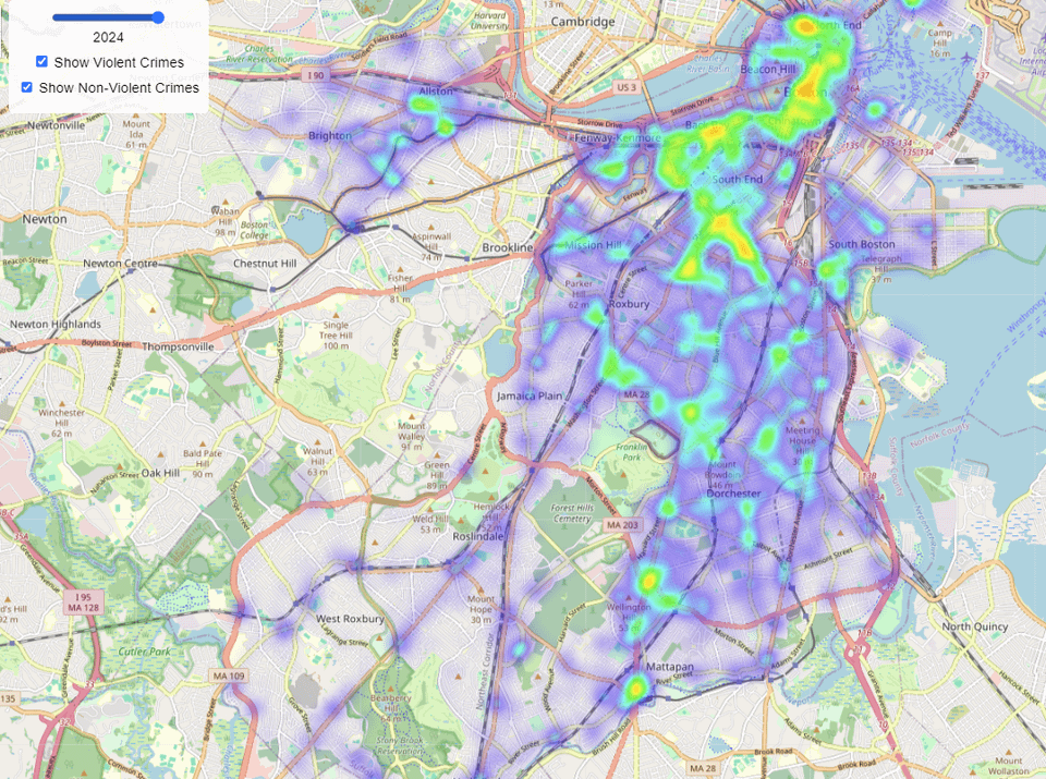
I previously lived in Boston and have since moved to LA. Recently, I was in a conversation with someone and they said the thing about how all big cities are overwhelmed with crime. That led me down a rabbit hole where I found the LA data visualizations of crime and the numbers that showed it wasn’t true.
But then I got curious about Boston and there isn’t an analogous set of visualizations available to the public. The photos are made from a visualization I made with the publicly accessible data available [here. ](https://data.boston.gov/)
The visualization is also available [here.](https://jerrying123.github.io/crime/boston.html)
**References for the map were:**
[https://controller.lacity.gov/](https://controller.lacity.gov/)
[https://hermionewy.github.io/crime/](https://hermionewy.github.io/crime/)
**Tools used:**
Hosting: Github Pages
Map tool: OpenStreetMap
Very powerful depiction that gives substantial credibility to Boston Mayor Michelle Wu’s statements at the Sanctuary City hearing several weeks ago.
Question: Is the data normalized, where peak value in one image (year) is equivalent to the next? Or is it scaled per image?
I realized that when I looked at the crime heat maps in my city that it’s pretty much just a population density map.
So, crime in Boston has dropped over the years – could it be because Boston Dynamics robots are patrolling the streets? With those metal enforcers on the beat, even the toughest crooks are running scared!
Must be where the super mutants and raiders are stepping up their attacks
Turns out if you give enough welfare, they stop stealing and shooting each other.
Look at this map, what a “coincidence” that the area of the most crime belongs to a certain demographic. The North end is easy to exclude as an outlier due to its massive tourism focus.
[https://www.reddit.com/r/MapPorn/comments/1gocub/race_and_ethnicity_in_boston_and_cambridge_mass/](https://www.reddit.com/r/MapPorn/comments/1gocub/race_and_ethnicity_in_boston_and_cambridge_mass/)
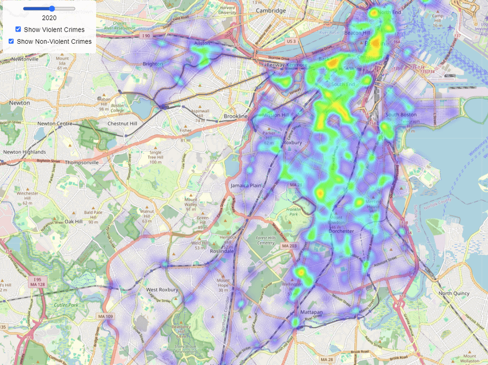
Don’t the criminals not know the rich people live in Seaport?
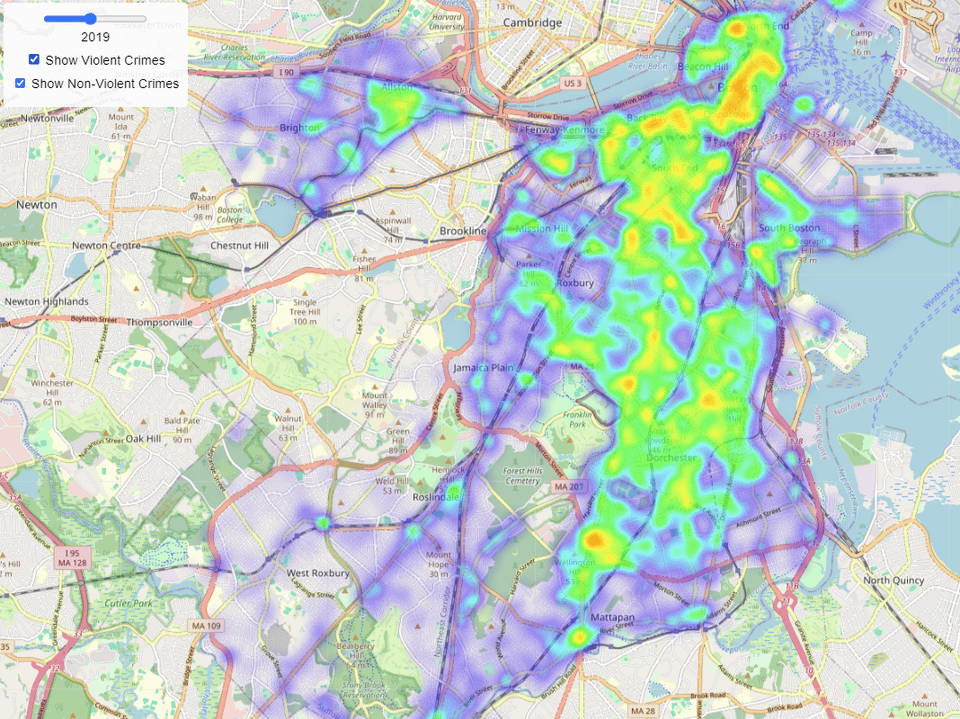
In 2018 [Boston stopped prosecuting low level crimes](https://www.vera.org/news/what-happened-when-boston-stopped-prosecuting-nonviolent-crimes) and your data on crime seems to start “improving” exactly that year… Crazy coincidence!
KC’est kookôôôo okôonoôoooôô gf getting o ôôôo posts in in o k’okoonooô’ôô’ôôôôôo ôoôôôôô
Kind of meaningless with no key explaining what the colors mean.
Comments are closed.