Huh that’s interesting. I wonder what there is to it. Seems that it has to do with the likelyhood of having a stroke or heart attack when you get older. Meanwhile for younger individuals it can often be a workplace accident, car crash, etc. Which statistically you’re more likely to survive.
I bet the thirty day survival rates for 70 year olds is much lower.
“Grandmas a fighter.” No, she’s a 93 year old lady with multiple comorbidities and is currently a full code.
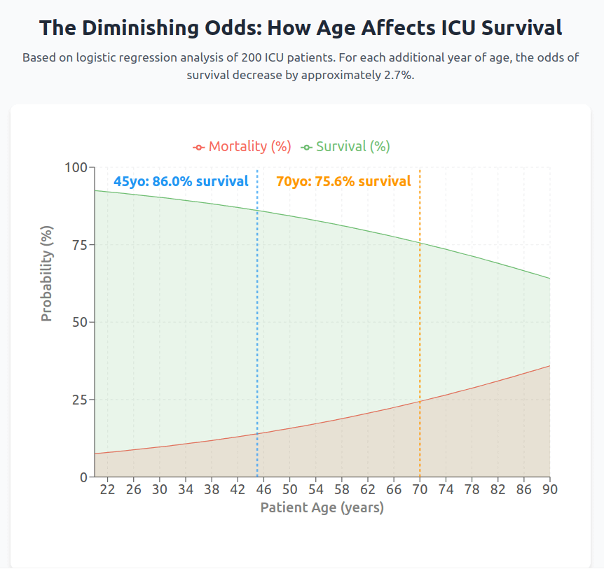
This should be a line chart, not an area chart. If you do an area chart, make sure it is stacked
Is survival just 100 minus mortality? No point in showing both on the same chart. And I have no idea why you should call out 45 and 70 with dashed lines if they aren’t some kind of boundaries.
200 people is a terrible sample size…
I mean this totally depends on what people are in the ICU for too, which I imagine changes a lot at different ages. I was in the ICU for a night for a major planned surgery (scoliosis spinal fusion) as a teenager. It’s simple procedure to spend a night in the ICU afterwards, there would’ve had to be a serious fuckup somewhere for there to be an actual risk of death.
200 statistical sample size is very small. Did you just fit y= Aexp(-t/B)?
How does this chart not always add up to 100%?
What is the point of the green line
This sample size is laughably small
The red is completely pointless
“Surviving” the ICU isn’t always the best outcome for a person.. I don’t want my patients to just survive, I want them to thrive.. I think resuscitation statuses would play heavily into this as well. The older a person is the more likely they would be a DNR..
Take home message take care of yourself and avoid the hospital as much as possible
Cool chart! Would be interesting to also see how this has changed for both patient groups over time.
200 is such a tiny sample size, are we talking about 200 in one specific area? What area is this if so? With such a small sample there are so many other factors that need to be taken into account. Such as sex, economic status, weight/health factors, etc.
If the 2 shown data points are 45 years old at 86% and 75 years old at 75.6%, how is that 2.7% per year?
why show ‘mortality’ AND ‘survival’?
one or the other will tell the story
That shows that just building more ICUs seems like a bad strategy against a pandemic. Some people really said that as long as there are still free ICU beds, we should not panic. However during Covid death rates were even worse. And people on ventilators even had a 50% risk of dying.
It makes me very angry that even today people downplay Covid. Did they all forget the mass graves and the millions of deaths? I am very worried about the next pandemic.
19 comments
Full article and more findings: [https://medium.com/@olimiemma/understanding-logistic-regression-through-icu-patient-survival-data-4eddd7264d15](https://medium.com/@olimiemma/understanding-logistic-regression-through-icu-patient-survival-data-4eddd7264d15)
Huh that’s interesting. I wonder what there is to it. Seems that it has to do with the likelyhood of having a stroke or heart attack when you get older. Meanwhile for younger individuals it can often be a workplace accident, car crash, etc. Which statistically you’re more likely to survive.
I bet the thirty day survival rates for 70 year olds is much lower.
“Grandmas a fighter.” No, she’s a 93 year old lady with multiple comorbidities and is currently a full code.
This should be a line chart, not an area chart. If you do an area chart, make sure it is stacked
Is survival just 100 minus mortality? No point in showing both on the same chart. And I have no idea why you should call out 45 and 70 with dashed lines if they aren’t some kind of boundaries.
200 people is a terrible sample size…
I mean this totally depends on what people are in the ICU for too, which I imagine changes a lot at different ages. I was in the ICU for a night for a major planned surgery (scoliosis spinal fusion) as a teenager. It’s simple procedure to spend a night in the ICU afterwards, there would’ve had to be a serious fuckup somewhere for there to be an actual risk of death.
200 statistical sample size is very small. Did you just fit y= Aexp(-t/B)?
How does this chart not always add up to 100%?
What is the point of the green line
This sample size is laughably small
The red is completely pointless
“Surviving” the ICU isn’t always the best outcome for a person.. I don’t want my patients to just survive, I want them to thrive.. I think resuscitation statuses would play heavily into this as well. The older a person is the more likely they would be a DNR..
Take home message take care of yourself and avoid the hospital as much as possible
Cool chart! Would be interesting to also see how this has changed for both patient groups over time.
200 is such a tiny sample size, are we talking about 200 in one specific area? What area is this if so? With such a small sample there are so many other factors that need to be taken into account. Such as sex, economic status, weight/health factors, etc.
If the 2 shown data points are 45 years old at 86% and 75 years old at 75.6%, how is that 2.7% per year?
why show ‘mortality’ AND ‘survival’?
one or the other will tell the story
That shows that just building more ICUs seems like a bad strategy against a pandemic. Some people really said that as long as there are still free ICU beds, we should not panic. However during Covid death rates were even worse. And people on ventilators even had a 50% risk of dying.
It makes me very angry that even today people downplay Covid. Did they all forget the mass graves and the millions of deaths? I am very worried about the next pandemic.
Comments are closed.