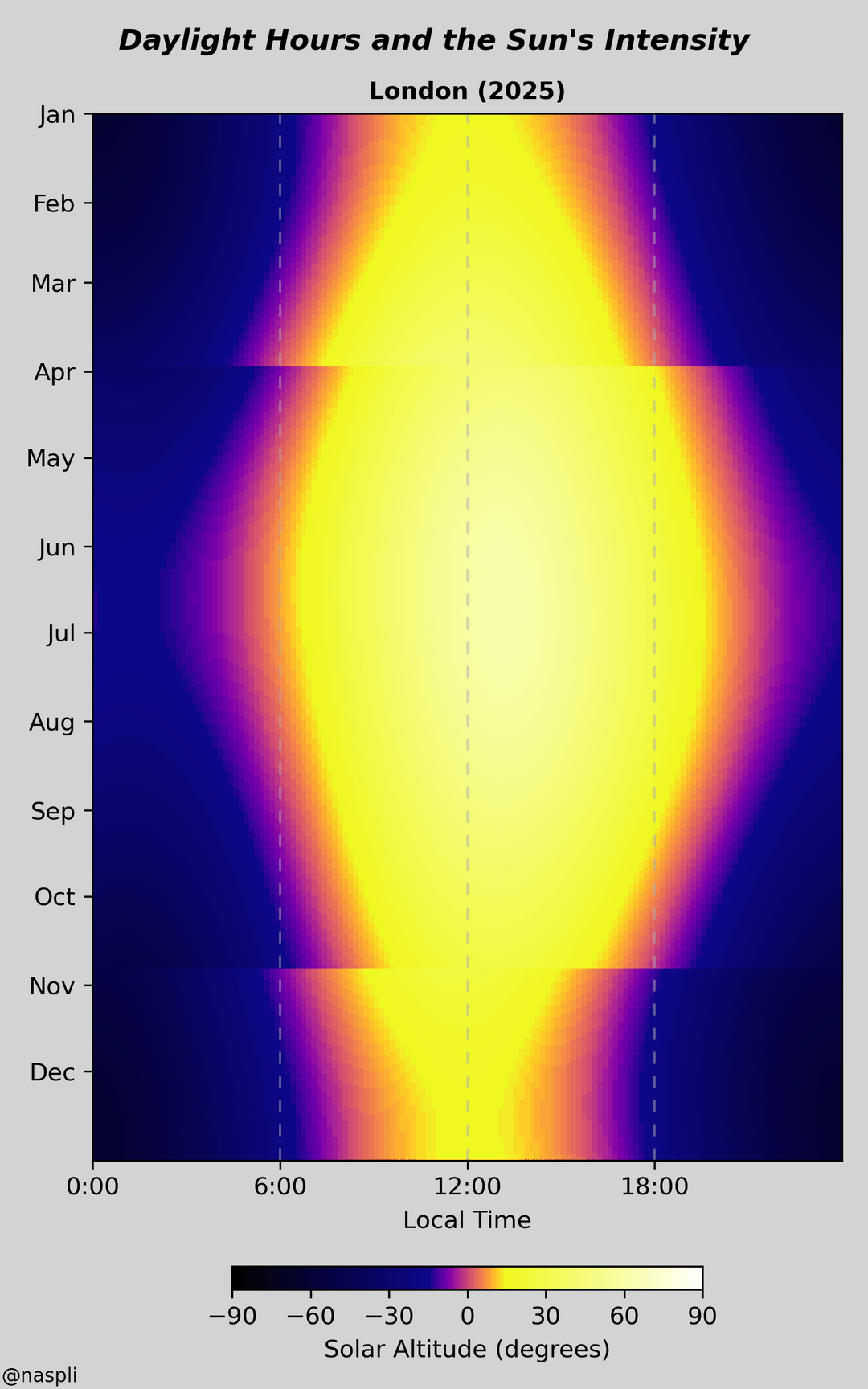
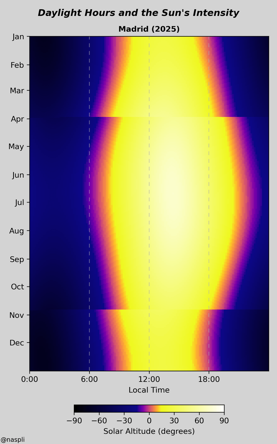
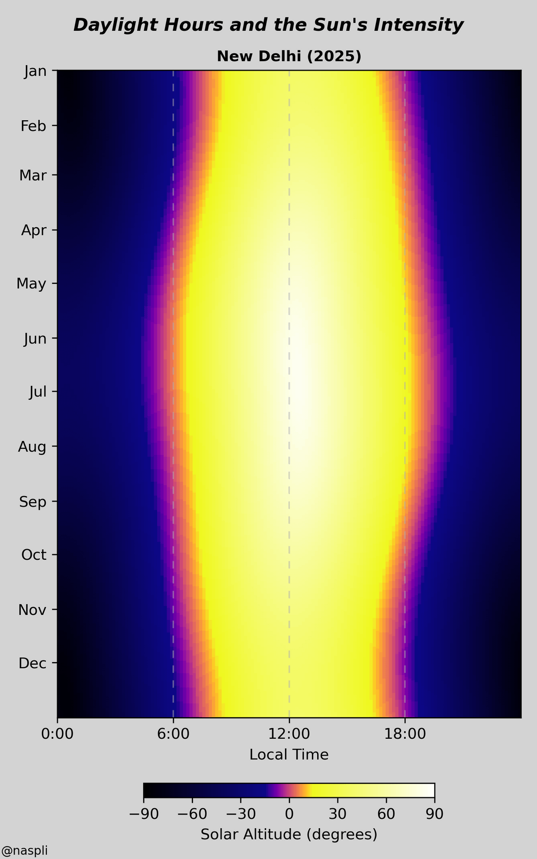
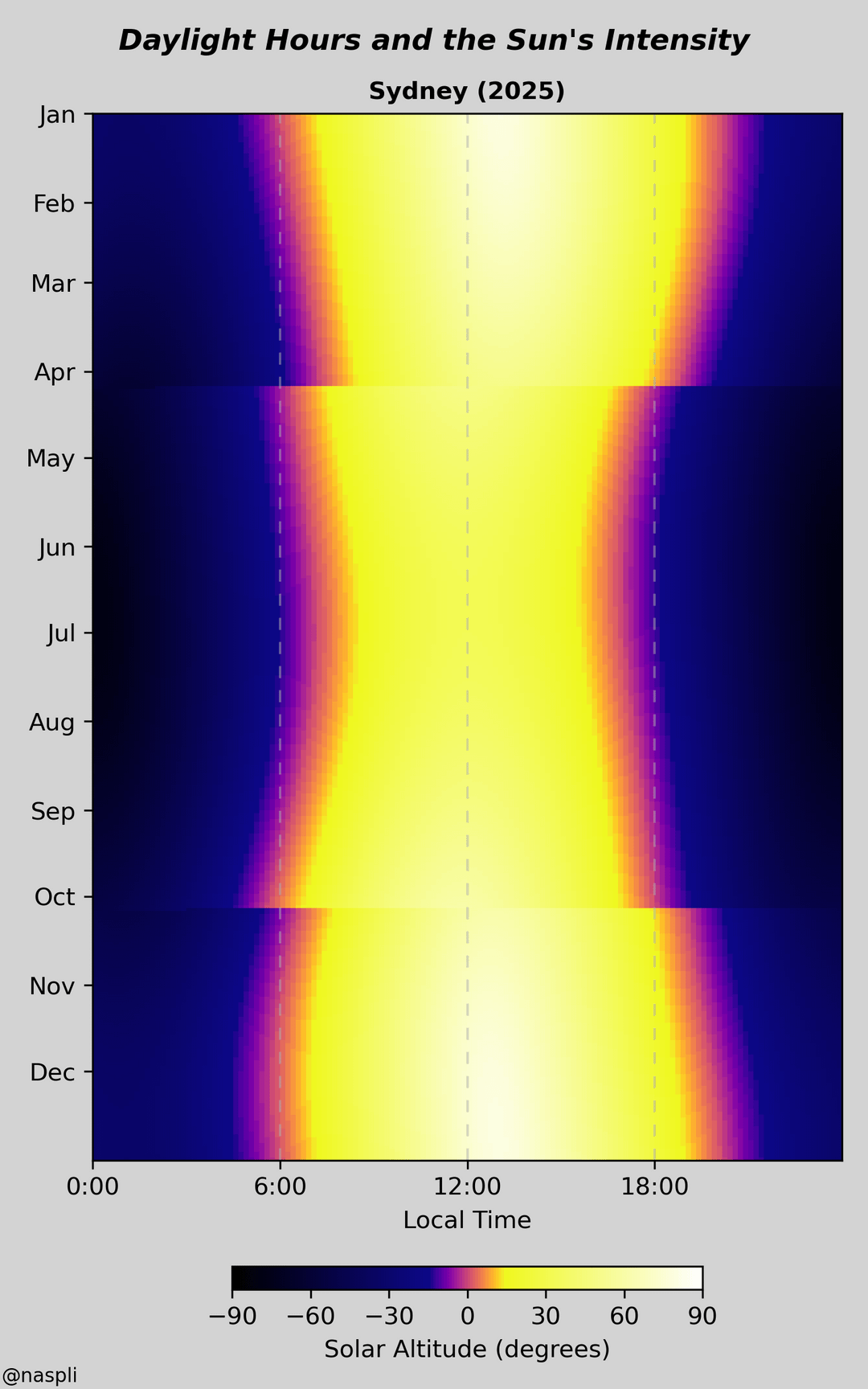
I’ve created a visualisation of daylight hours, and chosen various cities to show.
The colours are meant to intuitively reflect the sun’s intensity, with white-yellow in the day, orange-purple through sunset/sunrise, and black-blue in the night. Specifically, they map to solar altitude i.e., how high up the sun is in the sky.
As daylight saving time approaches here in London, I wanted to visualise what it meant. And also wanted to compare our hours to other countries. At the equator, Singapore is very stable through the year. Near the Arctic, Reykjavik’s change between Summer and Winter is even more extreme. Madrid has their day shifted late as their timezone doesn’t align with their longitude.
This is really neat! However, the continuous color scale makes it hard to determine exactly when sunrise/sunset occurs. I suggest adding a discontinuous color (gray?) at solar altitude = 0°.
Edit: for extra fun, you could add extra contours corresponding to civil/nautical/astronomical twilight.
Today I learned DST is not just a USA thing. These plots are fantastic.
These look great. Nice job!
Need to fix those screen tear artefacts.
I was like wtf Singapore has no seasons. Then I checked that it’s right on the equator. I’m not great in geography.
Would like to see a version that takes dst out
amazing how different they are
Before anyone goes off with that fake Indian proverb of “only a white man would take the end of a blanket and sow it to the top and call it longer”…when you wake up in the winter. Is it still dark. That’s because it’s to shift people’s sleeping habits to happen exclusively in the dark to free up more daylight. That falling back and hour means you wake up an hour earlier. And typically before the sun or just as it rises. So you gain an hour of useful daylight instead of sleeping through it
that madrid shift is insane
I think it’s old data because the shift occurs in early April but since 2006 the shift occurs the second weekend in March.
I rarely comment on this sub as a data professional I feel it’s unfair to be too critical.
But holy cow. This is an epic viz!
I would love to see this as a high res poster of small multiples.
Your use of color, axis, label and everything is so spot on that I didn’t even need to read your description. Immediately understandable and immediately insightful.
Comparing singapore.to Rejavik was my favorite!
Hate DST and how it disrupts so many things.. add this to the list.


![[OC] When do you get your sunlight? Visualising daylight hours and the sun's intensity](https://www.europesays.com/wp-content/uploads/2025/03/orq20pb9ipqe1-1080x1024.png)
13 comments
I’ve created a visualisation of daylight hours, and chosen various cities to show.
The colours are meant to intuitively reflect the sun’s intensity, with white-yellow in the day, orange-purple through sunset/sunrise, and black-blue in the night. Specifically, they map to solar altitude i.e., how high up the sun is in the sky.
As daylight saving time approaches here in London, I wanted to visualise what it meant. And also wanted to compare our hours to other countries. At the equator, Singapore is very stable through the year. Near the Arctic, Reykjavik’s change between Summer and Winter is even more extreme. Madrid has their day shifted late as their timezone doesn’t align with their longitude.
I used python and libraries including pysolar for the altitude calculations, and matplotlib for the display. Code is available on my [github](https://github.com/naspli/dataviz/tree/master/daylight).
This is really neat! However, the continuous color scale makes it hard to determine exactly when sunrise/sunset occurs. I suggest adding a discontinuous color (gray?) at solar altitude = 0°.
Edit: for extra fun, you could add extra contours corresponding to civil/nautical/astronomical twilight.
Today I learned DST is not just a USA thing. These plots are fantastic.
These look great. Nice job!
Need to fix those screen tear artefacts.
I was like wtf Singapore has no seasons. Then I checked that it’s right on the equator. I’m not great in geography.
Would like to see a version that takes dst out
amazing how different they are
Before anyone goes off with that fake Indian proverb of “only a white man would take the end of a blanket and sow it to the top and call it longer”…when you wake up in the winter. Is it still dark. That’s because it’s to shift people’s sleeping habits to happen exclusively in the dark to free up more daylight. That falling back and hour means you wake up an hour earlier. And typically before the sun or just as it rises. So you gain an hour of useful daylight instead of sleeping through it
that madrid shift is insane
I think it’s old data because the shift occurs in early April but since 2006 the shift occurs the second weekend in March.
I rarely comment on this sub as a data professional I feel it’s unfair to be too critical.
But holy cow. This is an epic viz!
I would love to see this as a high res poster of small multiples.
Your use of color, axis, label and everything is so spot on that I didn’t even need to read your description. Immediately understandable and immediately insightful.
Comparing singapore.to Rejavik was my favorite!
Hate DST and how it disrupts so many things.. add this to the list.
Comments are closed.