![Maps I made for planning an aurora-spotting vacation [OC]](https://www.europesays.com/wp-content/uploads/2025/03/ci97skrso1re1-1080x1024.jpg)
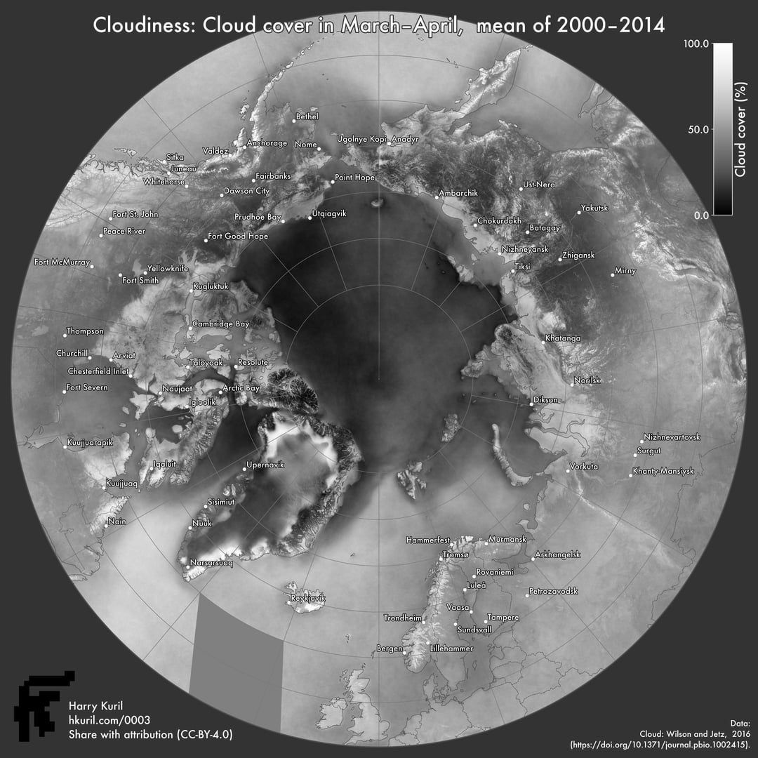
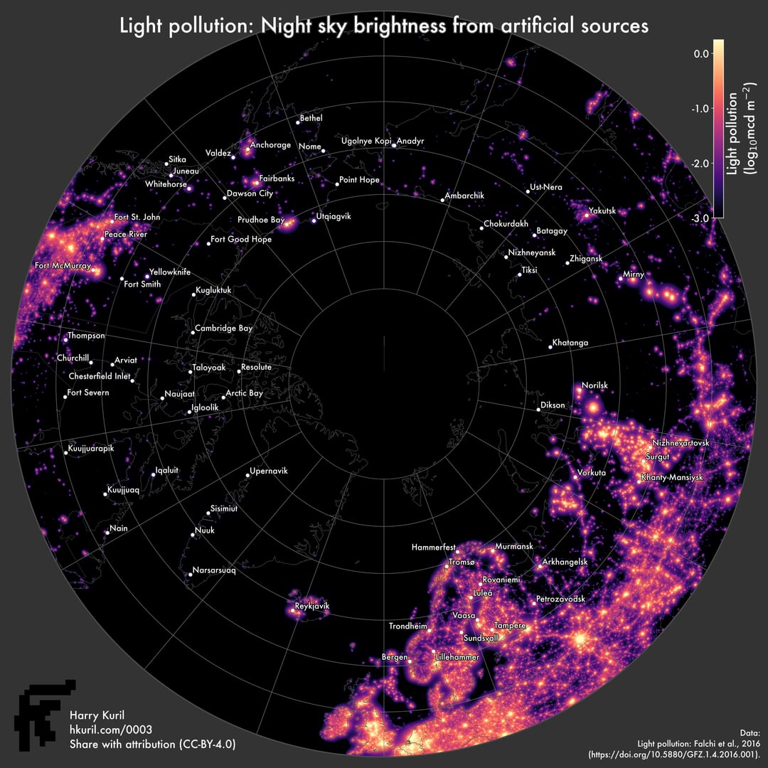
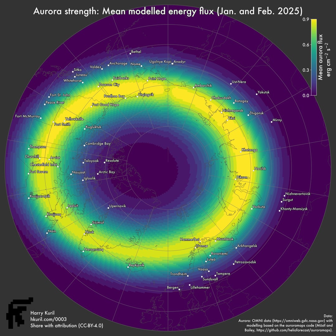
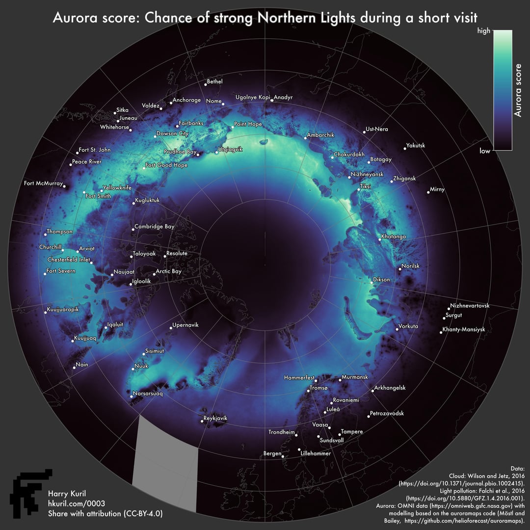
I wanted to plan a trip to try to see the aurora borealis, because solar activity is supposed to be reaching the peak of its roughly 11-year cycle. I wasn’t sure where in the world to go, so I plotted maps of recent aurora strength (Jan–Feb 2025), historical cloudiness in March–April (2000–2014), and light pollution. I also combined these into a single metric, the ‘aurora score’, by multiplying them togeher.
I did all this in a hurry I wanted to publish the results before they became useless—very soon, the days will be too short to see the Northern Lights. So, there might be some mistakes. I will probably return to this project at some point, so all feedback is welcome. In particular, I’m curious to see what people think of the ‘aurora score’ metric, and what other information or changes would be helpful (the next thing I’d like to look at is the optimal time of day).
In case you were wondering, I decided to go to Norway (closer to where I live) despite the fact that my map said it would probably be cloudy. And it was cloudy. But it was still an awesome Hurtigruten ferry trip around the northern tip of Europe, and we did see some aurora on some nights.
There is more background in my blog post: hkuril.com/0003
All the data and tools were free and open.
Data sources:
Cloud: Wilson and Jetz, 2016 ( https://doi.org/10.1371/journal.pbio.1002415 ).
Light pollution: Falchi et al., 2016 ( https://doi.org/10.5880/GFZ.1.4.2016.001 ).
Aurora: OMNI data ( https://omniweb.gsfc.nasa.gov ) with modelling based on the auroramaps code (Möstl and Bailey, https://github.com/helioforecast/auroramaps ).
Tools used:
QGIS (mapping, most raster processing).
NumPy (some raster processing, making colour bars).
Posted by hkuril
9 comments
**Data sources:**
Cloud: Wilson and Jetz, 2016 ( [https://doi.org/10.1371/journal.pbio.1002415](https://doi.org/10.1371/journal.pbio.1002415) ).
Light pollution: Falchi et al., 2016 ( [https://doi.org/10.5880/GFZ.1.4.2016.001](https://doi.org/10.5880/GFZ.1.4.2016.001) ).
Aurora: OMNI data ( [https://omniweb.gsfc.nasa.gov](https://omniweb.gsfc.nasa.gov) ) with modelling based on the auroramaps code (Möstl and Bailey, [https://github.com/helioforecast/auroramaps](https://github.com/helioforecast/auroramaps) ).
**Tools used:**
QGIS (mapping, most raster processing).
NumPy (some raster processing, making colour bars).
Man this is so cool, will go through this in detail.
This is great. Crosspost to r/GIS! Impressive work
I’d include mean temperature
Make Data Beautiful Again
I think it’s great. But why didn’t you finish doing the Raster processing in QGIS and do a “Multi-criteria Analysis” with the Visibility Optimization results? ☺️☺️
I think you need one more factor, which is accessibility.
Wrangel Island is probably one of the best land locations for viewing, but you’ve got basically no chance of being able to actually get there, so it shouldn’t be prominent on the final map.
Beautiful visualizations, though! Nice work!
Wish I had this when we were planning this trip, I’m about to go look at clouds for a week. 🙁
> In case you were wondering, I decided to go to Norway (closer to where I live)
So did we, for the same reason. We had 9 days in Tromso and saw no aurora at all. Started to wonder if the whole aurora thing was an invention of the Norwegian Tourist Office. Glad you saw some … but maybe you are part of the conspiracy.
Comments are closed.