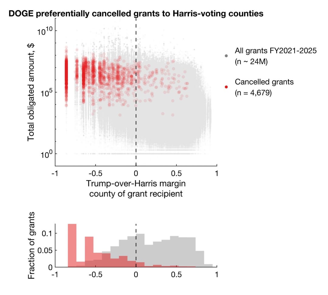
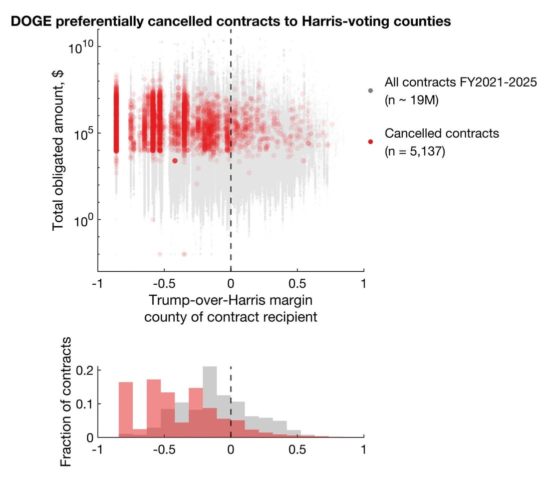
92.9% and 86.1% cancelled grants and contracts went to Harris counties, representing 96.6% and 92.4% of total dollar amounts.
Posted by airmovingdevice
92.9% and 86.1% cancelled grants and contracts went to Harris counties, representing 96.6% and 92.4% of total dollar amounts.
Posted by airmovingdevice
43 comments
Data source:
doge.gov/savings — cancelled federal grants and contracts
USAspending.gov — contract/grant recipient info
https://github.com/tonmcg/US_County_Level_Election_Results_08-24 & https://github.com/nytimes/presidential-precinct-map-2024 — county-level election data
Tools: Matlab
Methodology: see https://bsky.app/profile/airmovingdevice.bsky.social/post/3ll2ehugqik2n
I retrieved all publicly available cancellations from DOGE on 3/22, which according to DOGE is a subset of all cancellations.
I then cross-referenced them to official spending data on USAspending using links provided by DOGE and ended up with 5,137 and 4,679 contracts and grants with rich metadata.
These metadata include total dollar amounts obligated, dates, and information on contract/grant recipients (address, county, congressional district, etc).
I extracted county info (FIPS code) and cross-referenced them to county-level presidential election data from 2024.
For each contract/grant, I found Trump’s popular vote margin over Harris in the recipient county.
I plotted every cancellation in red, with total dollar amount obligated on the y axis against Trump-over-Harris margin on x.
There’s a bias for more cancellations in Harris counties. But does this reflect true bias or simply more contracts/grants awarded to Harris counties?
To answer this, I need a good background/control set. I compiled all contracts/grants from FY2021-2025 on USAspending, totaling ~19M/24M. ~99% of all cancelled contracts/grants were from this period.
Clearly, the background/control sets (plotted in gray) are distributed across the Trump-Harris spectrum, but the cancellations are biased towards Harris counties.
Potential caveat: DOGE doesn’t specify how it chose certain contract/grant cancellations to disclose. They claim the ones disclosed represent “~30% of total savings”. It is therefore possible that they made cancellations unbiasedly across the Trump-Harris political spectrum but preferentially disclosed ones to Harris counties for publicity purposes.
Most institutions that get grants are in cites, thus the correlation.
Help me understand this…these were contracts awarded to municipalities and not like Lockheed Martin, right? Are they awards to dense urban areas? Are they all in certain NAICS codes?
What are all of these $1 grants for?
Can you also make a version that carefully controls for the obligated amounts? It would be great if you could share the raw data too, I’d be interested in exploring this more myself.
Correlation isn’t causation.
What’s with all the sub-$1000 grants?
This is a very insightful data set and analysis, can you provide sources and methods?
What did you use to create the plots?
missed opportunity to use red/blue
well that makes sense to me.
I expect there is a correlation between number of grants awarded and political leanings.
I’ve yet to see a heavily grant funded University NOT be in a liberal community.
Boulder Colorado is heavily liberal and likely voted for Harris….and Has the University there.
Cheyenne Wells doesn’t get a lot of grants comparatively .
The Ag grants these rural areas get are pretty single purpose. Universities get a huge variety of grants ranging from Ag grants to social sciences, to STEM research. Claiming that rural areas get ‘more’ grants is not taking into account the variety of grants that are involved. DEI grants to podunk kentucky would be on the cutting block too….if they had any.
Nice. Would love to see this $ adjusted by amount cut not just # of grants.
trump/musk administrator is def not above personally and politically motivated stuff like that for absolutly no reason other than trump didnt see fealty to himself… . But would the counties that are higher % democrat, also not have more programs that republicans would see as waste ?
I love how the top comments in this thread are asking questions about the data. Clicking into the profiles of these users, they appear to be left leaning folks. If a data set favoring trump were posted to a pro-MAGA thread, the comments would be full of MAGAs blindly following the data with no verification at all.
Is this true a function of targetting Harris voters, or these contracts impacting population centers… Which are generally more left leaning?
So counties that primarily contain major cities…..? Ya know, where grants and contracts would be the most common based on population density?
Plz correct me if I’m wrong as I came to this conclusion based on common sense without looking at any of the data.
That is because those counties are actually full of educated individuals and that is where you send grant money to individuals who can perform scientific studies.
There’s no doubt that they’re consciously attacking liberals. I believe this is their main reason for pursuing DEI. It’s a cover to weaken education institutions, which they see as an enemy. Classic authoritarian behavior.
Trump also didn’t target law firms that worked for Republicans in spite of their strong DEI hiring policies.
This has got to be illegal, but it’s also an official act as president, and Elon will be pardoned if they thought they couldn’t go after him. I hope these states and counties get together and form a class action lawsuit that goes after him in individual districts.
coincidence is not causation.
Are we sure we don’t have an [xkcd 1138](https://xkcd.com/1138/) on our hands?
There’s a lot of things wrong with this. For one, there’s way more red counties than blue counties, so that’s going to skew the results. And it could be a policy targeting grants to urban areas and not so much rural. Correlation does not mean causation.
Something I’d like to add that doesn’t discount this analysis but does provide a new wrinkle in the data: **There are probably a disproportionate number of contracts and grants that were canceled to institutions in the DC Metro area**. Alexandria, Arlington and Fairfax counties in VA. Montgomery and Prince George’s counties in MD.
All voted for Harris and all contain large federal institutions (NIH or the frickin’ Pentagon, for example) as well as a large number of contractors that serve them or Department housed in DC proper (Beltway Bandits is the local term for contractors performing work for the federal government)
Presumably this is because they were awarded in those counties unjustly?
Trump flat out said for years he was going to punish blue areas. If anything this is a promise kept. I don’t think anyone on either side didn’t expect exactly this.
Right. Some nondiscript on reddet puts out an unsubstainiated chart & were suppose to take it as gospel. Wheres the supporting data?
What is the ratio of grants and contracts in harris v trump counties?
Overlay this with cities. There’s probably a correlation. Cities voted for Harris.
If I am reading this correctly, there were more grants to Trump leaning counties, but higher or greater rates of cancellation in Harris leaning counties? To mass process grant cancellations, I think we can safely assume DOGE used code to scan the contracts for multiple criteria. It would be easy to scan for keywords like “race”, “DEI”, “equity”, etc., and cull those out. Yes, it is a possibility this was done neutrally, but it’s unlikely.
This is no surprise Elon musk literally gave his phone number to republican congressmen so that if he cut something in their district they could ask him to put it back
Fun fact
People live in cities
anecdotal data point: I live in California in a red county. My NIH grant was renewed even though it has clear DEI leanings if you read beyond the title of the grant. My colleagues at other institutions with arguably fewer DEI outcomes scaffolded in the grant have had grants not renewed, awarded grants not funded, highly scored/rated grants seemingly ghosted.
Queer research wasn’t a priority
I guess that’s where the waste spending is the most prominent
What were the grants for though? That is also important information
Counties are not a good way to discuss policy differences because they come in all kinds of sizes and populations, so what you’ve made essentially boils down to population.
Look at congressional districts.
Claim: “DOGE preferentially canceled grants and contracts to counties that voted for Harris.”
Key Error #1 – Misreading Distribution:
The control group (gray dots) already shows that most grants were concentrated in counties that voted for Harris (i.e., urban, left-leaning areas). So naturally, more cancellations would hit those areas if more grants went there in the first place.
Key Error #2 – Confusing Disclosure Bias with Cancellation Bias:
Even the poster admits:
“It is possible they made cancellations unbiasedly across the Trump-Harris political spectrum but preferentially disclosed ones to Harris counties for publicity purposes.”
Exactly. The dataset is incomplete and the disclosure process is non-random, making any conclusion about intentional political targeting shaky at best.
Key Error #3 – Urban Centers vs Rural Spread:
More contracts, more money, and more programs flow to densely populated blue areas. If DOGE is cutting bloated or expired programs, it’ll naturally hit those areas harder, not because of politics, but because they received more in the first place.
⸻
Bottom Line:
1. The Reddit comment misattributes a current food issue to Trump out of raw emotion, not fact.
2. The DOGE chart is an interesting visualization but not proof of political targeting—especially when the person posting it admits the sample is incomplete and possibly filtered.
3. The Left is far more active in narrative manipulation than they admit. From banning books to canceling speakers, labeling dissent as “hate,” or censoring entire platforms, the real Thought Police wear progressive badges—and they hide behind the guise of compassion while wielding raw control.
Am I going insane or does the Y-axis really weird. Wouldn’t 10^0$ just be 1$? Why is it marked so weirdly, and why are they so high up on the y-axis??? This feels like someone is trying to manipulate the graph, altough I have 0 clue what it would achieve in this case
It’s almost like the democratic party loves embezzling and spending money that they don’t deserve… #harrisspentabilliondollarsandevenwentintodebt
Good. Traitors shouldn’t get benefits.
During his 2020 campaign, Trump repeatedly threatened to cut funding to democrat voting cities. Can you make the cancelations be plotted on a map to show *where* the cuts are happening? I’m curious to see if the cancelations are concentrated in Portland, Seattle, and New York.
Makes sense.
This is the most openly corrupt administration in modern history. Maga is a cancer
Comments are closed.