![I rendered arrival and departure traffic from Chicago O'Hare International Airport [OC]](https://www.europesays.com/wp-content/uploads/2025/03/z3knh96tsbre1-1080x1024.jpg)
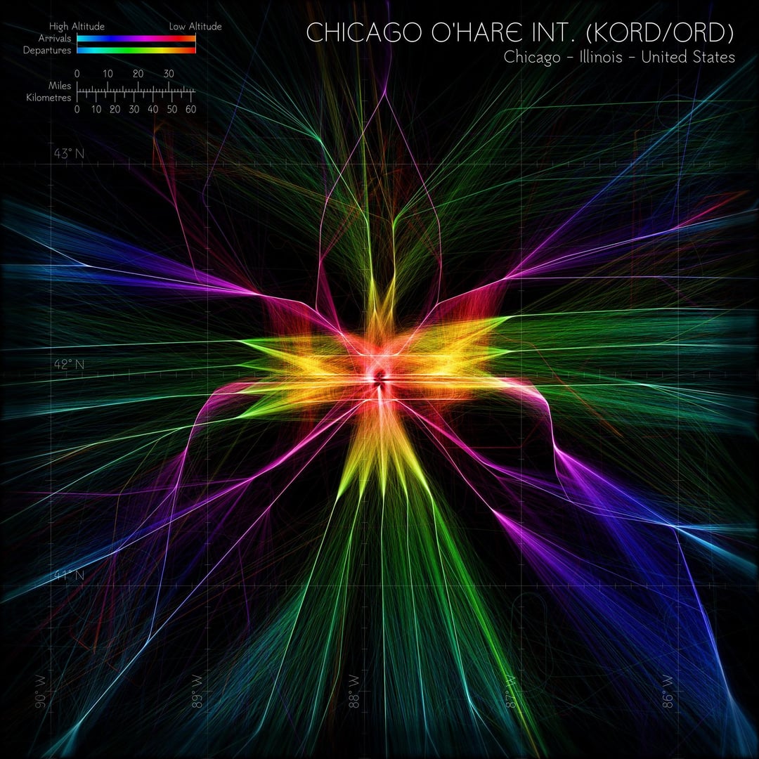


Satisfying one of many popular requests today with this airport. In frame is Chicago O'Hare International Airport (ORD/KORD). Another highly proceduralised airspace by the looks of the render, but perhaps not to the same extent as Atlanta (ATL/KATL) or Denver (DEN/KDEN).
I don't know much about US airspace in general, so I'd love it if anyone could enlighten me on the general airspace model here, as various features seem common across many of the US airports (particularly the busier ones).
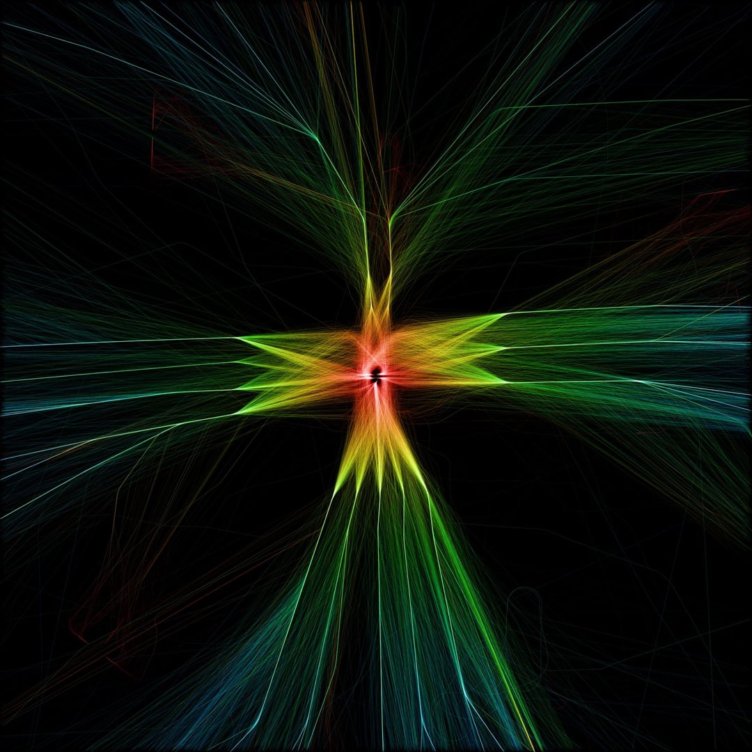
Swipe to see the image without an overlay, and separate renders with only the approaches in blue, and only the departures in green.
Posted by jimbob3806
6 comments
These images were generated with historical data from [adsb.lol](https://www.adsb.lol/docs), and arrival and departure flight data offered by the [OpenSky Network](https://openskynetwork.github.io/opensky-api/). To see previous renders of airports which I have posted here, please refer to my profile or other posts on Instagram @heatmaphorizons.
I’d defer to a pilot for more detailed info but ORD is laid out in a grid for the most part with East/West runways being the primary ones being used by most of the traffic, with arrivals/departures changing based on wind direction.
I live under the pattern on the north side and on a clear night you can watch the planes lining up a good ways out with 3 paths that they line up in. It’s really cool and this visualization is very beautiful! Fantastic work!
I had this visualization on Winamp.
Looks like a hummingbird facing upwards
I found it interesting that at least so far of the US maps youve made, the holding loops dont show up.
Very cool stuff! Looking forward to one of these for my backyard airport of DEN
I’d love to see this on an airport with more complex runway configurations like BOS, or on very lopsided demand airports like SFO where I’d expect it to be very heavy on the 28s arrivals and the 1s departures and light on everything else.
Comments are closed.