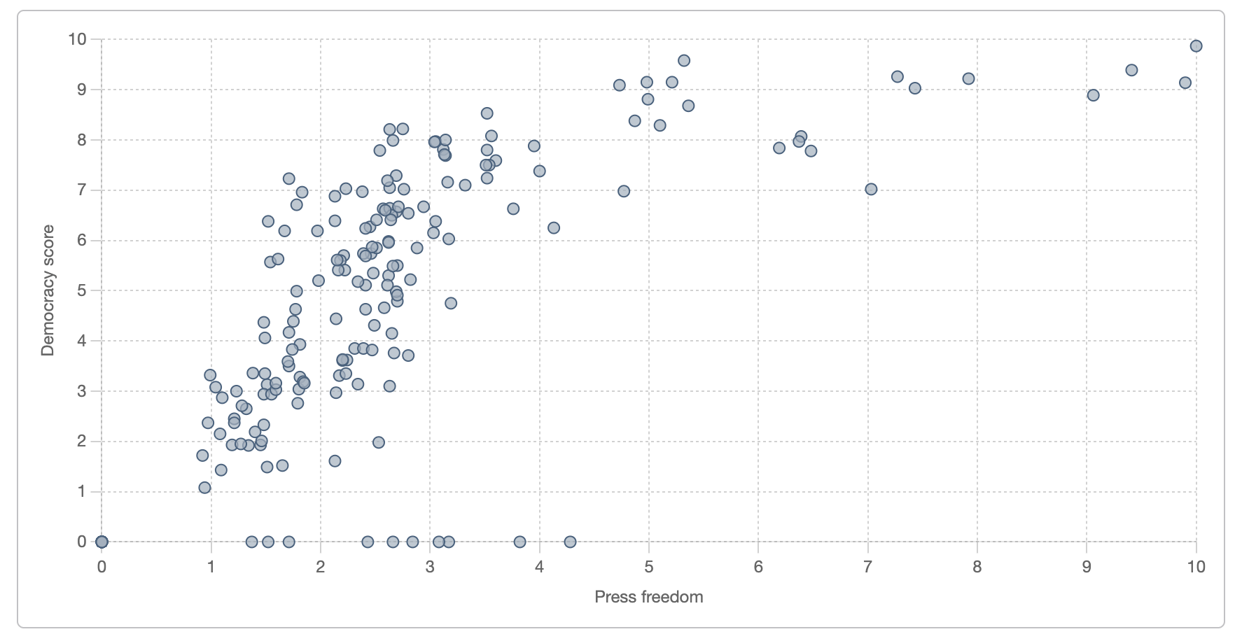
Not sure how beautiful, but super interesting! Found this graph while I was working on our platform today (I guess taking a screenshot of your own graph counts as OC?). According to the data, there is a strong positive correlation (coefficient: 0.72) between a country's democracy score and its press freedom score.
Looks like at the top we've got Norway!
The graph with the individual countries is here: https://www.workwithdata.com/charts/countries?agg=count&chart=scatter&x=press&y=democracy_score, and the data comes from SIPRI, the World Bank, and Reporters Without Borders. I really want to explore the outliers (countries that have a high democracy score but low-medium press freedom) and countries that don't seem to have scores and default to 0 (probably not a good idea, I have to work on that…). 😊
Posted by AniaWorksWithData
5 comments
Following the OC requirements: The source is in the main post (data platform I work with). The visualisation is done in-house (also use *Chart.js*) 🙂
Is freedom of press a component of a country’s democracy score? Because you’d then need to factor that out in your analysis
So this tells me I need press freedom in the 4 to 5 range to have decent democracy.
Lol, why does Samoa have a democracy score of 0? https://freedomhouse.org/country/samoa
That’s really cool, a good reminder of why the press / news are so important
Comments are closed.