![[OC] Visualizing educational attainment and political leaning of US counties](https://www.europesays.com/wp-content/uploads/2025/04/mbztl5v78iue1-1920x470.png)
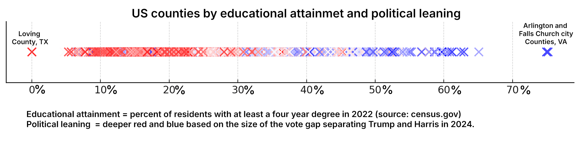
I gathered county level data on the 2024 presidential election (source) as well as educational attainment (source). I made a simple number line sorted by percent of a county's residents with at least a four year degree. I then colored the markers deeper shades red or blue depending on the size of the vote gap separating Trump and Harris in each county.
Fun fact: the gulf separating Trump and Harris in Roberts County, Texas was 92.4% and 86.1% in Washington DC…I'll let you guess in whose favor in each case.
I hypothesize that this relative lack of exposure to higher education accounts for conspiracy theory culture becoming so disproportionately endemic to the political right. I'd like to visualize that as well but can't immediately come up with a county-level data source that would serve as a measure of it. Suggestions are welcomed.
Posted by JaraSangHisSong
10 comments
Apparently I need to name the tool I used. I compiled the data in Excel and then asked ChatGPT to visualize it in this specific way since Excel couldn’t be bothered.
I would be interested to see this tiered for high school, associates, bachelors, masters, and doctorate.
This date doesn’t surprise me at all, but some will see it as evidence of a national conspiracy of educators to brain wash college kids. As opposed to the reality that higher education makes you more likely to think critically and therefore not be a conservative.
Curious about the outliers. High scoring red and low scoring blue.
I would be very interested in a similar analysis based on urbanization of each county. I found it very odd that the Electoral College was more Republican by 7 states but the Democrats net/net gained a seat, I blame the rural/urban divide with Congressional districts becoming less competitive over time.
I’d love to see a scatterplot with vertical axis being %Democratic or vote gap. You should still color code the dots to emphasize the point. Perhaps you could also encode county size with the size of the dot?
how is this beautiful?
While this format does make the correlation clear, adding a second axis for political leaning would make it a little easier to see how the x’s are distributed along the education axis.
What are the red counties in “blue territory” on this line, and the blue counties in “red territory” ?
First, using ChatGPT makes it instantly suspect, did it properly map the data or hallucinate the data wherever it felt fit it’s algorithm.
Second, without weighting for population, it’s not very compelling. Loving County Texas has an estimated population of 43… not 43 hundred nor 43 thousand… 43.
Clearly this must mean that schools with bachelor degrees turn you Democrat.
The only option is to only attain Associate or Certifications to remain truly AMERICAN.
Comments are closed.