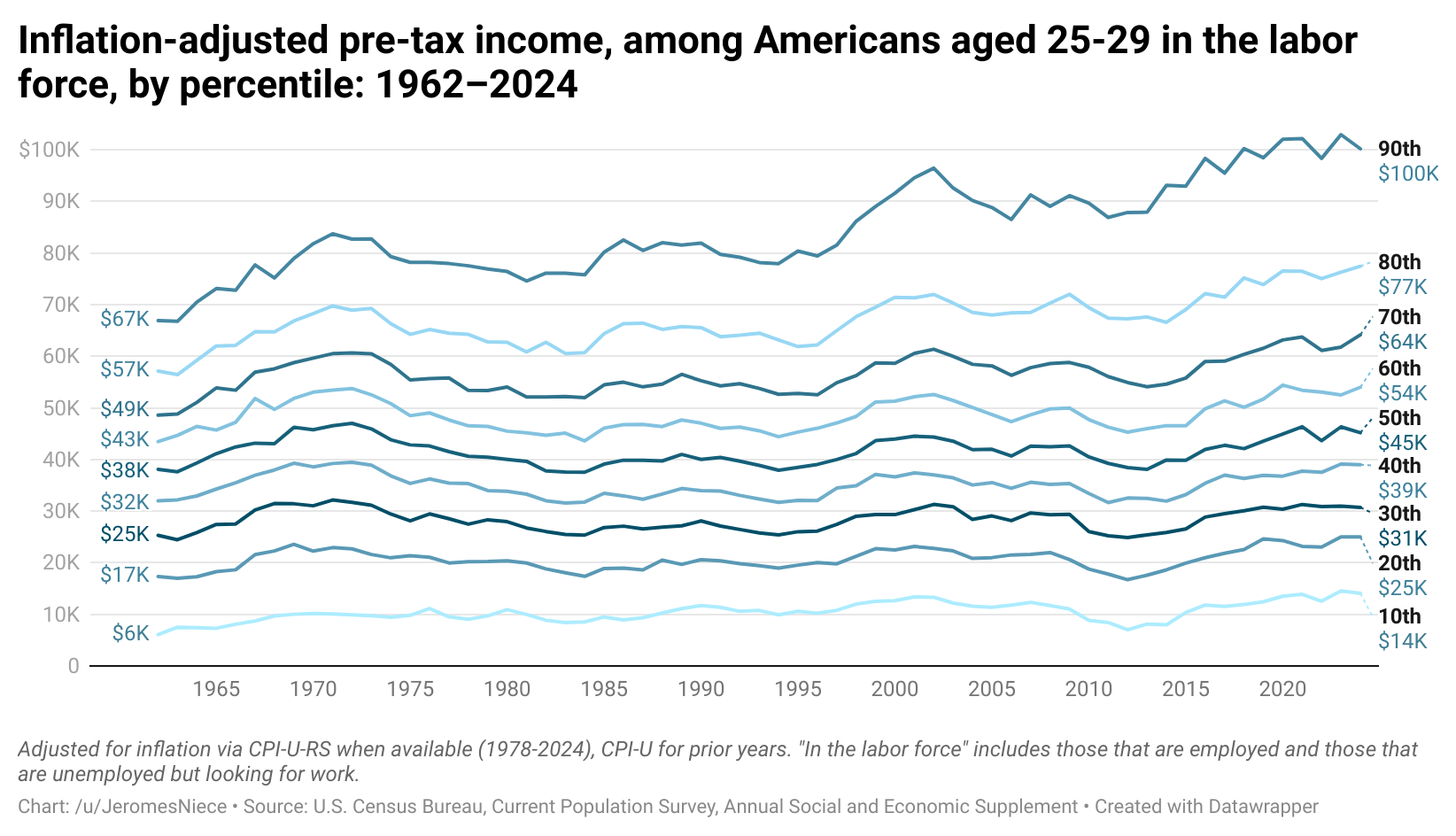
[OC] Inflation-adjusted pre-tax income, among Americans aged 25-29 in the labor force, by percentile: 1962–2024
Posted by JeromesNiece
[OC] Inflation-adjusted pre-tax income, among Americans aged 25-29 in the labor force, by percentile: 1962–2024
Posted by JeromesNiece
13 comments
Income is total income as reported to interviewers, including income from wage and salary work, business income, farm income, government welfare programs, interest, dividends, rent, unemployment benefits, worker’s comp, veteran’s benefits, alimony, child support, and any other sources.
The inflation adjustment is done via the consumer price index (CPI) research series when available, which uses modern methods to adjust for price differences between years, including all major categories of consumer purchases, including housing, food, healthcare, education, transportation, consumer goods, etc.
The source is the U.S. Census Bureau’s American Community Survey, Annual Social and Economic Supplement, a government-sponsored survey including 130,000+ respondents annually, and a gold-standard in economic and social science research.
[Link to full data](https://www.datawrapper.de/_/gH594/)
I assume the dashed represents the expected trend in 2025 from Trump’s policies?
Does anyone care what their pre-tax income is? I want to know how much money I’m actually going to have to spend.
It’d be nice to see GDP-adjusted or something as well. With inflation-adjusted increases to GDP, these should all be going up significantly rather than being flat.
Most being flat implies this age group is disproportionately not benefitting from economic growth.
This is kinda stunning. Every group except for the bottom 10% increased less than 50% over the course of 60 years. Even the top 10%, who look like outliers on the chart, only increased 49%.
Then again, this is inflation adjusted. So I guess I shouldn’t be too surprised. But it’s still very jarring to see it laid out like this.
Great graph.
I would prefer completely different colors for the lines through. Shades of blue are harder to follow than choosing from other colors.
Am I crazy to think that all wages/salaries need to be indexed to inflation? I understand this would make it harder for businesses but look at this graph. This is criminal in my opinion. This graph is the reason that wealth inequality has increased to where it’s at today. Am I stupid?
It’s pretty consistent for the 50th percentile and lower.
Very interesting!
This would be very useful to have as a log plot
It isn’t clear that the income ratio between the 90th-percentile and 10th percentile went down.
This is very confusing because my understanding was that inequality substantially increased, which you can definitely see for the top 10% vs the middle 50%.
Also notable that basically all the gains the bottom 10% have seen was in the last ten years!
Also would also be cool to see post-tax.
All this shows is that it always has been and continues to be difficult to get a high paying job right off the bat. Follow these lives through age into their 60s and we might learn something interesting. The only new bit here is that for those who CAN somehow command a high salary right out of college, they can command a higher one now than in the past. <shrugs>
Considering that this age bracket is part of the college age bracket, this doesn’t surprise me. This bracket includes:
People who recently graduated
People who just got out of the military and are starting college
People who are attending grad school or med school.
If you dug into the data more, the lowest end are probably in college or other school, and are younger. the higher end are your engineers and older part of the bracket. No one should be surprised by any of it.
Very interesting, but inflation based on the consumer price index wouldn’t take into account things like student loans would it? Nor would it take into account “non-necessary” telecommunications such as cell phones and internet which are basically mandatory to be part of the workforce now. Nor the fact that some of the purchase categories more favored by under-30s, such as used cars vs. new cars, are disproportionately high. I’d argue that showing the raw earning power has some value, but paints a different picture considering different standards of living and costs with that time.
Also, turned 25 in 2013, glad to see I timed that dip. O.o
One thing to remember is that the more time that passes, the less inflation matters. What is the value of a car in 1962 compared to 2024? The features, the safety, the style, the feel, the way that you use the machine – – all of these are completely different. Saying the price of cars has therefore increased by x% is basically meaningless. Economists do try to make value judgements, they’ll say such and such feature is with $x, and this works well for the short and medium term, but in the long run, as the basket of goods and services that consumers can buy continually and radically transforms, it starts to lose meaning.
In my view, a more literal material analysis tends to be better. With that in mind, the data here is still probably reasonably true.
Comments are closed.