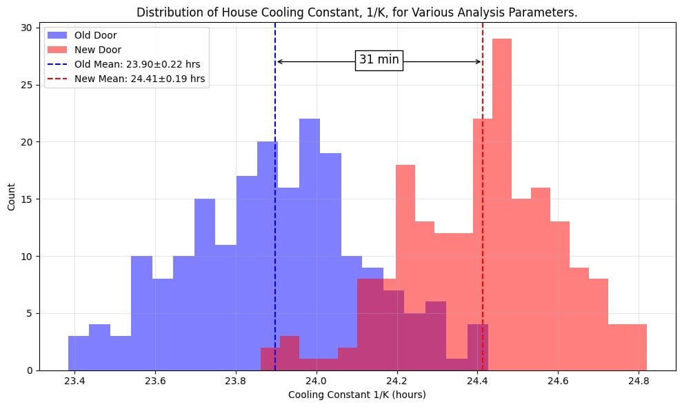
This blog post describes how I collected and analyzed temperature data to study when I had my old front door replaced with a new, weatherized one.
As mentioned in the blog, all of the data and code is in a github repository. This includes the C++ code to program my ESP32_S3 controlled temperature sensors as well as the Python notebooks used for data analysis and plotting. Noteworthy Python packages used for the analysis include numpy, scipy, pandas, and matplotlib. The repository includes a custom Python package, horemheb, to contain and reuse code to read, analyze, and plot data particular to this study.
Posted by Same_Actuator8111
2 comments
This blog post describes how I collected and analyzed temperature data to study when I had my old front door replaced with a new, weatherized one.
As mentioned in the blog, all of the data and code is in a┬Ā[github repository](https://github.com/jdsalmonson/temperature_sensor_esp32_mcp9808). This includes the C++ code to program my ESP32_S3 controlled temperature sensors as well as the Python notebooks used for data analysis and plotting. Noteworthy Python packages used for the analysis include numpy, scipy, pandas, and matplotlib. The repository includes a custom Python package, horemheb, to contain and reuse code to read, analyze, and plot data particular to this study.
This is a thorough write up and impressive work that comes off as a skilled physicist tinkering around with something new. I’m a big fan of projects like this. Is this designed to be a demonstration for PhD students to emulate?
I have a couple of quibbles, I hope they are taken as positive criticism. The plots of the raw temperature have some locations where the data was obviously influenced by either an external factor or erroneous readings. Feb 14th outside and March 3rd inside both have some chaotic measurements. Looking at it I can’t tell if it’s external factors or the instruments causing the fluctuations. Since drive space is cheap I probably would have read for a couple days at every 30 seconds and done an assessment of the data quality. A rolling median across a small time period is likely to clean up the plots if you have enough data points to throw some out.
When you were plotting the 13 segments the plot looks messy, colors were well chosen but the data spanning so much of the plotting area brings up questions about how the plots are shown. Seeing all the segments and the fit line on that plot makes me question the r^2 of 0.97. It could be the scaling or my unfamiliarity with thermal conductivity analysis but that high of a linear correlation combined with that plot immediately set off my suspicious alert.
If the intended audience is the public and not to publish or show grad students how to publish, it would be helpful to go a step further and do a little more math and show how that thermal conductivity change affects energy usage and or the cost of heating/cooling in a year.
Comments are closed.