I thought this was an effective graphic. Scrolling through the results over time was a good way of visualizing the changes in electoral performance.
Posted by irate_alien
I thought this was an effective graphic. Scrolling through the results over time was a good way of visualizing the changes in electoral performance.
Posted by irate_alien
3 comments
https://preview.redd.it/bbm83a943vwe1.png?width=1414&format=png&auto=webp&s=3c9641a6312b7b70c992ede062e69ed93cbc41d4
Here’s an example. You you can scroll through to see the changes over time.
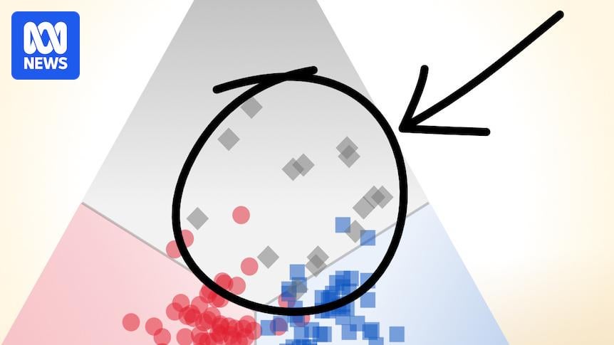
Preferential voting is where it is at
This is really fascinating, and it makes the two party preferred stuff that polling relies on much less meaningful.
Comments are closed.