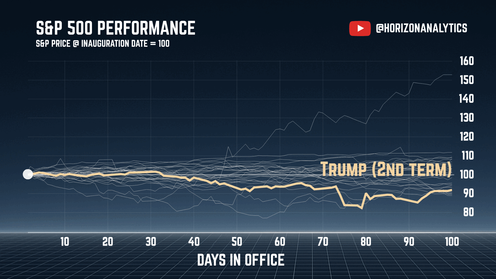
Presidents are shown in reverse chronological order.
y-axis: S&P 500 price normalized to =100 for each president.
x-axis: number of days in office (0-100).
Made with yfinance lib data in python and canva.
Posted by haphame
![Every Modern US President's First 100 Day S&P 500 Performance [OC]](https://www.europesays.com/wp-content/uploads/2025/05/r6ie483hn4ye1-1920x1024.gif)
Presidents are shown in reverse chronological order.
y-axis: S&P 500 price normalized to =100 for each president.
x-axis: number of days in office (0-100).
Made with yfinance lib data in python and canva.
Posted by haphame
5 comments
Very interesting. At one point Trump was the worst but the stock market has evened out.
Great way of visualising this issue.
What people need to understand is that the Stock Market today works very differently. We will never ever have a -89% crash again. Too much money is at stake, worldwide, for that to happen.
What people also need to understand is that the SP500 sort of averaged a -10% thanks to the more stable companies but that the most important companies did all the crashing. MSFT, NVDA, APPL, GOOG, AMZN, META, all the tech companies we rely on got fucked. It’s important to keep this in mind when discussing the crash that occurred. Millions of people were entirely invested in these companies, and their portfolio got DELETED in less than 3 months.
Not great, not terrible. Neat data visualization. Thanks for sharing.
The unique aspect to Trump’s implosion is that it was self-created and completely avoidable.
see guys trumps doing fine /s
The US won’t go through Roosavelt’s boom ever, since Americans would cry about “communism” and other malarky
Comments are closed.