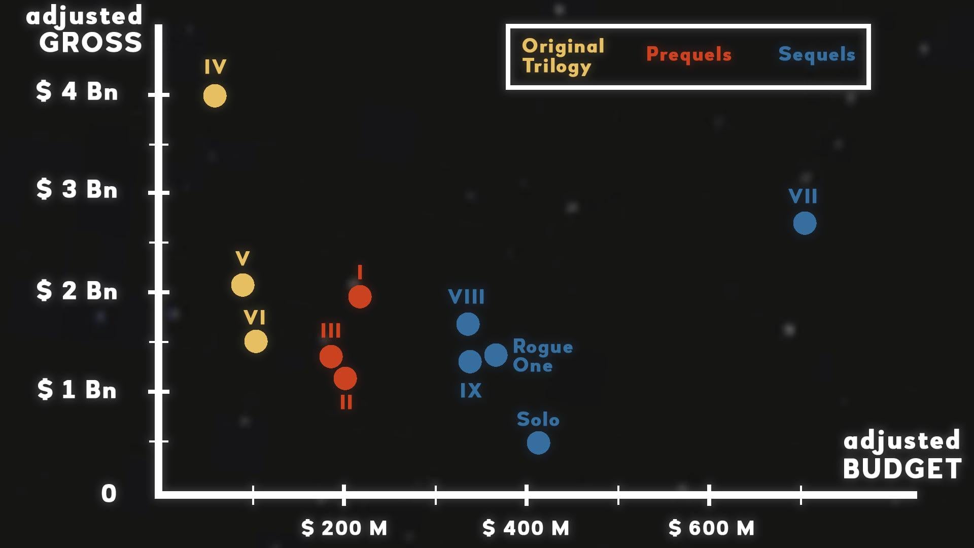
![[OC] Star Wars franchise movies budget-gross scatter](https://www.europesays.com/wp-content/uploads/2025/05/9mf2u8hwpkye1-1920x1024.jpeg)
Sources:
Gross: https://www.the-numbers.com/box-office-records/worldwide/all-movies/cumulative/all-time
Budget: https://www.the-numbers.com/movie/budgets/all
Those numbers were inflation-adjsuted to 2024 using: https://www.minneapolisfed.org/about-us/monetary-policy/inflation-calculator/consumer-price-index-1913-
2 big outliers here, Episode VII with its huge budget, aka when Disney had to make quick profit out of the recent LucasFilm buyout.
And obviously Episode IV, such an unexpected sucess, made with a mere $11M at the time. The two others originals also turned out as big return on investment.
If by any chance you wish to discover more Star Wars related charts, I'll humbly share a video I've made about it: https://youtu.be/vUFDtF1b1ZM
PS: I posted this last week without enough labels so here it is corrected!
Posted by Steren_Cantina
6 comments
I wonder what was so special about VII. Was it hype train? Because whatever it was died and the modern Star Wars all ended up in roughly the same spot.
MISTAKE: “Rouge One” and “Solo” are technically prequels, being set before the events of Ep IV.
I would have loved a symmetric graph here (meaning X and y axis in the same scale).
That way, we could compare cost vs gross much more intuitively.
I’d suggest putting in y = x line, either grey or dotted, so that we can easily discern profitability
This could really use a “break even” line, since the axis aren’t on the same scale it’s not just a diagonal line. Might also be interesting to use something like 3x the budget which is commonly cited as the money necessary to break even given how much is spent on advertising and the cut for the theaters and whatnot.
Does anyone else feel like the axes should be swapped?
Comments are closed.