*ignore the typo can’t edit posts and have already deleted and reposted
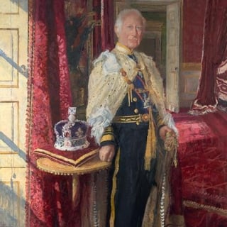
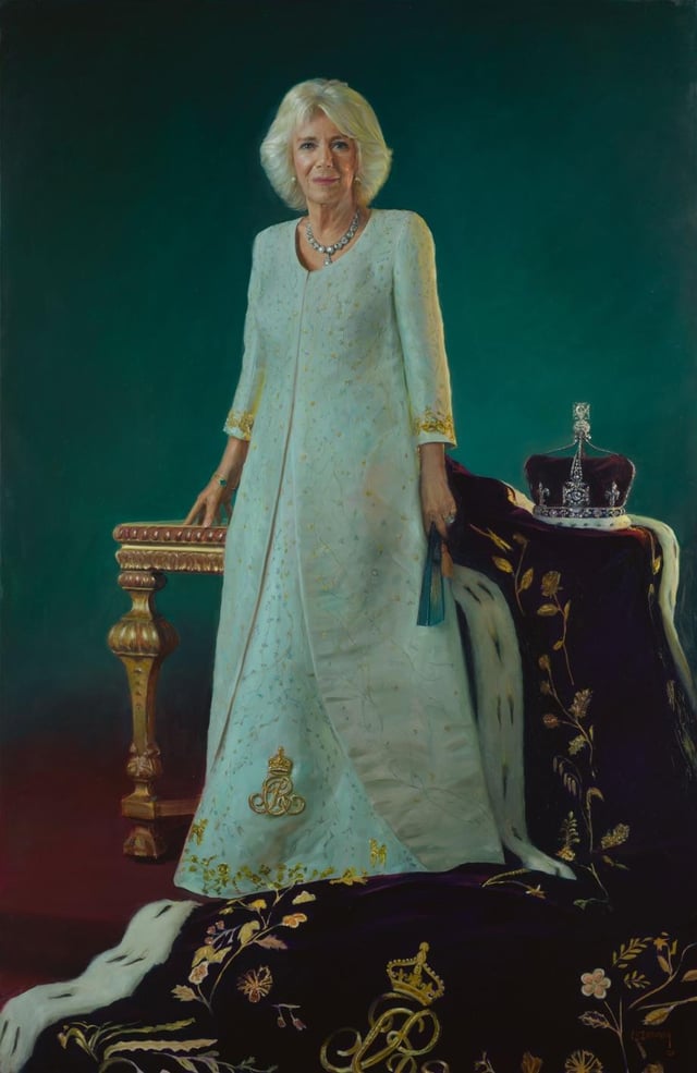
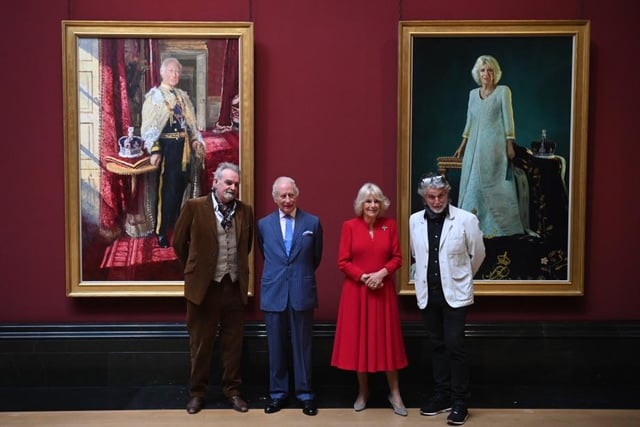
> The portraits, which will form part of the Royal Collection, were painted by two different artists personally selected by Their Majesties. His Majesty chose to be painted by Peter Kuhfeld and Queen Camilla selected Paul S. Benney. Both artists are known to The King and Queen already, having previously contributed to other royal commissions.
Crazy that Camilla’s is a portrait – looks like a photo!
[deleted]
I really like Camilla’s portrait. Charles’ makes me feel like I need glasses, lol.
Camilla’s portrait is very nice. I really like it. Charles’ portrait looks blurry.
Camilla’s portrait is actually very nice – it’s interesting in all the right ways and you can really appreciate the skill that went into making it.
Charles….well its better than the red devil portrait.
Why does Charles’ portrait look super low res I can’t put a finger on it
dying at Camilla having the better portrait by far haha
Lovely portraits in completely different styles for ea h of them.
Love the pictures! Camilla in particular just shines here, reminds me of the Cambridge Portrait from 2022, all of them gorgeous and stunning, but in Charles’s case, has that bit of old-fashioned uh *charm* that he’s known for.
. His is very fitting…old world, traditionalist, and stuffy. Hers is actually refreshing. It’s more contemporary and beautiful in it’s simplicity
The painter hates Charles or what?
Why is Charles’ portrait so busy in the background? It’s too much
His has all the trappings and regalia but hers has all the power. Seems strange to me that they chose such different styles of painters.
Meh. I liked the purple track suit more. This coronation sponsored by Adidas.
Camilla’s is beautiful. Charles’ looks out of proportion almost. I dunno, not my favorite.
I hate how much I love Camilla’s
I’m beginning to wonder if it’s the artist’s style or does he hate Charles… I can’t even see Charles’ face lmao.
Why does Charles’ almost look blurry??
Why is camillas 1000% better???
Charles looks like a Roald Dahl character
Those heads are the wrong size, it’s uncanny Valley territory
I am sorry, compared to his predecessors, Charles’ portrait is horrible.
There is nothing majestic about it – no pizzazz, no grandeur – just horrible.
It is fascinating how different these are. Charles’ is less refined in terms of brushstrokes, is situated firmly in a real setting (not just the interior but also the sunlight coming through the window), uses warm tones, and overall gives an impression of someone who is grounded, approachable, but traditional. And he is dressed in his official regalia, but gives off an almost grandfatherly appearance. (Interesting to note given recent family dynamics.) Camilla’s is technically more precise and closer to photorealism, seems to be in an artificial setting (perhaps a studio), with cool and almost somber tones, and with her regalia beside her—her portrait is much less personal and approachable, but is more stately and commanding, despite the separation of her person with her regalia.
Realistic art looking being automatically ‘good’ and stylised art being automatically ‘bad’ because it’s a ‘looks blurry’ hurts my heart y’all. Can we not appreciate art in its many forms? Including paintings that aren’t hyper realistic? You don’t have to understand them but saying Charles’ portrait is ‘bad’ is objectively wild.
Very random, but Charles’ reminds me of the illustrations of a copy of The Prisoner Of Zenda I had as a child, I was not impressed 😂
27 comments
*ignore the typo can’t edit posts and have already deleted and reposted
> The portraits, which will form part of the Royal Collection, were painted by two different artists personally selected by Their Majesties. His Majesty chose to be painted by Peter Kuhfeld and Queen Camilla selected Paul S. Benney. Both artists are known to The King and Queen already, having previously contributed to other royal commissions.
https://www.royal.uk/state-portraits
Crazy that Camilla’s is a portrait – looks like a photo!
[deleted]
I really like Camilla’s portrait. Charles’ makes me feel like I need glasses, lol.
Camilla’s portrait is very nice. I really like it. Charles’ portrait looks blurry.
Camilla’s portrait is actually very nice – it’s interesting in all the right ways and you can really appreciate the skill that went into making it.
Charles….well its better than the red devil portrait.
Why does Charles’ portrait look super low res I can’t put a finger on it
dying at Camilla having the better portrait by far haha
Lovely portraits in completely different styles for ea h of them.
Love the pictures! Camilla in particular just shines here, reminds me of the Cambridge Portrait from 2022, all of them gorgeous and stunning, but in Charles’s case, has that bit of old-fashioned uh *charm* that he’s known for.
. His is very fitting…old world, traditionalist, and stuffy. Hers is actually refreshing. It’s more contemporary and beautiful in it’s simplicity
The painter hates Charles or what?
Why is Charles’ portrait so busy in the background? It’s too much
His has all the trappings and regalia but hers has all the power. Seems strange to me that they chose such different styles of painters.
Meh. I liked the purple track suit more. This coronation sponsored by Adidas.
Camilla’s is beautiful. Charles’ looks out of proportion almost. I dunno, not my favorite.
I hate how much I love Camilla’s
I’m beginning to wonder if it’s the artist’s style or does he hate Charles… I can’t even see Charles’ face lmao.
Why does Charles’ almost look blurry??
Why is camillas 1000% better???
Charles looks like a Roald Dahl character
Those heads are the wrong size, it’s uncanny Valley territory
I am sorry, compared to his predecessors, Charles’ portrait is horrible.
https://preview.redd.it/aijpbx8jc6ze1.jpeg?width=1536&format=pjpg&auto=webp&s=8a37fe727ed5c9f4a6ac4e8d1711c04ef358ffeb
There is nothing majestic about it – no pizzazz, no grandeur – just horrible.
It is fascinating how different these are. Charles’ is less refined in terms of brushstrokes, is situated firmly in a real setting (not just the interior but also the sunlight coming through the window), uses warm tones, and overall gives an impression of someone who is grounded, approachable, but traditional. And he is dressed in his official regalia, but gives off an almost grandfatherly appearance. (Interesting to note given recent family dynamics.) Camilla’s is technically more precise and closer to photorealism, seems to be in an artificial setting (perhaps a studio), with cool and almost somber tones, and with her regalia beside her—her portrait is much less personal and approachable, but is more stately and commanding, despite the separation of her person with her regalia.
Realistic art looking being automatically ‘good’ and stylised art being automatically ‘bad’ because it’s a ‘looks blurry’ hurts my heart y’all. Can we not appreciate art in its many forms? Including paintings that aren’t hyper realistic? You don’t have to understand them but saying Charles’ portrait is ‘bad’ is objectively wild.
Very random, but Charles’ reminds me of the illustrations of a copy of The Prisoner Of Zenda I had as a child, I was not impressed 😂
He looks so German.
Comments are closed.