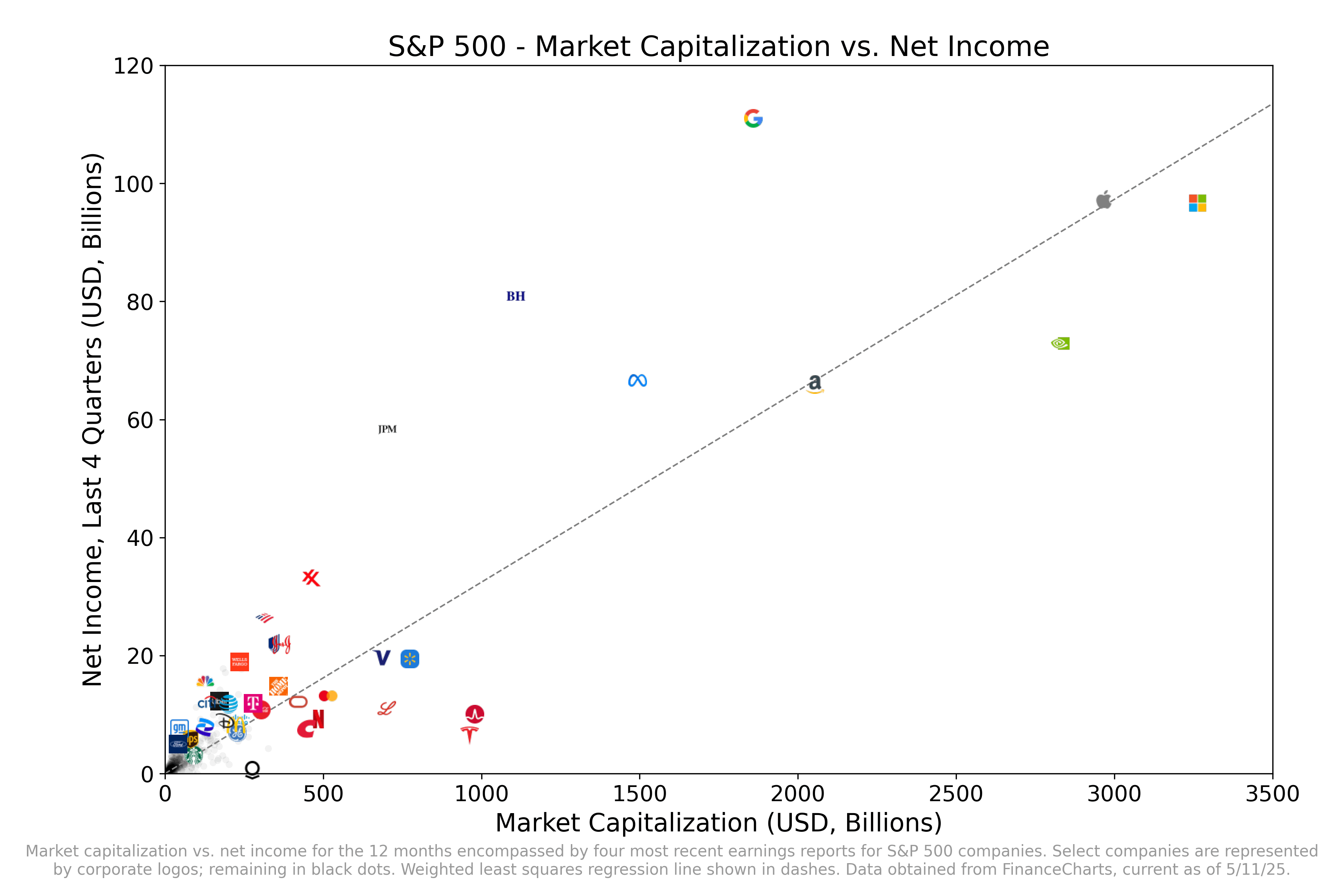
* Data from [FinanceCharts](https://www.financecharts.com/screener/sp-500).
* Each company is represented by a black dot, except for select companies represented by a corporate logo.
* Top 17 companies by market cap included, including all of the “Magnificent Seven”
* Additional companies include outliers in terms of extremely high PE, extremely low PE, or just represent iconic American companies whose logos would be easily recognizable
* I couldn’t include other companies on this plot because it got too cramped–they were too close to other companies which had logos of a similar color scheme.
* Note that companies that have yet to report this quarter include NVDA, AVGO, WMT, and COST. Their net income will likely look much more favorable if I were to update this in a month.
* Graphs generated using Python matplotlib
This means that the market is predicting more growth ahead to companies like Microsoft and Tesla vs Google for example.
Personally, I think that the market is wrong here, but we’ll see.
I really don’t understand the unpopularity of Google. That P/E is insane.
Two things:
1. This just seems like a more complicated way to present P/E ratio.
2. Log scale probably makes more sense for both axes, as stock prices are generally modeled as geometric BM and you’d want to preserve the linearity of static P/E values.
If you flip the axes, the slope is P/E
what’s next to Tesla? At first I thought it was Lululemon, but that can’t be right.
This also seems like a small lesson in branding and a quality logo too.
Tesla market cap is 52% of Google. It looks like if both return to the mean, then TSLA should be 6% of Google?!
Good thing they don’t pay taxes and get Billions in welfare
Low PE:
– Bank of America and JP Morgan, I guess prone to market volatility and taking the brunt of the damage during financial crises.
– Google and Meta, subject to anti-thrust on their main revenue streams
– Berkshire hathaway, IDK? The face and force of the company, Warren Buffet is very old?
– Exxon, fully running on an industry that is being phased out
High PE:
– Nvidia: expected to be(come) a key piece in the AI revolution
– Tesla & Walmart: absolutely no clue, overhyped if anything if you ask me
– Other hypestock logos I don’t recognise but I assume just over hyped stocks.
Oh, would you look at that, Tesla has less income than GM, and their sales and revenues are dropping.
Can anyone explain the difference between Eli Lilly and JNJ? JNJ made twice as much but is valued at half?
Alphabet $Goog looking pretty neat
The problem with regression here is the outliers pretty much define the slope entirely. That’s on top of all the other reasons net income isn’t a good way to determine a company’s value.
Show the r2. That’s a pretty bad regression fit tbh
![[OC] S&P 500 - Market Capitalization vs. Net Income](https://www.europesays.com/wp-content/uploads/2025/05/n5h43saog80f1-1920x1024.png)
15 comments
* Data from [FinanceCharts](https://www.financecharts.com/screener/sp-500).
* Each company is represented by a black dot, except for select companies represented by a corporate logo.
* Top 17 companies by market cap included, including all of the “Magnificent Seven”
* Additional companies include outliers in terms of extremely high PE, extremely low PE, or just represent iconic American companies whose logos would be easily recognizable
* I couldn’t include other companies on this plot because it got too cramped–they were too close to other companies which had logos of a similar color scheme.
* Note that companies that have yet to report this quarter include NVDA, AVGO, WMT, and COST. Their net income will likely look much more favorable if I were to update this in a month.
* Graphs generated using Python matplotlib
This means that the market is predicting more growth ahead to companies like Microsoft and Tesla vs Google for example.
Personally, I think that the market is wrong here, but we’ll see.
I really don’t understand the unpopularity of Google. That P/E is insane.
Two things:
1. This just seems like a more complicated way to present P/E ratio.
2. Log scale probably makes more sense for both axes, as stock prices are generally modeled as geometric BM and you’d want to preserve the linearity of static P/E values.
If you flip the axes, the slope is P/E
what’s next to Tesla? At first I thought it was Lululemon, but that can’t be right.
This also seems like a small lesson in branding and a quality logo too.
Tesla market cap is 52% of Google. It looks like if both return to the mean, then TSLA should be 6% of Google?!
Good thing they don’t pay taxes and get Billions in welfare
Low PE:
– Bank of America and JP Morgan, I guess prone to market volatility and taking the brunt of the damage during financial crises.
– Google and Meta, subject to anti-thrust on their main revenue streams
– Berkshire hathaway, IDK? The face and force of the company, Warren Buffet is very old?
– Exxon, fully running on an industry that is being phased out
High PE:
– Nvidia: expected to be(come) a key piece in the AI revolution
– Tesla & Walmart: absolutely no clue, overhyped if anything if you ask me
– Other hypestock logos I don’t recognise but I assume just over hyped stocks.
Oh, would you look at that, Tesla has less income than GM, and their sales and revenues are dropping.
Can anyone explain the difference between Eli Lilly and JNJ? JNJ made twice as much but is valued at half?
Alphabet $Goog looking pretty neat
The problem with regression here is the outliers pretty much define the slope entirely. That’s on top of all the other reasons net income isn’t a good way to determine a company’s value.
Show the r2. That’s a pretty bad regression fit tbh
Comments are closed.