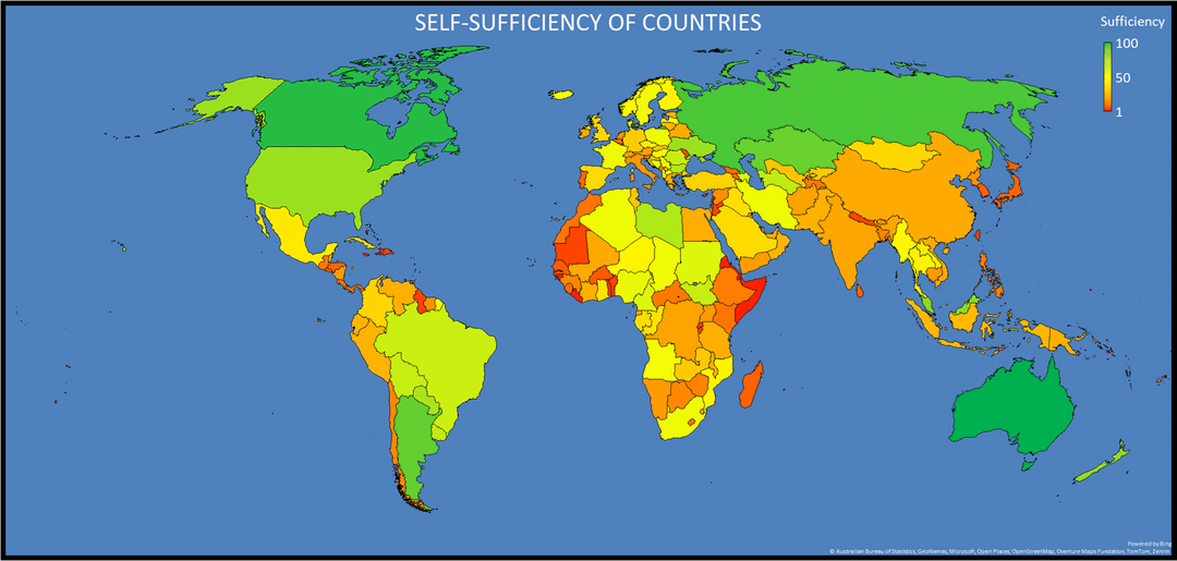
Each country and US state was scored based on how self-sufficient it was and then the scores were normalized from 1-100. The most important metrics are Food Self-Sufficiency and Energy Self-Sufficiency. Other important metrics include internal stability, industrial output, local access to resources, population, area, and military size. Some minor modifier metrics include coastline, median age, and current exports vs import size.
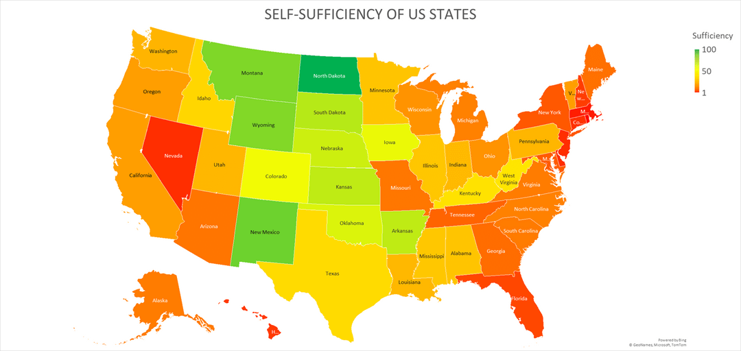
Seeing texas as orange/yellow really causes me to disbelieve this data. It was to my knowledge at least that it could entirely be self sufficient.
North carolina, as orange as it is, my home state, also surprises me
I don’t know how pakistan is not in red, it’s literally living off IMF bailouts….highly doubt this data.
Strange, Russia, for example, produces (almost) nothing of modern electronics (all purchases in China), and yet it is “100% self-sufficient”. If you’re talking about energy self-sufficiency only, you should make such a title.
This is literally garbage. This inforgraphic means nothing without explaining the metric used. Classic misinformation
Ah god can you at least put the definition of the scale on the map. Is 1 most sufficient or least sufficient? We could infer from the first map or go read the linked article but that means this isn’t beautiful data.
Useless, meaningless post.
Michigan has the second-highest agricultural diversity, an abundance of fresh water, and actual capacity for heavy manufacturing. No way in hell we’re not top 5 for US states
12 comments
What does any of this mean?
This is garbage. Where’s the data?
North Dakota doesn’t need anyone because no one actually lives there.
Sources: [https://journals.plos.org/plosone/article?id=10.1371%2Fjournal.pone.0213448](https://journals.plos.org/plosone/article?id=10.1371%2Fjournal.pone.0213448)
[https://power.lowyinstitute.org/data/](https://power.lowyinstitute.org/data/)
[https://par.nsf.gov/servlets/purl/10336560](https://par.nsf.gov/servlets/purl/10336560)
[https://ilsr.org/articles/report-energy-self-reliant-states-2020/](https://ilsr.org/articles/report-energy-self-reliant-states-2020/)
Tool: Microsoft Excel 2024 (Windows).
Each country and US state was scored based on how self-sufficient it was and then the scores were normalized from 1-100. The most important metrics are Food Self-Sufficiency and Energy Self-Sufficiency. Other important metrics include internal stability, industrial output, local access to resources, population, area, and military size. Some minor modifier metrics include coastline, median age, and current exports vs import size.
Seeing texas as orange/yellow really causes me to disbelieve this data. It was to my knowledge at least that it could entirely be self sufficient.
North carolina, as orange as it is, my home state, also surprises me
I don’t know how pakistan is not in red, it’s literally living off IMF bailouts….highly doubt this data.
Strange, Russia, for example, produces (almost) nothing of modern electronics (all purchases in China), and yet it is “100% self-sufficient”. If you’re talking about energy self-sufficiency only, you should make such a title.
This is literally garbage. This inforgraphic means nothing without explaining the metric used. Classic misinformation
Ah god can you at least put the definition of the scale on the map. Is 1 most sufficient or least sufficient? We could infer from the first map or go read the linked article but that means this isn’t beautiful data.
Useless, meaningless post.
Michigan has the second-highest agricultural diversity, an abundance of fresh water, and actual capacity for heavy manufacturing. No way in hell we’re not top 5 for US states
What is self sufficiency a measure of?
Comments are closed.