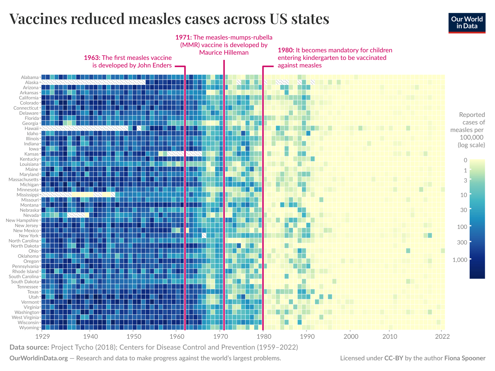
![[OC] Vaccines reduced measles cases across US states](https://www.europesays.com/wp-content/uploads/2025/05/mxon9os0cq1f1-1700x1024.png)
For more information, check out our recent article on how measles vaccines save millions of lives each year.
The data shown here was compiled from Project Tycho data and US CDC data, a data sheet with each source used for each data point is available here.
Tools: Initial plotting in R Studio, code here, followed by finishing in Figma.
(I'm a data scientist at Our World in Data)
Posted by spionaf
38 comments
And yet there are still morons rejecting the vaccine and using “natural immunization”.
[ Removed by Reddit ]
If RFK Jr. Could read he’d be very mad right now.
What’s up with that wave of cases in the late 80s?
Off to figure out what happened in that little blip in the late 80s/early 90s.
For those wondering about the late 80s jump, looks like it was before the second vax dose was recommended and after budget cuts to vaccine programs: [https://historyofvaccines.org/blog/1989-1991-measles-epidemic-almost-stopped-basketball-tournament](https://historyofvaccines.org/blog/1989-1991-measles-epidemic-almost-stopped-basketball-tournament)
“The outbreak in the early 1990s hit poor black and Latino communities the hardest, in Central Brooklyn, upper Manhattan and the South Bronx.
The outbreak in New York City took off in the spring of 1990. And once the public health response got underway, parents got on board.
…
Public health historians partially attribute the outbreak to budget cuts during President Ronald Reagan’s administration that affected federal funds directed toward immunization and public health initiatives.”
From [NPR](https://www.npr.org/sections/health-shots/2019/05/13/722944146/how-public-health-outreach-ended-a-1990s-measles-outbreak-and-whats-different-no).
Love the colors used. As red green colorblind, I can see this very clearly.
Wait bro, you’ve got it all wrong, my favorite podcast personality talked to a doctor one time who said vaccines are bullshit
Oh wow. [Notices the log scale] WOW!
The US version of the Health Secretary should post this on his/her Twitter to make people understand and stop being reluctant.
For those of us born from ~’60-’87, you may want an update. Apparently, it has changed a bit, so a second shot won’t hurt.
Duh. The idiocy of the antivax crowd laid bare, what a stupid hill to die on.
This is indeed beautiful data.
This is indeed very convincing data. The hard part seems to be to convincing people that measles is a terrible disease in the first place.
So Texas will be uniquely shaded when refreshed in 2028. Good to know.
Truly a beautiful presentation of data! Thanks, great post.
God I love data. You can argue with it but it’s gonna tell you that you’re stupid. (Although I also understand this sometimes we misunderstand what the data is trying to tell us.)
YoU sHoUlD pUt ThIs AgAiNsT tHe RiSe Of AuTiSm FoR cOnTeXt 🙈🙉
Please don’t show this to RFK, Jr.’s brain worm
Any squares after the late 1990s that are not yellow can be blamed entirely on Mr Andrew Wakefield.
I use the title “Mr” deliberately. I’m also very careful with my language when I call him a cheat, a liar, and a fraud.
The conservatives in this sub are very upset with you right now
Do we have a similar chart for polio? Some knuckle daggers believe the banning of DDT in the US is what caused polio cases to drop, but that came years after the polio vaccine was developed and mass distributed
There is an interesting discussion on how DDT lead to the rise of polio cases (with DDT nuking the immune system of kids and elderly), but that doesn’t disprove the efficacy of the polio vaccine itself.
The obvious again shown, vaccination works and is necessary
As someone who is learning R and analytics, I’m so jealous you get to make these for a living. Lovely heatmap.
Would love to see the same kind of graph for a whole bunch of other vaccines.
I’ve never seen this type of viz and I love it. Thanks for including your code!
They rather get measles than take a vaccine
This looks like my personal git commits after I got a developer job
What!? The preventative measure actually prevented!?! If those kids could read…
This is sick (pun intended)! What a powerful and effective visual. If you’re taking data viz reccs, I’d suggest rotating the scale bar 180 degrees so that zero is on the bottom. I think generally people intuit that the bottom of a scale bar is the lowest value. Zero at top caused me to pause in confusion for a moment
So it took about 5 years to see results from each milestone. Guess we’ll correct RFK’s idiocy roundabout 2033
Unfortunately, the rejection of work done by public health agencies and the good and brilliant people who work for them is sending us back to the dark past. Too bad there’s no vaccine to fight willful ignorance and conspiracies against proven science.
Even when there was the Disneyland measles outbreak in 2014, the effectiveness of the vaccine caused barely a blip in cases in California and the surrounding states.
so the mid 1900s are back on the menu…. ideologically, economically and of course health wise. gl everyone.
really important item to notice here: It is ONLY with the nationwide requirement and banning from school entry for not having the vaccine that the disease was stomped out.
The creation, improvement, and availability of the vaccine and treatment itself was not enough, there are always a huge number of truly stupid people who refuse this stuff or don’t bother until they are required (then their objections vanish).
Vaccine mandates are objectively good.
We’re going to look back on the MAGA era and wonder how people could be this stupid.
Way to go OP for not only taking interesting data but also presenting in both a visually appealing way that’s also extremely informative.
Comments are closed.