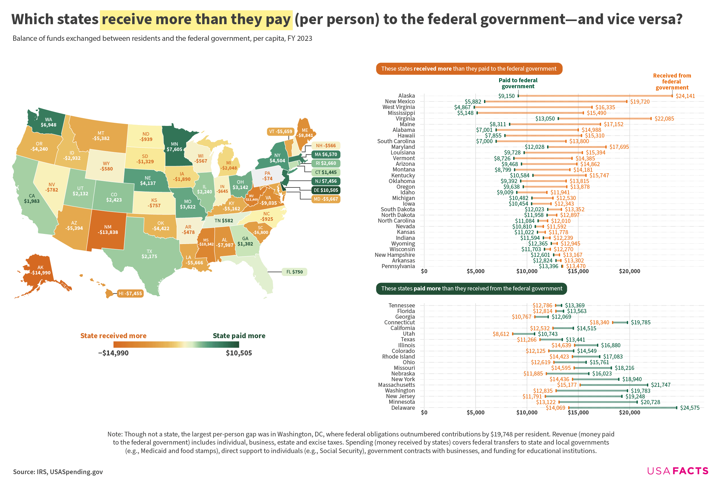
Note: Revenue (money paid to the federal government) includes individual, business, estate and excise taxes. Spending (money received by states) covers federal transfers to state and local governments (e.g., Medicaid and food stamps), direct support to individuals (e.g., Social Security), government contracts with businesses, and funding for educational institutions.
While this map and plot are similar to what is on our site, I wanted to make some changes so the static version (the site charts have hover text) would be easier to parse on Reddit. So, I tried something a bit different with the color choices on the range plot, with the goal of creating a visual tie between the states in the map and the states in the plot. Matching the gradient from the map created some accessibility/contrast issues and may have looked too busy, so I just went with solid orange and green. Curious to hear feedback on those design choices!
Wow that map is all over the place.
Here’s a bit of context for this chart:
In 2023 the United States federal government collected about $4.67 trillion from states and their residents (mostly individual and payroll taxes) and disbursed roughly $4.56 trillion back through programs like Social Security, Medicaid, food stamps and education grants. Nationally that left a $105 billion gap in Washington’s favor—about $314 per person—but it varied by state.
On a total-dollars basis, 19 states were net contributors to the Treasury. New York led the pack, sending roughly $89 billion more than it got back, followed by California ($78 billion) and New Jersey ($70 billion). At the other end, Virginia received about $79 billion more than it paid, with Alabama ($41 billion) and Arizona ($40 billion) close behind.
Putting population into the mix (like in the chart we posted) changes things a bit. Delaware topped the per-capita contributors list, sending $10,505 more to Washington than they received back. Minnesota ($7,605) and New Jersey ($7,456) ranked second and third. At the other end, Alaska saw the largest net per-person with $14,990 coming back, followed by New Mexico ($13,838) and West Virginia ($11,469).
Though it’s not a state, Washington, DC, received $19,748 more per person than it received. More than Alaska, but again, not a state. More than a third of this came from contracts and grants from the Department of Transportation—including Amtrak funding—and Department of Defense funding for the military branches operating in the district.
Almost every red state in the South uses more Federal dollars that they pay to the Federal government
why do missouri and nebraska pay more to the federal government that they receive??? The other states are rich and can support themselves but missouri and bebraska i don’t understand
States don’t pay anything to the federal government, citizens who live there do
I assume VA gets more from the Feds due to all the federal infrastructure in the state? VA doesn’t really match the rest of the states in that the top 10 so I’m a bit curious. Anything I’m missing?
This excludes what from federal spending? Military and interest payments?
Has anyone analyzed this comparing the relative contributions of red vs blue states?
Im in NE and was surprised by my states data. I would have expected the welfare farm state to have it the other way. Guessing our military base here has something to do with it?
I assume 100% of Apple and Google’s (as an example) fed taxes paid are credited to California in this, since they are headquartered there, correct?
GM would fully be credited to Michigan, etc
Where are the MAGA supporters with “Go woke, go Broke” “You get what you voted for” etc.?
Top 5 contributors are all Democratic states.
Top 5 receivers besides NM are Republican states.
Probably need some tariffs.
As a Minnesotan, you’re welcome
Good ole Bible Belt. But not to worry, once they get rid of all transgender athletes and woke people they’ll stop being dirt poor.
I hate how the cost per citizen is in green. Green usually means good… which in this case not necessarily. I pay ~$7k more for amenities in other states, which are then weaponized against my state to encourage voters to vote against my state/party’s interests, because they are under the impression their policies are doing fine… not realizing they are being supplimented greatly for their shitty policies.
I think this is a difficult analysis and presenting it with no nuance is misleading
Gotta believe Delaware won’t hold that position for long.
WA is supporting the nation! Time for Cascadia!
I’d be more interested in the results with federal contracts with private businesses removed from the numbers. Virginia is pretty well-off and pays a lot per person to the federal government, but because the federal government is basically *in* Virginia (between the capital itself and both land and naval military presence), there is a huge concentration of contracts. I don’t consider that federal support for the state, and I think VA and MD are obvious outliers in your charts.
I am trying to think of a way to adjust this for the budget deficit. The fact that the govt spends so much more than it takes in, probably skews this a bit
![[OC] Which states receive more than they pay (per person) to the federal government?](https://www.europesays.com/wp-content/uploads/2025/05/xkr6638ttc2f1-1920x1024.png)
22 comments
Source: IRS, USASpending.gov
Tools: Datawrapper, Illustrator
Note: Revenue (money paid to the federal government) includes individual, business, estate and excise taxes. Spending (money received by states) covers federal transfers to state and local governments (e.g., Medicaid and food stamps), direct support to individuals (e.g., Social Security), government contracts with businesses, and funding for educational institutions.
More data [here](https://usafacts.org/articles/which-states-contribute-the-most-and-least-to-federal-revenue/)
While this map and plot are similar to what is on our site, I wanted to make some changes so the static version (the site charts have hover text) would be easier to parse on Reddit. So, I tried something a bit different with the color choices on the range plot, with the goal of creating a visual tie between the states in the map and the states in the plot. Matching the gradient from the map created some accessibility/contrast issues and may have looked too busy, so I just went with solid orange and green. Curious to hear feedback on those design choices!
Wow that map is all over the place.
Here’s a bit of context for this chart:
In 2023 the United States federal government collected about $4.67 trillion from states and their residents (mostly individual and payroll taxes) and disbursed roughly $4.56 trillion back through programs like Social Security, Medicaid, food stamps and education grants. Nationally that left a $105 billion gap in Washington’s favor—about $314 per person—but it varied by state.
On a total-dollars basis, 19 states were net contributors to the Treasury. New York led the pack, sending roughly $89 billion more than it got back, followed by California ($78 billion) and New Jersey ($70 billion). At the other end, Virginia received about $79 billion more than it paid, with Alabama ($41 billion) and Arizona ($40 billion) close behind.
Putting population into the mix (like in the chart we posted) changes things a bit. Delaware topped the per-capita contributors list, sending $10,505 more to Washington than they received back. Minnesota ($7,605) and New Jersey ($7,456) ranked second and third. At the other end, Alaska saw the largest net per-person with $14,990 coming back, followed by New Mexico ($13,838) and West Virginia ($11,469).
Though it’s not a state, Washington, DC, received $19,748 more per person than it received. More than Alaska, but again, not a state. More than a third of this came from contracts and grants from the Department of Transportation—including Amtrak funding—and Department of Defense funding for the military branches operating in the district.
More data on this topic [here](https://usafacts.org/articles/which-states-contribute-the-most-and-least-to-federal-revenue/), and more data on grants sent to states [here](https://usafacts.org/articles/which-states-rely-the-most-on-federal-aid/).
Top 5 contributors: DE,MN,NJ,WA,MA
Top 5 Receivers: AK,NM,WV,MS,VA
Almost every red state in the South uses more Federal dollars that they pay to the Federal government
why do missouri and nebraska pay more to the federal government that they receive??? The other states are rich and can support themselves but missouri and bebraska i don’t understand
States don’t pay anything to the federal government, citizens who live there do
I assume VA gets more from the Feds due to all the federal infrastructure in the state? VA doesn’t really match the rest of the states in that the top 10 so I’m a bit curious. Anything I’m missing?
This excludes what from federal spending? Military and interest payments?
Has anyone analyzed this comparing the relative contributions of red vs blue states?
Im in NE and was surprised by my states data. I would have expected the welfare farm state to have it the other way. Guessing our military base here has something to do with it?
I assume 100% of Apple and Google’s (as an example) fed taxes paid are credited to California in this, since they are headquartered there, correct?
GM would fully be credited to Michigan, etc
Where are the MAGA supporters with “Go woke, go Broke” “You get what you voted for” etc.?
Top 5 contributors are all Democratic states.
Top 5 receivers besides NM are Republican states.
Probably need some tariffs.
As a Minnesotan, you’re welcome
Good ole Bible Belt. But not to worry, once they get rid of all transgender athletes and woke people they’ll stop being dirt poor.
I hate how the cost per citizen is in green. Green usually means good… which in this case not necessarily. I pay ~$7k more for amenities in other states, which are then weaponized against my state to encourage voters to vote against my state/party’s interests, because they are under the impression their policies are doing fine… not realizing they are being supplimented greatly for their shitty policies.
I think this is a difficult analysis and presenting it with no nuance is misleading
Gotta believe Delaware won’t hold that position for long.
WA is supporting the nation! Time for Cascadia!
I’d be more interested in the results with federal contracts with private businesses removed from the numbers. Virginia is pretty well-off and pays a lot per person to the federal government, but because the federal government is basically *in* Virginia (between the capital itself and both land and naval military presence), there is a huge concentration of contracts. I don’t consider that federal support for the state, and I think VA and MD are obvious outliers in your charts.
I am trying to think of a way to adjust this for the budget deficit. The fact that the govt spends so much more than it takes in, probably skews this a bit
Comments are closed.