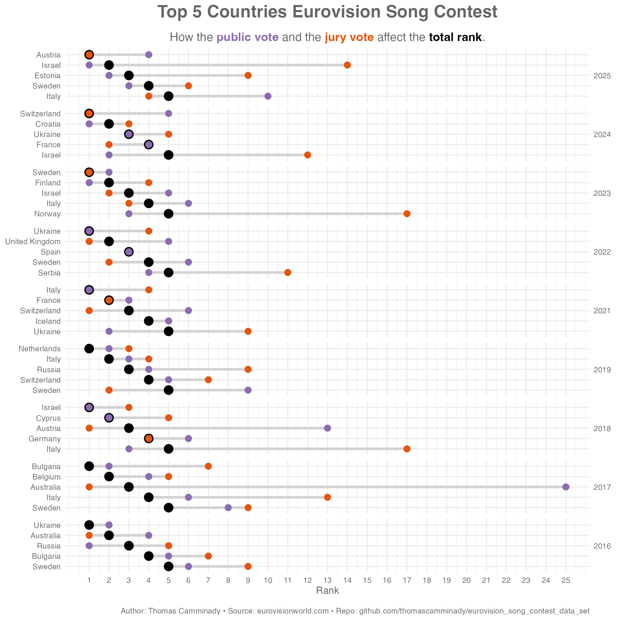
![[OC] How public and jury votes affect the Eurovision rankings (2016–2025)](https://www.europesays.com/wp-content/uploads/2025/05/p97t01ev8b2f1-1920x1024.png)
Tools: R (python, ggplot2, ggtext), data wrangling in tidyverse, polars
Data: Scraped from eurovisionworld.com
Author: Thomas Camminady
Repo: github.com/thomascamminady/eurovision_song_contest_data_set
Thought it would be fun to visualize how different the jury and public votes are in Eurovision's top 5 each year. Sometimes they agree, sometimes… very much not.
Posted by k1next
10 comments
This is really interesting. Also shows how it’s not uncommon for one country to have a strong public vote against the jury. Australia in 2017 doing the absolute opposite though wow. The public fucking hated them!
Edit- confused the two large European nations of Australia and Austria
2017 is wrong. Portugal got first. Moldova got third.
Wow that’s very interesting! Though what happened in 2019? The top four countries got bumped up a rank compared to the public vote, where’s the country that the public actually voted in first place?
Is a low number better or worse? Am i proud to be Australian or did everyone hate us in 2017?…. Never seen a second of eurovision my apologies
You can also look at the correlation of the public vs jury scores to see something odd appeared to be going this year, compared to previous years.
[https://successfulsoftware.net/2025/05/19/eurovision-2025-jury-vs-public-vote-discrepancies/](https://successfulsoftware.net/2025/05/19/eurovision-2025-jury-vs-public-vote-discrepancies/)
OP here. As u/petnog pointed out correctly, I made a mistake when aggregating the data. The 2017 chart is wrong. Here’s an updated version of the plot: [https://raw.githubusercontent.com/thomascamminady/eurovision_song_contest_data_set/main/chart.png](https://raw.githubusercontent.com/thomascamminady/eurovision_song_contest_data_set/main/chart.png)
I know the 2017 graph had errors, but yeah, Australia had a rough time with the televote that year. “It don’t come easy” indeed.
I liked the song, though I thought he tried to overdo it at the finals.
(Edit: may have been the semis)
How embarrassing would it be if a government would try to actively influence the vote of a lalala contest that has very little to do with the countries anyway, to prove that everyone loves them (and fail).
The judges were flabbergasted Israel almost won. I feel like a lot of people fed up with the liberal status quo voted for Israel just to troll them. Someone from the Netherlands I know said as much.
Soooo, had Israel been buying votes for the past two years or what?
Comments are closed.