UK Government statistics so there is probably some systemic bias in there, just thought it was interesting. Made with python/pandas/seaborn.
Posted by Equivalent-Repeat539
UK Government statistics so there is probably some systemic bias in there, just thought it was interesting. Made with python/pandas/seaborn.
Posted by Equivalent-Repeat539
18 comments
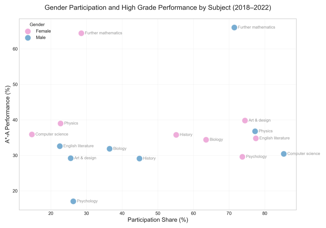
Seems like both genders are dreadful at psychology, and if you take higher maths, you might just be academically minded.
Edit: Fuck me, I can’t spell
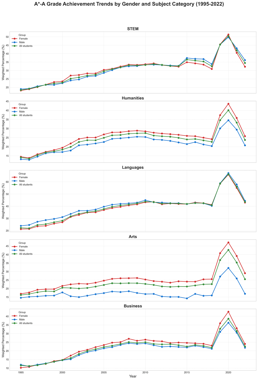
Looks like everyone did really well during COVID!
I thought it was maybe an influx of AI, or was that later?
Beautiful graphs, and thoughtfully put together; great submission!
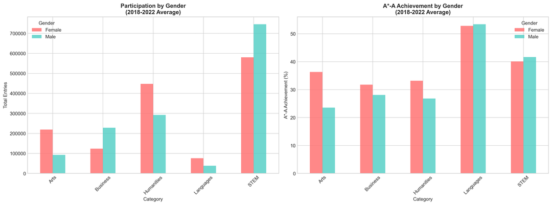
STEM is a bit depressing. For a while it looked quite balanced, but has become biased towards men again since. Really sad to see so few women in computer science (again) these days, but given the tendency towards toxicity in the field I’m not surprised.
EDIT: I’m not saying that the rest of the graph isn’t just as depressing, it’s just that STEM is my main interest and area of knowledge and until I saw this diagram I didn’t realise how balanced it had become around 2000 ish. I had no idea such balance had ever been achieved!
https://preview.redd.it/7awi597lpt4f1.png?width=1024&format=png&auto=webp&s=8aae7af0b8ae217baf950776282ad4b0d92eae7d
That’s clearly just Mario…
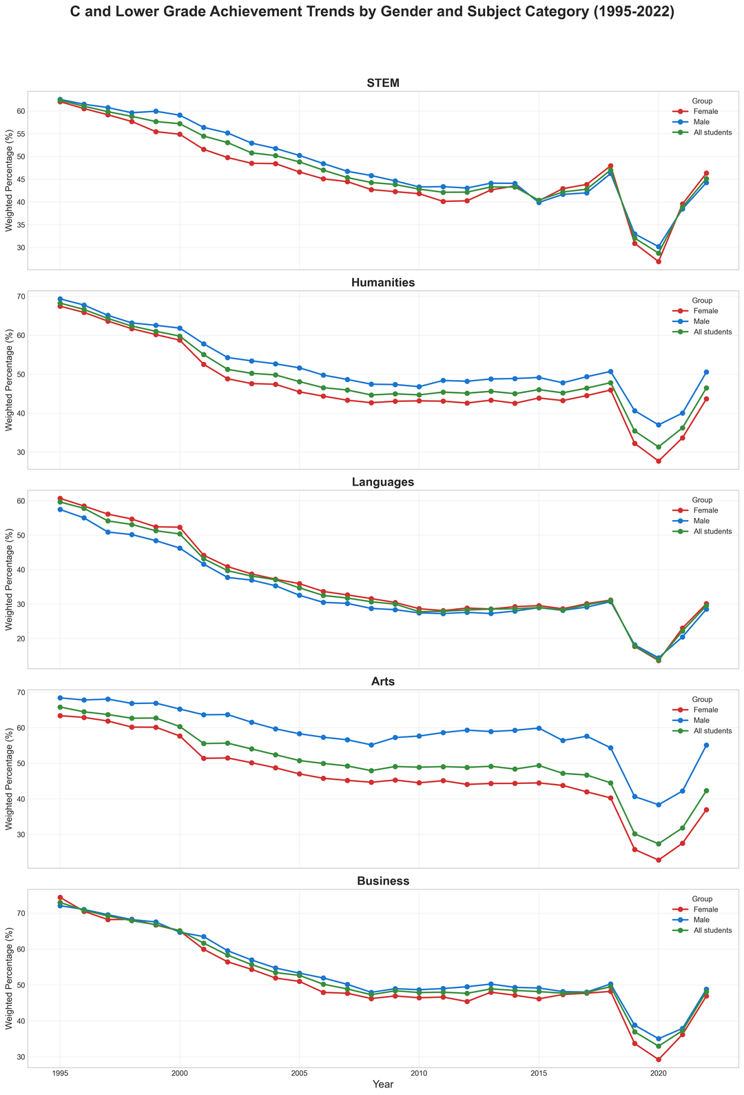
Very cool graphs! 2nd is best for me, then the 5th. The 3,4 are a bit tricky to understand, maybe a square box with text explaining how to read it would be good. The 1st I just don’t have the mental capacity right now😂
Ahahha seems only outlier is the grading of men in psychology. Wonder what’s happening there. The rest seem normal?
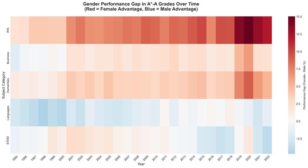
Scale is a bit misleading between -2.5 and 15% …
What do you mean systematic bias in the data? This will be all of the results for GCSE exams?
The STEM one makes me sad to see, mostly because I went to an all girls’ school and we had more high performers in STEM than anything else. Makes me wonder how much of an effect having mixed classrooms is on which subjects have male advantage- I can imagine mixed STEM classrooms being quite male-dominated (not by numbers, just in terms of culture)
Edit: I see the sub doesn’t like any comment about systemic biases contributing to gender imbalance in STEM….I wonder why….in a data visualisation sub….so weird…..
COVID years grades are a complete fraud, then.
Boys are better at math and girls are better at humanities in school. This is pretty well documented.
It’s a bit disappointing that they just randomly chose only 2 genders from the whole spectrum
Bruh I got my math exam paper 1 in an hour 😭😭😭
This is cool, nice to see it confirms my assumptions/the stereotypes are still up and well lol
I think the first chart is beautiful but all subsequent ones are lacking in some way, not showing a good story.
The second chart is potentially the most interesting. Can you find a way to relate male+female in a given subject? Maybe a line between them? There aren’t too many. The angle of each line would tell a story, as would its length.
Sorry, but the first two charts are cursed. That cannot be the best way to present the data.
As an A level teacher, I’m interested to see these data, but my eyes are bleeding!
Comments are closed.