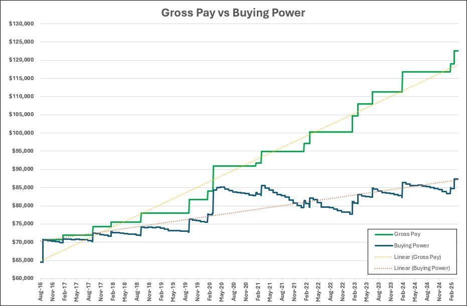
Out of curiosity I wanted to know exactly how much inflation (BLS.gov) has been eating into my salary over the past decade. By all accounts, between hard work and a fair amount of luck, I’ve been fortunate enough to receive COLAs and raises frequently. However, as you can see, little headway has been made, especially in the high inflation years of 2021-2022. I know that there are nuances to using inflation data for the entire US instead of my local area, but I guarantee the trend is the same. I guess this is more of just a vent to the universe than anything else. Enjoy!
Posted by BYUBrettzky
13 comments
Inflation data from https://www.bls.gov
What industry/profession are you in?
I would love to work for a company that provides this amount of COLA. In the Cyber Security field, I’ve only managed to go from 70k-89k since 2019…
Something seems off: I plugged in $123,000 for April 2025 and it says that it’s equivalent to $98,307 for May 2020.
Using the below
[https://www.bls.gov/data/inflation_calculator.htm](https://www.bls.gov/data/inflation_calculator.htm)
Is this compounding monthly?
How’d you create the graph? I’d love to use it if you have it handy/available. About to request a raise and having zero COLA (or any increase) in years is a big part of my argument.
In 9 years your wages doubled but increased 40% in real terms. Looks Pretty great for me
Just an observation – you are completely typical.
Here is a chart of median income adjusted by cost of living. This chart doesn’t include 2024, but 2024 will come in exactly as yours does – all time high spending $, but just barely.
https://fred.stlouisfed.org/series/MEPAINUSA672N
You’re doing a lot better than most
Truth. Government spending at it finest.
This is consistent with intense inflation at the tail end of covid that has since eased off.
FRED has [inflation segmented by MSA](https://fred.stlouisfed.org/tags/series?t=inflation%3Bmsa), OP.
Also, what did tool you use to create this?
So this is no general data but only YOUR personal data?
Remember, this is also as companies continue to offer r inferior products at the same price as before, the quality of the products you purchase has gone way down. So PP is not flat, it’s falling
Comments are closed.