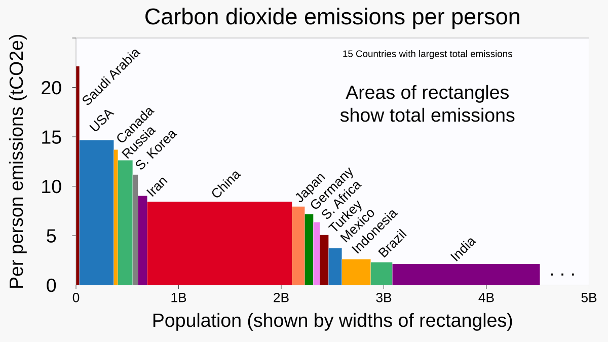
These kinds of charts are called Variable-width bar charts. This was made by a Wikipedia (RCraig09) and originally uploaded to the Wikimedia project called Wikimedia Commons (sub: /r/WCommons), the second largest such project after the Wikipedias. There are a huge number of well-organized data graphics on that site which are all under free media licenses – you can find them in this category. There now also is a new Wikipedia project for data graphics: WikiProject Data Visualization
Posted by prototyperspective
4 comments
This is the correct way to represent data across different groups, like countries.
Why per capita and not per GDP?
People assume that China’s average per capita emissions are low, but in fact, China’s average per capita emissions are higher than the average of developed countries.
Climate change where the ‘size does matter’ joke tragically fits.
Comments are closed.