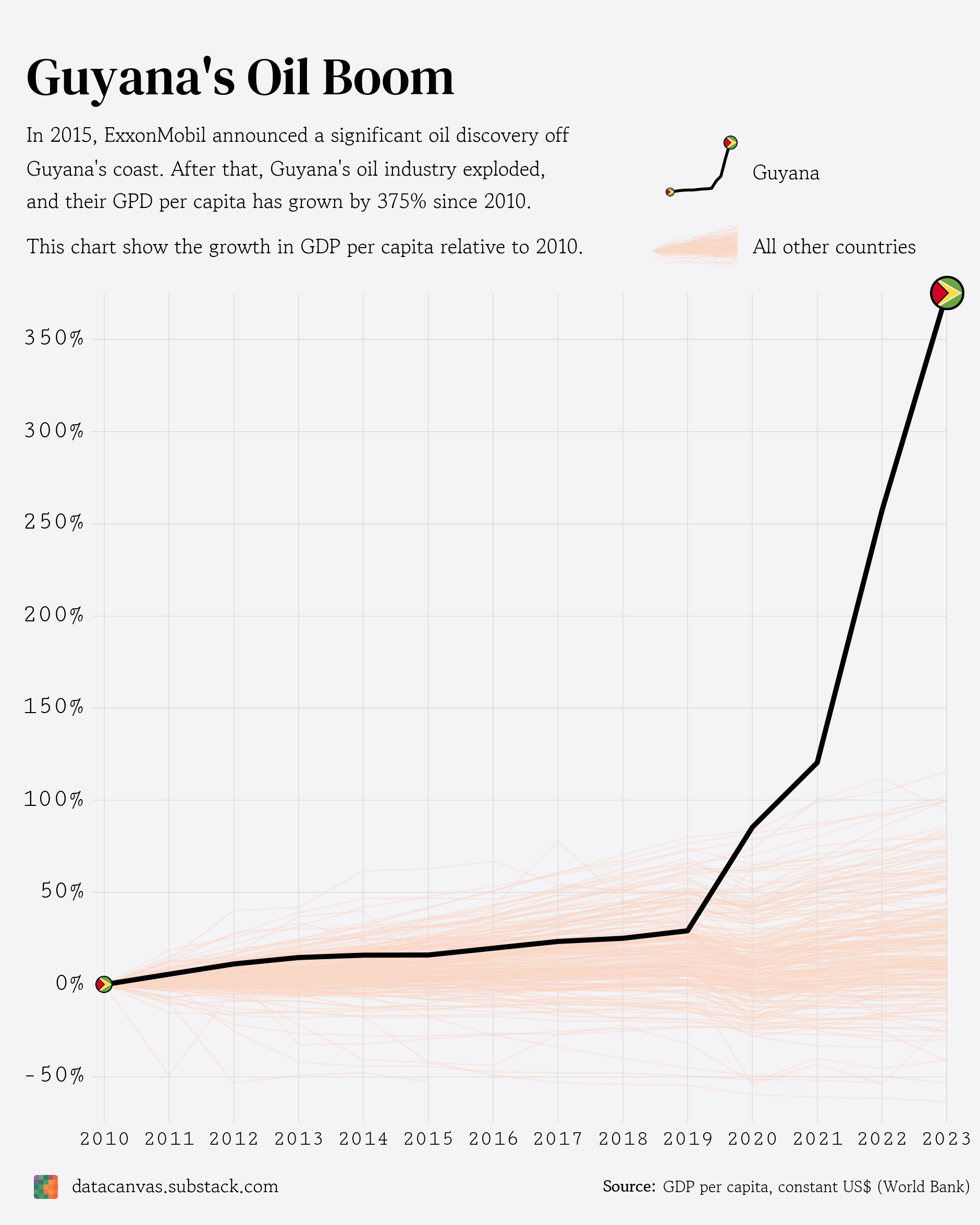
Data source: GDP per capita (constant 2015 US$)
Tools used: Matplotlib
Let me know how I can improve this visualization! 🙂
Posted by oscarleo0
![[OC] Guyana's Oil Boom - Visualizing Relative Growth in GDP per capita between 2010 and 2023](https://www.europesays.com/wp-content/uploads/2025/06/k740d83moh6f1-1880x1024.png)
Data source: GDP per capita (constant 2015 US$)
Tools used: Matplotlib
Let me know how I can improve this visualization! 🙂
Posted by oscarleo0
2 comments
I Have been living in Guyana since 2022, and have seen the first hand effects of this (both positive and negative).
Positive:
– Suspension bridge joining region 3 and 4 to improve people and goods mobility
– Planned suspension bridges to connect to Suriname, and connect region 5 and 6
– 4 State of the art hospitals being built (or more)
– 4 major road works and counting (or more)
– 6 luxury hotels being built
– Natural Gas power plant being built (cost of energy cut in half)
– More high paid jobs
Negative:
– Housing costs multiplying
– Inflation rampant due to increasing wages
– Food costs getting higher
great work! which software did you use for this?
Comments are closed.