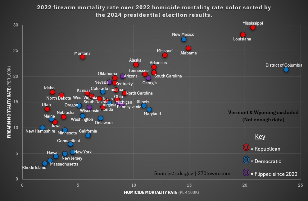
States are adjusted for differences in age-distribution and population size, rankings by state do not take into account other state specific population characteristics that may affect the level of mortality. When the number of deaths is small, rankings by state may be unreliable due to instability in death rates.
Posted by Juicy_Joey
12 comments
One cursory glance presents a theme of sorts…
You could probably convey even more trends with a shape or size parameter. There are other interesting variables besides these three that would explain the trend more. Unless it’s just an agenda post.
Can we get this broken down by city/county instead of state? I’m almost certain we would have a lot more “DC”s up there. This is a very bad representation of data no matter what you are trying to convey lol.
Cool story. Now color code this for who runs the large cities in these states that are the prime centers of crime
What the actual fuck is happening to this sub. This overlapping cluster fuck of labels should be against the basic design standards of the sub. Completely unreadable.
it’s crazy how Republicans are convinced that big coastal cities are dangerous hell holes.
I think it would be better to use firearm homicide rate over firearm mortality rates, given that the majority of those mortalities are self-inflicted. That or general mortality rates over homicide rates. I expect the trends we see here to become more clarified and meaningful in either case.
It would also be interesting to see whether or not police killings are included in either dataset
Wonder how long before this gets locked. Comments were already being removed >10 mins.
It’s easy for both sides to use the inherent leeway in how their statistics are presented to prove their point.
Seems like it’ll just be an open, back and forth, argument.
Missouri coming in 5th and 6th feels strange. I figured we were putting in more work than that.
Is this sub supposed to be so political? Not necessarily saying it should or shouldn’t be, if it’s not for me it’s not for me. But I feel like it didn’t used to be this way, and that we used to get cool, nice looking graphs of random niche topics that people wanted to track – usually with no ulterior agenda.
Now we have graphs like this which show useful data, but don’t accurately portray the agenda they push. And above all of that, this is just a damn basic graph that isn’t even nice to look at.
And before anyone tried to take a jab at me politically. I’m a left leaning Australian, never owned a gun, never wanted to own a gun, and certainly love walking down the street knowing that I can’t get domed by any random guy. Just hoping not to see political agendas in every corner of my feed. But like I prefaced, if this is the way the sub is meant to be, I’m not gonna judge, just move on
Put the two-letter state code INSIDE the circles. It will clean up the labels.
Now add a point for world average and europe average. That would probably be enlightening…
Comments are closed.