Article created by: Rugilė Žemaitytė
The subreddit r/dataisbeautiful truly lives up to its name. From global or internet trends to societal issues, this community covers it all in easy-to-understand visualizations that effectively convey otherwise complex information. Each graph, chart, or map has the potential to uncover patterns, expose correlations, or shed light on various topics. No wonder why as of today, over 19M people appreciate this subreddit.
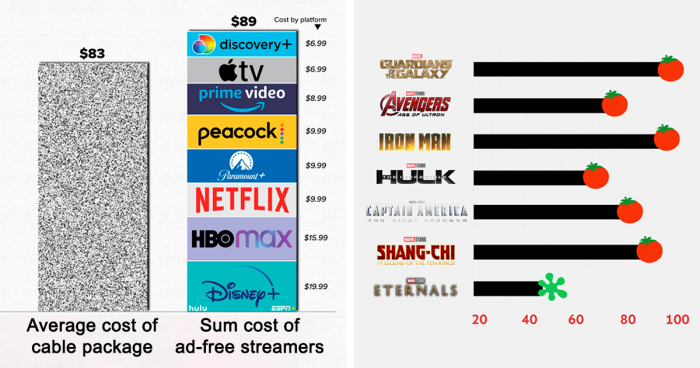
So if you feel that sometimes life is just too difficult to comprehend, hopefully, this list will make you feel at least somewhat at ease knowing that even the most complex things can be summed up in a beautiful visualization.