Data source: Excess Mortality (Our World in Data). Tools used: Matplotlib Posted by oscarleo0 Tags:DataData Is BeautifulDataIsBeautiful 3 comments I’d predict this data will go negative in the upcoming decade. Cool, can you maybe mark the 0% line to see it better ? And maybe choose a color gradient for the years instead of completely different ones EDIT : I thought the circles were for one year each. Maybe draw 4 small circles for the 4 years, then one big for the average ? Missed the first “T” and so was thinking “this should be interesting” (excess morality) Comments are closed.
Cool, can you maybe mark the 0% line to see it better ? And maybe choose a color gradient for the years instead of completely different ones EDIT : I thought the circles were for one year each. Maybe draw 4 small circles for the 4 years, then one big for the average ?
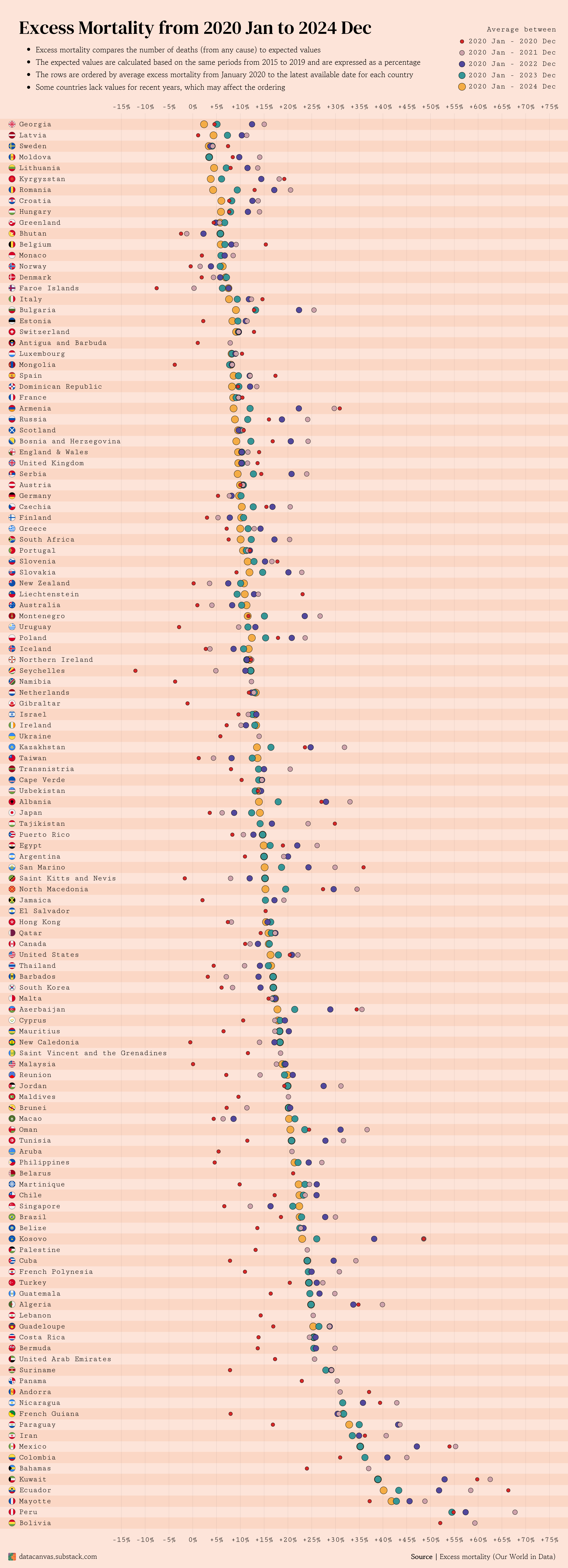
![[OC] Excess Mortality from 2020 Jan to 2024 Dec](https://www.europesays.com/wp-content/uploads/2025/06/ixywvkrgzg7f1-1920x1024.png)
3 comments
I’d predict this data will go negative in the upcoming decade.
Cool, can you maybe mark the 0% line to see it better ? And maybe choose a color gradient for the years instead of completely different ones
EDIT : I thought the circles were for one year each. Maybe draw 4 small circles for the 4 years, then one big for the average ?
Missed the first “T” and so was thinking “this should be interesting” (excess morality)
Comments are closed.