Reproducible source code: https://pluto.land/n/l4s57p8v
Tools: Makie.jl (visualization), Pluto.jl (notebook)
Reproducible source code: https://pluto.land/n/l4s57p8v
Tools: Makie.jl (visualization), Pluto.jl (notebook)
Data source: https://github.com/US-CBO/eval-projections
Posted by moelf
8 comments
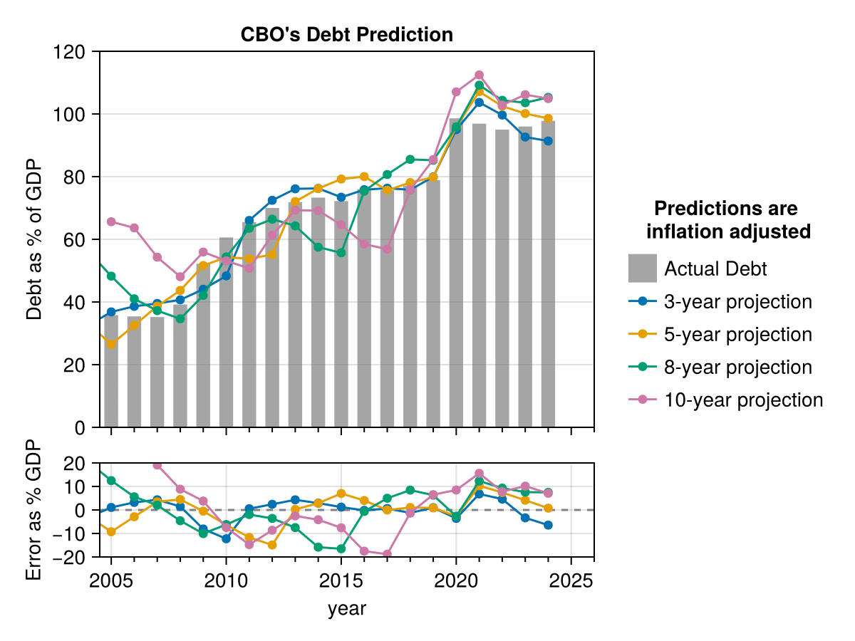
Huh. I didnt actually realise US debt was that high. Close to 100% is genuinely getting pretty damn high compared to a lot of western countries.
Neat! The bottom graph is a nice alternative way to represent the data. The only potential improvement is I would put a gradient color on the projection lines (e.g. light blue to dark blue)
This is cool, for these reasons:
* Code and data is easy to find. TIL that the US CBO has github repo’s
* You don’t see a lot of Julia around here
* The visualization is clear and reasonably aethestic
My nitpicks:
* Can you tell me what we’re looking at? I *think* e.g. the magenta point for e.g. 2005 tells me what the CBO forecast was for 2005, as forecast in 1995?
* I think the error is a “points” rather that “pct” error (e.g. it’s [forecast – actual]; not [forecast / actual – 1])? Because the debt has grown so much, I think I’d rather see a pct. error calc, but that’s a real nitpick.
* What’s the takeaway or insight? Other than the growth of US debt, what’s the a-ha? For me, I think it’s: 3 and 5 year forecasts are reasonably accurate, while 8-10 aren’t really that useful. Not a surprise that forecast accuracy declines with the length of the lag period, but it’s striking how the 8-10 have some pretty big misses (mostly due to the 2008 financial crisis). If you’re trying to make a point with a visualization, it can be helpful to articulate that point
When exactly are the projections being made? At first, I assumed that the 10-year project was showing predictions 10 years in the future. So, for example, the 2020 point would be what was predicted in 2010. However, this must not be the case because there’s a big jump in 2020 (due to Pandemic spending) and all the model seem to correctly ‘predict’ this.
It seems to me the CBO is pretty good at forecasting a rather difficult number, especially in the short term.
After Clinton it was looking solid like there’d be reductions, then the Republican tax cut of 2001 and Iraq war, started to stabilize under Obama, shot up again with Republican tax cut of 2017. The new republican plan will drive us off a debt cliff. But you voted for it and will get what you deserve.
Nice work, and great job whoever’s doing the projections. My only nitpick would be you don’t really need the blobs on the lines, they make the lower graph harder to read
Our deficit balloon in 2020 during Covid but somehow spend never went back down. I thought Covid spending was over? Hard to get politicians to spend less…
Comments are closed.