[OC] Hello!
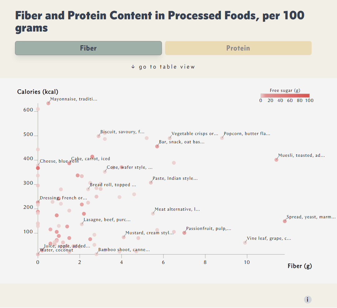
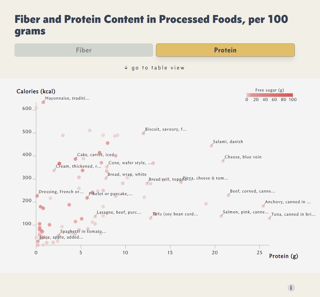
I am learning React.js and, while doing so, wanted to make a useful chart to share with you. That’s why I chose to visualize nutrients in common processed foods.
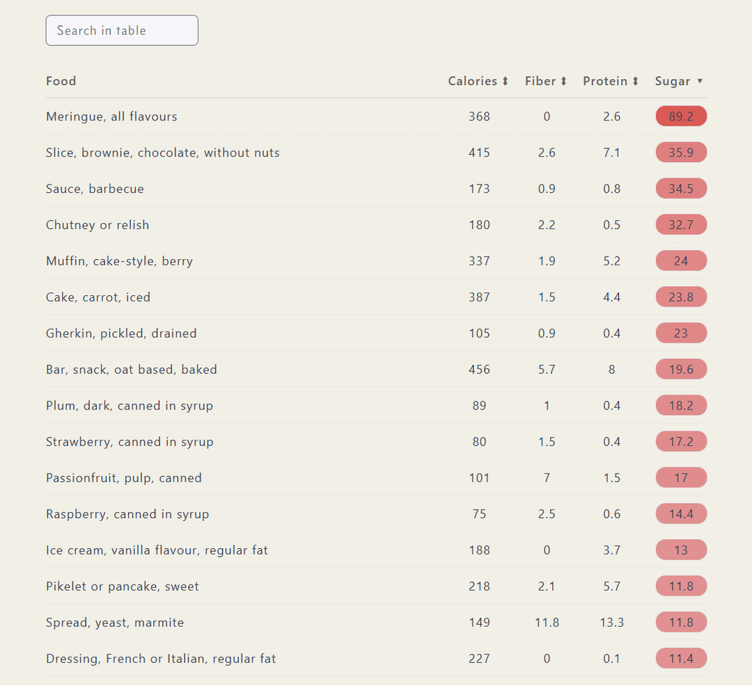
The chart is interactive, and you can access it here. If you're exploring on a PC, you can click on each dot to see the corresponding food item and its data. On mobile, it's probably easier to use the table as it can be sorted, for example, to find foods highest in fiber.
About the data:
I fetched a data file from the Australian Food Composition Database (amazing resource!). The researchers used various sources to compile it: from lab analysis results to food labels. I filtered the rows to include only those containing the following words: commercial, processed, formulated, purchased, canned, cream, yoghurt, salami, chips, crisps, muesli, bar, sausage, spread, cereal, butter, or cheese. Then, to reduce the number of dots on the chart, I selected only one item per type of food.
Tools used: R (dplyr), D3, React, Tailwind
Let me know if you'd like me to optimize it in any way or add something else!
Posted by menadione
3 comments
This is the start of something great but there just isn’t enough information to truly be useful. It is beautiful imo so +1
– for a start, being able to screen data for food type would be very helpful. Say if someone wanted to quickly know what the highest protein bean is or the best cereal for fiber. They would have to sort then scroll down until they found the first one.
– Being able to make informed food choices requires more than just consideration of fiber and protein. Fat, type of fat, vitamins, salt etc all matter quite a bit. in general, the best decision is to _avoid_ processed foods entirely if possible.
I would recommend color coding based on calories and sugar content as a grading scale. The “Free sugar” scale is not totally clear.
At present, the data assumes anything bottom rightmost on the graph are best choices in their category as low cal and high protein/fiber. But beans are demonstrably the clear winner when comparing calories and sugar content, but it is not clear. Same with canned fish for protein.
I think these “winners” should be more overtly clear in the data visual.
This is beautiful data but the story it tells us not true. Food health comes down to more than just a few key ingredients. Case and point is Mayonnaise. It is generally quite a healthy ingredient when made from eggs and decent oils. It’s full of good fats and good calories. That being said your body doesn’t just need fat so obviously a diet where Mayo is a large constituent would be bad.
TLDR: our body needs lots of different things and we shouldn’t condense it down to a few key metrics. Except for fibre free sugar, that shit is poisonous.
Comments are closed.