Data is from 2023 Census ACS
Exact API call is here: https://api.census.gov/data/2023/acs/acsse?get=NAME%2CK200802_005E%2CK200802_001E&for=state%3A%2A
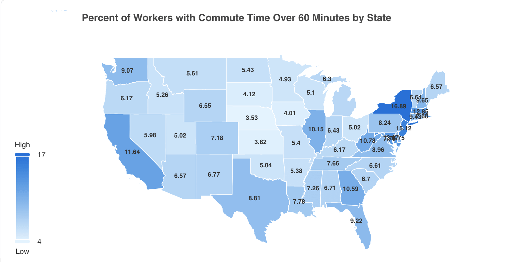
I made the chart here: https://selecteight.com/census
Sorry if you saw my last post, I realized I aggregated the data incorrectly!
Posted by philosophyof
15 comments
Is that 60 minutes one way? Can’t imagine wasting 2 hours of my day going to work and back. That’s 1/8 of your waking hours.
Since this is averaging highly localized data across an entire state, this would likely be more informative if it was presented at the metro-area or even county level instead.
Does this include people that live in Mexico that commute to the US?
Not beautiful. Can’t read values of the northeast states.
This is by state worked in, correct?
When the numbers for DC, Maryland and Delaware are completely illegible, this is not beautiful
People are willing to endure commutes to live in highly desirable areas (or be near family in those areas)
Not surprising.
Why is Michigan’s number on the UP?
60 minutes on a commuter rail train is lovely. 60 minutes in stop-and-go traffic is hell.
Content good, presentation sucks.
Why is New York the highest?
I think an interesting covariate to look at would be the housing prices in these regions. I wonder if they highly correlate.
Take me over an hour to get into Brooklyn from just over the river in Hudson County. Luckily I’m an hourly paid truck driver but there’s people who make the commute just to get to work. That’s just 12 miles of driving.
Ugly and overlapping data
Am I seeing that right that Nebraska is the lowest!
Comments are closed.