Well the discussions in this comment section will certainly be nice, friendly and based on facts not feelings, fear and hate 🙂
I seriously doubt Africa continues on that constant linear growth for the next ~80 years.
This is where foreign aid gets you
“What’s the population of your country?”
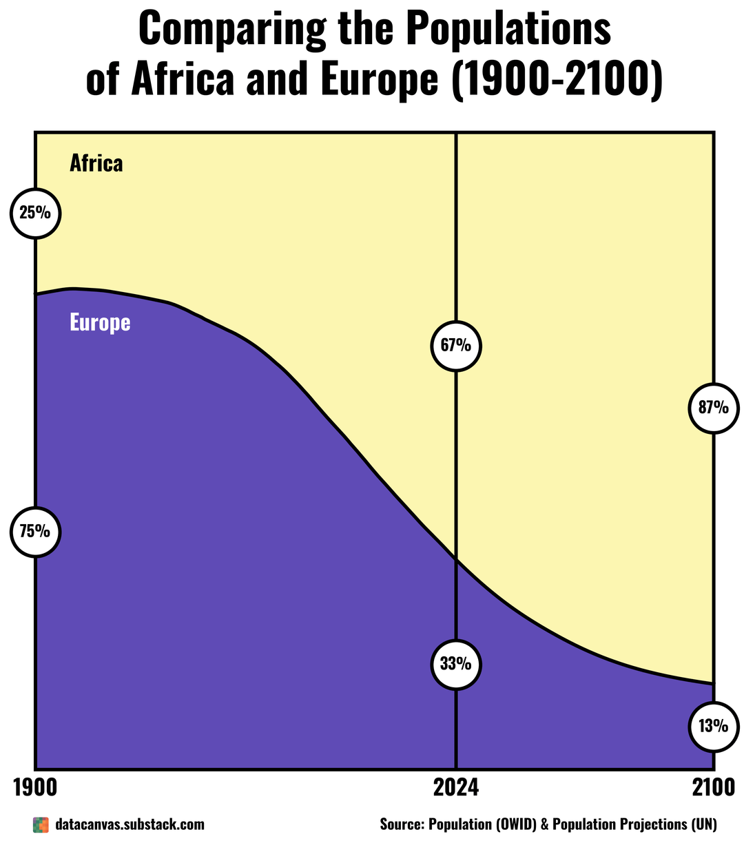
“67%”
“Of Earth’s population?”
“No”
That seems rather dubious considering the current rate of urbanization in Africa. We’ve seen this play out repeatedly, the faster countries industrialize the faster they hit population decline, there’s little reason to think that will play out differently in Africa.
I don’t think it will behave that way. Their population growth rate started to decline a few decades ago
It seems so crazy to me that Africa had so few people just 125 years ago.
Quality>quantity
It will depend on how Africa makes its economic transition. If the economies stay stagnant those stats will become reality. If it follows the Asian model the numbers will drop massively.
The charts themselves are nice and told a good clear story side by side. Not too cluttered and easy to understand the material.
Probably going to pull a China/India and boom then bust.
So Africa just doesn’t have a population ceiling like the rest of the continents or what?
Is Africa a magical place with resources to sustain constant (and near exponential) growth?
since there doesn’t seem to be much discussion of the visualization: these are nice visualizations
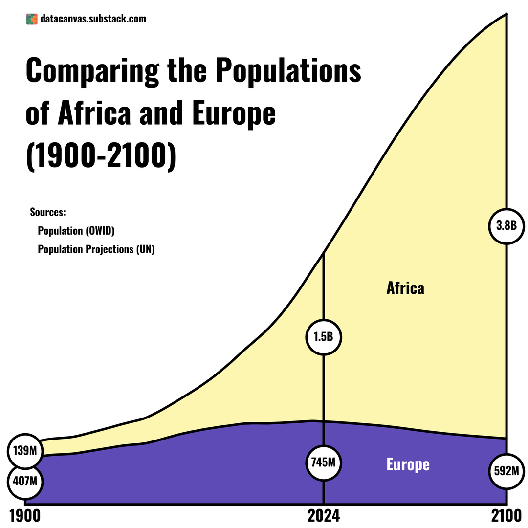
in the second figure I would maybe have gone with “0.75B” instead of “745M” or whatever to keep the units the same.
otherwise, these are clear and aesthetically pleasing to me. and interesting.
The projections to 2100 are a range, not a single line of data. Your map “source” key should not just say “UN” — that tells us nothing. It should contain the full citation to the World Population Prospects 2024 report, and the specific dataset used, or if there is a mixed methodology, a link to your methodology.
The percentage graph is bizarre. Europe + Africa are percentages of what whole, exactly? You picked a strange set of years without ticking anything else on the axes, and without giving any other numbers on the axes. You also don’t give any clear indication (other than context, that you post this this year, because you don’t provide a source in the map) where the data ends and the projection model begins, and which projection you are using.
population is not consistent, because factors like environment, economy, cultures, agriculture etc is changing every time. Europe birth is declining but at some point raise again, Africa birth is raising but at some point will decline again and this will be what happens every centuries with other continents too. We are already starting to see this pattern, african’s birth rates is seeing a decline, and Europe maybe in 50 or 100 years will see a growth again. This is how humanity works
This has been happening since the beginning of humans, every societies birth rates is different depending on multiple factors, and it’s always changing.
Would be interesting to see this but per sq km or mile of arable land. Africa is vastly bigger but has large unihabitable (Sahara, tropical jungle) areas.
Give a country education and these projections fall off a cliff. China/India are now negative population growth.
A fifth of that boom is specificly in Nigeria. Nigeria has an explosively high population about 50% of which are in cities. But it is also unstable, a bomb waiting to blow. Rumors of genocide persist. The surrounding nations have collapsed in the past 3 years. There are multiple quiet wars taling place inside the border, including battles between Ukraine and Russian forces.
Egypt and Ethiopia together form another 5th of that boom. Both are in existential crisises.
Really the danger of this population boom is where it is concentrated. Enormous populations booms are happening is small areas (specifically West Africa) mismatched to the available resources.
This can touch the buttons of every major political issue:
Oil, religion, race, immigration, population boom & bust, war.
It even has a time line 7 more years before that population bomb starts to really go off as those young people (40% of Nigeria & Ethiopia, 30% of Egypt) come of age.
Percentage of what, on the first graph?
They just kept having babies..
How did you manage to customize matplotlib so much?..
I see you are quite skilled in it would you be able to give me some sources that you might know on matplotlib? Yt videos, articles, courses..? – That you learned from before?
this is not even real data…
I doubt that European population will decline that much. There will be massive immigration due to climate change.
Ah yes, I had forgotten the linear population growth formula.
This is why North Africa is always separated from the rest of Africa because we ain’t having this type of growth in Tunisia lol. Most women have 2 kids (Morocco, Tunisia, Libya) to 3 kids (Egypt, Algeria) not the 4 and 5 seen in the rest of Africa.
Interesting. And how about Europe vs. South America.
More like datacirclejerk or smth. europe got a population of arround 700mio, while afrika got 1,55mio. make some useful comparisions… 5min with ai, i got a more statisfying outlook. edit: i mean, look at the population share of all other continents… if you want to get a better and bigger picture. not we dont only see, that africa got bigger in comparision to europe, but they generally grew. but not as much they “dominate” world population(wise?)
Continent | 1900 Population | Share 1900 | 1950 Population | Share 1950 | 2025 Population | Share 2025 | 2050 Population | Share 2050
——————|——————|————|——————|————|——————|————|——————|————
Asia | 947 million | 57.4% | 1.37 billion | 55.3% | 4.83 billion | 59.2% | 5.28 billion | 53.3%
Africa | 133 million | 8.1% | 228 million | 13.1% | 1.55 billion | 19.0% | 2.47 billion | 25.0%
Europe | 408 million | 24.7% | 549 million | 33.3% | 719 million | 8.8% | 703 million | 7.1%
North America | 82 million | 5.0% | 172 million | 10.4% | 612 million | 7.5% | 402 million | 4.1%
South America | 38 million | 2.3% | 167 million | 10.0% | 438 million | 5.4% | 469 million | 4.7%
People do the strangest things instead of simply properly labeling and annotating the axes on their graphs.
0 chance Africa will keep growing at this rate for 80 years. India had already slowed down.
With climate change continuing to rear its ugly head year after year more viciously, I seriously doubt Africa will continually grow unabated for 75 more years.
I wonder, if timeline had started in the middle ages, would it literally just look like a bell curve?
![[OC] Comparing the Populations of Africa and Europe (1900-2100)](https://www.europesays.com/wp-content/uploads/2025/06/nwwisj8ad29f1-1080x1024.png)
31 comments
Well the discussions in this comment section will certainly be nice, friendly and based on facts not feelings, fear and hate 🙂
I seriously doubt Africa continues on that constant linear growth for the next ~80 years.
This is where foreign aid gets you
“What’s the population of your country?”
“67%”
“Of Earth’s population?”
“No”
That seems rather dubious considering the current rate of urbanization in Africa. We’ve seen this play out repeatedly, the faster countries industrialize the faster they hit population decline, there’s little reason to think that will play out differently in Africa.
I don’t think it will behave that way. Their population growth rate started to decline a few decades ago
It seems so crazy to me that Africa had so few people just 125 years ago.
Quality>quantity
It will depend on how Africa makes its economic transition. If the economies stay stagnant those stats will become reality. If it follows the Asian model the numbers will drop massively.
The charts themselves are nice and told a good clear story side by side. Not too cluttered and easy to understand the material.
Probably going to pull a China/India and boom then bust.
So Africa just doesn’t have a population ceiling like the rest of the continents or what?
Is Africa a magical place with resources to sustain constant (and near exponential) growth?
since there doesn’t seem to be much discussion of the visualization: these are nice visualizations
in the second figure I would maybe have gone with “0.75B” instead of “745M” or whatever to keep the units the same.
otherwise, these are clear and aesthetically pleasing to me. and interesting.
The projections to 2100 are a range, not a single line of data. Your map “source” key should not just say “UN” — that tells us nothing. It should contain the full citation to the World Population Prospects 2024 report, and the specific dataset used, or if there is a mixed methodology, a link to your methodology.
The percentage graph is bizarre. Europe + Africa are percentages of what whole, exactly? You picked a strange set of years without ticking anything else on the axes, and without giving any other numbers on the axes. You also don’t give any clear indication (other than context, that you post this this year, because you don’t provide a source in the map) where the data ends and the projection model begins, and which projection you are using.
population is not consistent, because factors like environment, economy, cultures, agriculture etc is changing every time. Europe birth is declining but at some point raise again, Africa birth is raising but at some point will decline again and this will be what happens every centuries with other continents too. We are already starting to see this pattern, african’s birth rates is seeing a decline, and Europe maybe in 50 or 100 years will see a growth again. This is how humanity works
This has been happening since the beginning of humans, every societies birth rates is different depending on multiple factors, and it’s always changing.
Would be interesting to see this but per sq km or mile of arable land. Africa is vastly bigger but has large unihabitable (Sahara, tropical jungle) areas.
Give a country education and these projections fall off a cliff. China/India are now negative population growth.
A fifth of that boom is specificly in Nigeria. Nigeria has an explosively high population about 50% of which are in cities. But it is also unstable, a bomb waiting to blow. Rumors of genocide persist. The surrounding nations have collapsed in the past 3 years. There are multiple quiet wars taling place inside the border, including battles between Ukraine and Russian forces.
Egypt and Ethiopia together form another 5th of that boom. Both are in existential crisises.
Really the danger of this population boom is where it is concentrated. Enormous populations booms are happening is small areas (specifically West Africa) mismatched to the available resources.
This can touch the buttons of every major political issue:
Oil, religion, race, immigration, population boom & bust, war.
It even has a time line 7 more years before that population bomb starts to really go off as those young people (40% of Nigeria & Ethiopia, 30% of Egypt) come of age.
Percentage of what, on the first graph?
They just kept having babies..
How did you manage to customize matplotlib so much?..
I see you are quite skilled in it would you be able to give me some sources that you might know on matplotlib? Yt videos, articles, courses..? – That you learned from before?
this is not even real data…
I doubt that European population will decline that much. There will be massive immigration due to climate change.
Ah yes, I had forgotten the linear population growth formula.
This is why North Africa is always separated from the rest of Africa because we ain’t having this type of growth in Tunisia lol. Most women have 2 kids (Morocco, Tunisia, Libya) to 3 kids (Egypt, Algeria) not the 4 and 5 seen in the rest of Africa.
Interesting. And how about Europe vs. South America.
More like datacirclejerk or smth. europe got a population of arround 700mio, while afrika got 1,55mio. make some useful comparisions… 5min with ai, i got a more statisfying outlook. edit: i mean, look at the population share of all other continents… if you want to get a better and bigger picture. not we dont only see, that africa got bigger in comparision to europe, but they generally grew. but not as much they “dominate” world population(wise?)
Continent | 1900 Population | Share 1900 | 1950 Population | Share 1950 | 2025 Population | Share 2025 | 2050 Population | Share 2050
——————|——————|————|——————|————|——————|————|——————|————
Asia | 947 million | 57.4% | 1.37 billion | 55.3% | 4.83 billion | 59.2% | 5.28 billion | 53.3%
Africa | 133 million | 8.1% | 228 million | 13.1% | 1.55 billion | 19.0% | 2.47 billion | 25.0%
Europe | 408 million | 24.7% | 549 million | 33.3% | 719 million | 8.8% | 703 million | 7.1%
North America | 82 million | 5.0% | 172 million | 10.4% | 612 million | 7.5% | 402 million | 4.1%
South America | 38 million | 2.3% | 167 million | 10.0% | 438 million | 5.4% | 469 million | 4.7%
People do the strangest things instead of simply properly labeling and annotating the axes on their graphs.
0 chance Africa will keep growing at this rate for 80 years. India had already slowed down.
With climate change continuing to rear its ugly head year after year more viciously, I seriously doubt Africa will continually grow unabated for 75 more years.
I wonder, if timeline had started in the middle ages, would it literally just look like a bell curve?
Comments are closed.