ShouldnŌĆÖt you compare same profession and years of experience for this to be more insightful?
Am I reading correctly that this does not control in any way for differences in hours worked, industry, experience, etc?
This sort of stuff is always frustratingly misleading to the point of being actually useless information. It doesn’t indicate discrimination or, well, *anything* negative.
e.g. men regularly work more overtime whereas women are frequently content with having better work-life balances. Men gravitate towards higher paying jobs whereas women gravitate towards jobs with better benefits. Then you’ve got the old money which is frequently male and that’s incorporated into this as well despite it essentially being a vestige from decades ago due to how inherited wealth and the bigotry of the past occurred.
A wage gap *does* exist, but it’s closer to about 2-3% (last I checked) and there are multiple factors that could be contributing that we can’t accurately measure, unfortunately, including basic temperament. Men are more prone to risk-taking due to testosterone which could lead to asking for higher raises than women, for example. Sexism, of course, could also be a factor.
We should strive for equality in general, but let’s not mislead people with this overgeneralised nonsense. There are already at least two laws that make unequal pay illegal in the US, for example, and a dozen other campaigns and efforts to fix the wage gap with no discernible effect as they’re based around the premise that it’s entirely due to sexism and nothing else.
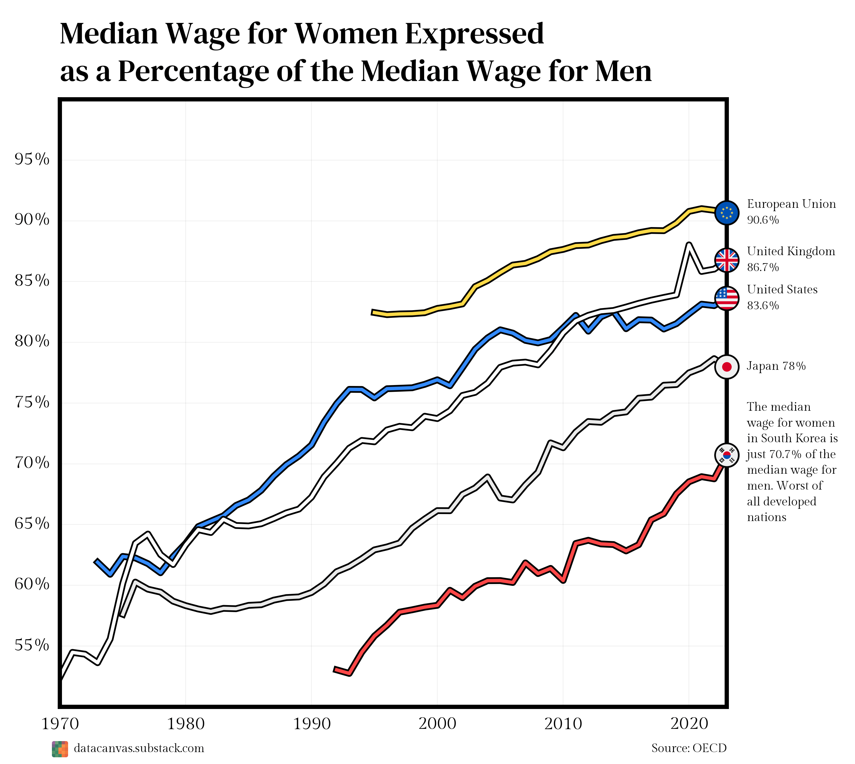
I wonder what the weird spike in 2019 is about for the UK – anybody know?
The Man is trying to keep women off of oil-rigs, out of sewers, excluded from excavation, and down from telephone poles.
It’s a fecking conspiracy, man…
So…
You’re saying (as a man) I should go to work in South Korea.
Gotcha.
The thing about this kind of data is that we wind up taking the wrong message away from it because it lacks context.
Fields donŌĆÖt have equal gender representation, so while most people take away ŌĆ£men get paid more for the same jobŌĆØ from charts like this, that would actually be a different chart. Not to say that that gap doesnŌĆÖt also exist, but IŌĆÖd bet that in the US and Europe at least, the gap would be significantly smaller.
Further, it doesnŌĆÖt take into account the lag time of some jobs. As in CEOs. Most are older people, and thus we might expect the pool of qualified applicants to mirror what business masters graduation rates looked like 20 or 30 years ago as opposed to what they look like today.
Regardless, what this chart is pointing out is that fields (like tech) that are male dominated pay better than fields women tend to go into (social sciences).
This chart allows us to ask the question, shouldnŌĆÖt we value that kind of work more?
Could we get a similar chart for countries in EU? I imagine thereŌĆÖs some difference between the members
not accounting for different jobs or experience levels
How wide are the distributions? There is no reason to assume the distributions are normal.
Comments are not it. We do know that at similar job, hours and experience the pay is similar. The issue, and what the wage gap shows, is that: “feminized” professions pay less, on average (there’s a bunch of studies on that, and showing how when women take over a field, the salaries stop going up); having children benefit men’s careers while it does the opposite for women (who are the one to take fewer hours, or do not get promoted, or leave a high earning career path that requires longer hours); etc.
The reality is that a lot of women work in, for example, care fields, which pay less. We can have arguments about if an hour of work as a teacher, nurse, or elderly care worker is more, less, or equally valuable as a roofer or plumber (just taking examples of typically feminine/masculine jobs), but this is where the main difference comes from.
Yes, but women control 75% to 85% of consumer spending. Why? Because most working people of both genders contribute everything they earn to running the household, and women make most of the decisions about how that money is spent. Which would rather be, the person who earns more, or the person who spends more?
Information about South Koreas gender dynamics are always so cursed
Zooming in on the y axis like this only obfuscates things by making visual comparisons between countries and points in time less intuitive.
Going from 0% – 100% on the y-axis does a better job of showing:
1. What the rates are visually without having to look at the axis
2. How close different nations are to each other (The EU ratio is not 2x as high as South Korea)
3. How drastically things have changed (The US ratio hasn’t doubled, even though visually it looks that way)
Should have the entire y axis shown for percentages imo. More intuitive and you wouldn’t sacrifice any details
This data is presented with a clear bias in that Korea is labled as the “worst” of developed nations.
What people really need to ask is what the changes over time represent. What drives the wage gap in the first place? What cultural/economic changes affect the gap? Are those changes “good” “bad” or neutral?
I strongly suspect that the majority of the gender pay gap boils down to the maternal role. In countries where women are culturally expected to prioritize childcare, the wage gap will be larger because this prioritization decreases value in the labor market. This is not necessarily a “bad” thing as childcare is very important to society at large.
I suspect that countries with a smaller wage gap have fathers who on average take a more active role in childcare and/or more accessible childcare services. In a hypothetical society where males were predominantly the primary caregivers, I would expect the wage gap to reverse.
cool now lets see the gender distripution in proffesions, the median hours worked per gender. just comparing everyone to everyone is pointless
I see this metric a lot but I think a more interesting percentage would be, what percentage of women are working somewhere where they make less than all the men working there? Because if a woman CEO is making 800k compared to her male counterparts $1 million, how many women making minimum wage who are paid the same as their male coworkers does that cancel out?
For example, if its a study of 100 women. 1 woman makes 800k a year compared to her male colleagues $1 million a year. The other 99 women in the study make 40k a year and their male coworkers also make 40k a year. After doing the math it still shows that women only make 95 cents on the dollar compared to men even though 99% of women in the study make the same as men in their same jobs
Would be interesting to see this normalized to like for like. All to often women, and sometimes men, have so many at home duties or roles, that while they are working 16 hour days, only 6-8 are in a career paying job.
It would be interesting to see this broken down and how society accounts for this.
I might be a girl dad and a 2nd waive feminist; and at the same time I see that groups have lost so much hope and faith that they are choosing to end their own lives much like the Jews in the very early days of Nazi Germany while Eugenists were trying to say they were a weaker people and thatŌĆÖs why they were having those rates.
I think that while this is enlightening, there is more here and we may benefit from seeing it as a systems problem and not solely isolating one person or one gender though, it is still telling. IŌĆÖd also like to see the distribution of wages as I do know women with 1/2 billion so seeing the mode and overall distribution would be interesting.
Means nothing without linking professions and experience level. Otherwise it just says “We don’t have the same jobs.” which is true.
I’m an engineer. Gender has zero effect on pay rate for any employer I’ve worked for. That doesn’t mean much if there are no women engineers. I’ve never worked with one. My college has zero women in the program going into year 3 of coursework. Hundred engineers, zero women. It’s sad because year 1 entity to engineering classes were like 1/3rd women. That dropped to like 6 year 2 and 0 year 3.
In my adult life and acquaintance scope, I know only of exactly 1 woman engineer, a person my friend is married to. Out of maybe a couple thousand people I know at any level, 1, just 1, is an engineer.
Why? No clue. But that kind of employment offset certainly skews the median.
But is it for some job and same hours? Or you’re comparing different jobs when men do a lot of overtime?
now show one that accounts for women taking more time off for maternity, woman doing more part time work, woman choosing fields of work that pay less, then show me that new graph which shows between men and women salaries after taking this into account the real difference is less than 2%.
Checked the source – IŌĆÖm unfamiliar how the site works, could someone explain what it means by 2780 data points? Because if thatŌĆÖs the number of times this information has been analyzed in the past 55 years across all professions then thatŌĆÖs a good number, but if thatŌĆÖs the number of professions itŌĆÖs analyzing, this could be wildly misleading
There’s a simple solution for this. First, we legally mandate that women must work as many hours as men. Second, we force women to take jobs in higher paying career fields. Sorry honey, you can’t be a librarian, you’re going to work in the oil fields.
Third, no more staying home to take care of your children when they’re young. You want to do it and your husband will go to work and support you during it? Too bad, get back to work!
As you can see, this system will make everything more equal, which is of course everyone’s goal in life, so I see no possible downsides and everyone will support it enthusiastically.
The data source says:
> This dataset contains gender wage gaps defined as the unadjusted difference between median wages of men and women relative to the median wages of men.
Is this per hour?
Dammit it’s linear, they’ll overtake us ¤ś▒
The problem with this graph and pretty much every other graph I have seen is it doesn’t have “content creation” or really any job in the front facing social media space. Do we not count those jobs because women are making upwards of 70 million a year doing them or what’s the deal?
This always omits things such as hours worked, the type of job, level of education required for the job (including training such as apprenticeships), etc.
Almost always when you factor those in the disparity almost totally goes away. Are there sexist people who donŌĆÖt pay women the same as men? Yes. Is it the reason why charts like this exist? Third variable conundrum as always.
> Worst of all developed nations
Pretty good data until you started commenting on it.
![[OC] Median Wage for Women Expressed as a Percentage of the Median Wage for Men](https://www.europesays.com/wp-content/uploads/2025/06/uxnogjewn3af1-1920x1024.png)
29 comments
ShouldnŌĆÖt you compare same profession and years of experience for this to be more insightful?
Am I reading correctly that this does not control in any way for differences in hours worked, industry, experience, etc?
This sort of stuff is always frustratingly misleading to the point of being actually useless information. It doesn’t indicate discrimination or, well, *anything* negative.
e.g. men regularly work more overtime whereas women are frequently content with having better work-life balances. Men gravitate towards higher paying jobs whereas women gravitate towards jobs with better benefits. Then you’ve got the old money which is frequently male and that’s incorporated into this as well despite it essentially being a vestige from decades ago due to how inherited wealth and the bigotry of the past occurred.
A wage gap *does* exist, but it’s closer to about 2-3% (last I checked) and there are multiple factors that could be contributing that we can’t accurately measure, unfortunately, including basic temperament. Men are more prone to risk-taking due to testosterone which could lead to asking for higher raises than women, for example. Sexism, of course, could also be a factor.
We should strive for equality in general, but let’s not mislead people with this overgeneralised nonsense. There are already at least two laws that make unequal pay illegal in the US, for example, and a dozen other campaigns and efforts to fix the wage gap with no discernible effect as they’re based around the premise that it’s entirely due to sexism and nothing else.
I wonder what the weird spike in 2019 is about for the UK – anybody know?
The Man is trying to keep women off of oil-rigs, out of sewers, excluded from excavation, and down from telephone poles.
It’s a fecking conspiracy, man…
So…
You’re saying (as a man) I should go to work in South Korea.
Gotcha.
The thing about this kind of data is that we wind up taking the wrong message away from it because it lacks context.
Fields donŌĆÖt have equal gender representation, so while most people take away ŌĆ£men get paid more for the same jobŌĆØ from charts like this, that would actually be a different chart. Not to say that that gap doesnŌĆÖt also exist, but IŌĆÖd bet that in the US and Europe at least, the gap would be significantly smaller.
Further, it doesnŌĆÖt take into account the lag time of some jobs. As in CEOs. Most are older people, and thus we might expect the pool of qualified applicants to mirror what business masters graduation rates looked like 20 or 30 years ago as opposed to what they look like today.
Regardless, what this chart is pointing out is that fields (like tech) that are male dominated pay better than fields women tend to go into (social sciences).
This chart allows us to ask the question, shouldnŌĆÖt we value that kind of work more?
Could we get a similar chart for countries in EU? I imagine thereŌĆÖs some difference between the members
https://preview.redd.it/745sqi4wr3af1.png?width=487&format=png&auto=webp&s=4dd257e224f85f71bb90b1b187ebf687e9296937
not accounting for different jobs or experience levels
How wide are the distributions? There is no reason to assume the distributions are normal.
Comments are not it. We do know that at similar job, hours and experience the pay is similar. The issue, and what the wage gap shows, is that: “feminized” professions pay less, on average (there’s a bunch of studies on that, and showing how when women take over a field, the salaries stop going up); having children benefit men’s careers while it does the opposite for women (who are the one to take fewer hours, or do not get promoted, or leave a high earning career path that requires longer hours); etc.
The reality is that a lot of women work in, for example, care fields, which pay less. We can have arguments about if an hour of work as a teacher, nurse, or elderly care worker is more, less, or equally valuable as a roofer or plumber (just taking examples of typically feminine/masculine jobs), but this is where the main difference comes from.
Yes, but women control 75% to 85% of consumer spending. Why? Because most working people of both genders contribute everything they earn to running the household, and women make most of the decisions about how that money is spent. Which would rather be, the person who earns more, or the person who spends more?
Information about South Koreas gender dynamics are always so cursed
Zooming in on the y axis like this only obfuscates things by making visual comparisons between countries and points in time less intuitive.
Going from 0% – 100% on the y-axis does a better job of showing:
1. What the rates are visually without having to look at the axis
2. How close different nations are to each other (The EU ratio is not 2x as high as South Korea)
3. How drastically things have changed (The US ratio hasn’t doubled, even though visually it looks that way)
Should have the entire y axis shown for percentages imo. More intuitive and you wouldn’t sacrifice any details
This data is presented with a clear bias in that Korea is labled as the “worst” of developed nations.
What people really need to ask is what the changes over time represent. What drives the wage gap in the first place? What cultural/economic changes affect the gap? Are those changes “good” “bad” or neutral?
I strongly suspect that the majority of the gender pay gap boils down to the maternal role. In countries where women are culturally expected to prioritize childcare, the wage gap will be larger because this prioritization decreases value in the labor market. This is not necessarily a “bad” thing as childcare is very important to society at large.
I suspect that countries with a smaller wage gap have fathers who on average take a more active role in childcare and/or more accessible childcare services. In a hypothetical society where males were predominantly the primary caregivers, I would expect the wage gap to reverse.
cool now lets see the gender distripution in proffesions, the median hours worked per gender. just comparing everyone to everyone is pointless
I see this metric a lot but I think a more interesting percentage would be, what percentage of women are working somewhere where they make less than all the men working there? Because if a woman CEO is making 800k compared to her male counterparts $1 million, how many women making minimum wage who are paid the same as their male coworkers does that cancel out?
For example, if its a study of 100 women. 1 woman makes 800k a year compared to her male colleagues $1 million a year. The other 99 women in the study make 40k a year and their male coworkers also make 40k a year. After doing the math it still shows that women only make 95 cents on the dollar compared to men even though 99% of women in the study make the same as men in their same jobs
Would be interesting to see this normalized to like for like. All to often women, and sometimes men, have so many at home duties or roles, that while they are working 16 hour days, only 6-8 are in a career paying job.
It would be interesting to see this broken down and how society accounts for this.
I might be a girl dad and a 2nd waive feminist; and at the same time I see that groups have lost so much hope and faith that they are choosing to end their own lives much like the Jews in the very early days of Nazi Germany while Eugenists were trying to say they were a weaker people and thatŌĆÖs why they were having those rates.
I think that while this is enlightening, there is more here and we may benefit from seeing it as a systems problem and not solely isolating one person or one gender though, it is still telling. IŌĆÖd also like to see the distribution of wages as I do know women with 1/2 billion so seeing the mode and overall distribution would be interesting.
Means nothing without linking professions and experience level. Otherwise it just says “We don’t have the same jobs.” which is true.
I’m an engineer. Gender has zero effect on pay rate for any employer I’ve worked for. That doesn’t mean much if there are no women engineers. I’ve never worked with one. My college has zero women in the program going into year 3 of coursework. Hundred engineers, zero women. It’s sad because year 1 entity to engineering classes were like 1/3rd women. That dropped to like 6 year 2 and 0 year 3.
In my adult life and acquaintance scope, I know only of exactly 1 woman engineer, a person my friend is married to. Out of maybe a couple thousand people I know at any level, 1, just 1, is an engineer.
Why? No clue. But that kind of employment offset certainly skews the median.
But is it for some job and same hours? Or you’re comparing different jobs when men do a lot of overtime?
now show one that accounts for women taking more time off for maternity, woman doing more part time work, woman choosing fields of work that pay less, then show me that new graph which shows between men and women salaries after taking this into account the real difference is less than 2%.
Checked the source – IŌĆÖm unfamiliar how the site works, could someone explain what it means by 2780 data points? Because if thatŌĆÖs the number of times this information has been analyzed in the past 55 years across all professions then thatŌĆÖs a good number, but if thatŌĆÖs the number of professions itŌĆÖs analyzing, this could be wildly misleading
There’s a simple solution for this. First, we legally mandate that women must work as many hours as men. Second, we force women to take jobs in higher paying career fields. Sorry honey, you can’t be a librarian, you’re going to work in the oil fields.
Third, no more staying home to take care of your children when they’re young. You want to do it and your husband will go to work and support you during it? Too bad, get back to work!
As you can see, this system will make everything more equal, which is of course everyone’s goal in life, so I see no possible downsides and everyone will support it enthusiastically.
The data source says:
> This dataset contains gender wage gaps defined as the unadjusted difference between median wages of men and women relative to the median wages of men.
Is this per hour?
Dammit it’s linear, they’ll overtake us ¤ś▒
The problem with this graph and pretty much every other graph I have seen is it doesn’t have “content creation” or really any job in the front facing social media space. Do we not count those jobs because women are making upwards of 70 million a year doing them or what’s the deal?
This always omits things such as hours worked, the type of job, level of education required for the job (including training such as apprenticeships), etc.
Almost always when you factor those in the disparity almost totally goes away. Are there sexist people who donŌĆÖt pay women the same as men? Yes. Is it the reason why charts like this exist? Third variable conundrum as always.
> Worst of all developed nations
Pretty good data until you started commenting on it.
Comments are closed.