![[OC] How Qatar’s population pyramid changed from 1950 to 2023](https://www.europesays.com/wp-content/uploads/2025/07/70raocg5unbf1-1500x1024.gif)
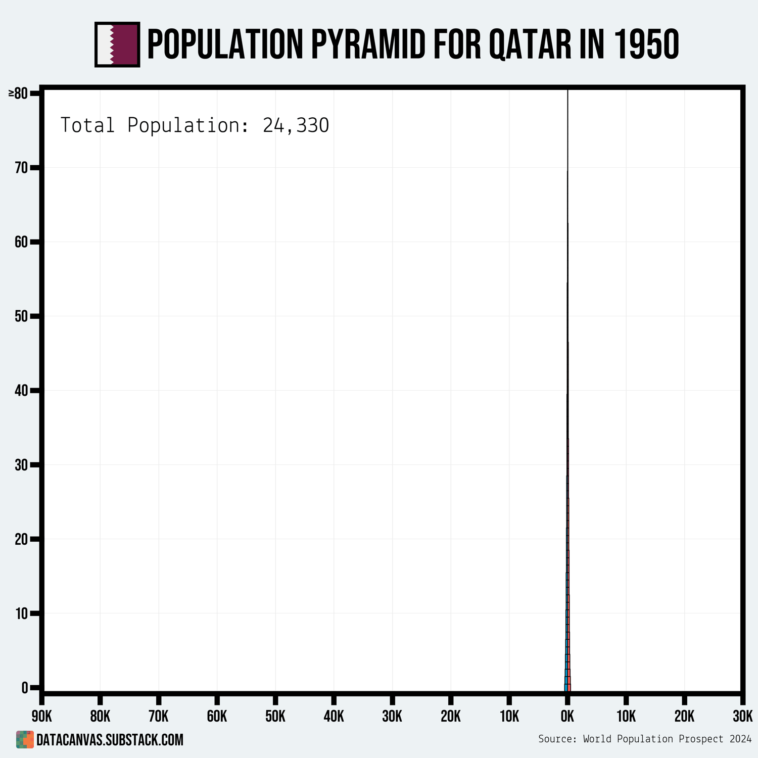
Data source: World Population Prospect 2024 – Population on 01 January, by single age
Tools used: Matplotlib
I just shared a data visualization describing how heavily male-dominated Qatar's population has is. Perhaps some of you appreciate this animation showing how the population exploded in 2005 when the influx of foreign workers took off! 🙂
Posted by oscarleo0
19 comments
influx of foreign workers a.k.a modern slavery !
edit: thanks to all who’ve helped me with this!
You know the demographics are fucked when the line is not even centered
Interesting that the men who came in the eighties generally stayed…
Also this is modern slavery :/
I wish there was some sort of key, telling me what color is what for this beautiful data.
Out of curiosity, why did the number of foreign workers suddenly explode in 2009-2015?
The forever sausage party
Interesting but downvoted because no color key (even though I could guess)
Could this be made for the % of population rather than raw numbers it’s hard to see that data at the start
For the people saying the percentage is 90 fucking percent for slavery. Guys. I am Tunisian and my family moved to Qatar when I was age 8-12 and my dad worked in administration and had colleagues from everywhere in the arab world. We had a completely normal life. In fact, more luxurious than here in Tunisia and we had our passports a 3 rooms house and everything. It’s really only the low income workers treated like this which are like 40-50% and that’s still CONCERNING but it’s not 90%.
Also it looks like after 2016 it looks like they slowed immigration a lot as the peak demographic just keeps aging which is interestingly the year my family moved there and we left in 2020 back to Tunisia as they fired so many in covid. The thing is qatar or any of these gulf countries (except Saudi Arabia because only 30% are immigrants there) can’t really stop immigration unless they are going to deport all the existing ones and crash their economy because if they stay without other immigrants coming in. In just 30 years they will become the oldest country in the world with everyone in their 60s. They are basically forced to keep bringing immigrants.
Not beautiful – what do the two colors mean?
this is a terrible graphic. i took me too long to decipher the axes and color
So… who all the guys fuck?
These places in the middle east could be gay paradises if yknow… its a shame
Data vis without labels should be banned.
Lemme see the correlated infanticide chart, then we can have a real talk.
This population chart gif would be cooler if:
– the bottom scale grew with the larger populations, because the starting numbers were too small to see the original pattern
– 2 seperate colors for the men and women of Qatari and the migrant workers
“Are you having a boy or an abortion?”[](https://www.tiktok.com/@moviemeat/video/7238008130926382378)
Qatar population charts so hot right now
Comments are closed.