![[OC] How historic events shaped the strange looking population pyramid of China](https://www.europesays.com/wp-content/uploads/2025/07/95lyiboac2cf1-1920x1024.png)
Data source: World Population Prospect – Population by Single Age, Both Sexes
Tools used: Matplotlib
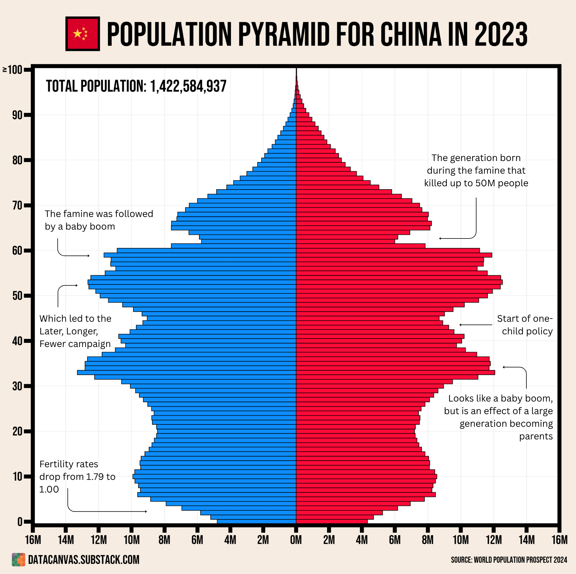
It's very interesting to see how a country's population pyramid reflect show historic events and how the resulting changed reverberate into future generations. Chinas population is one of the best examples where the famine shaped the size of several generations and almost hides the potential population decrease since the number of children continued increased after the on-child policy, but that was just because the generation starting families was large.
Posted by oscarleo0
15 comments
It’s not the worst population pyramid. I want to see all the consequences of administratively managing reproduction.
That bulge of people between 50 and 60 are going to be a big problem when they retire. They’re being replaced in the labour force by the much smaller young generation.
China has benefited a lot from a high proportion of its population being of working age. That’s about to go over a cliff edge
Labeling axes and explaining the color would be helpful.
A cohort becoming parents is the definition of a baby boom. Especially if rates had been dropping before.
Conveniently left out the cultural revolution that followed the self-inflicted famine.
Fertlity rate of 1.00 means…
100 parents
50 children
25 grandchildren
where is the start of 2 child policy and 3 child policy?
50-60 bulge is going to be bad in 20 years.
The 30-40 bulge is going to be existential.
Being picky, blue and red should be labelled but this is actually a good visualisation because it helps the reader UNDERSTAND the data. Good job OP!
Do we actually believe that the birth rate only reached 1 child per woman in modern times, despite it being illegal to have more than one child for decades for most of the population? Is there something I’m missing that would hold the birthrate above that policy for so long?
Why would there be a jump in population of people in their mid 30s because they were having kids?
Where does the data come from? Many suspect that the situation is much, much worse than the official data suggests.
Why isn’t the y-axis labeled
Well done, really good visualization and context
Jeeeesus. I’m sorry, what happened in the last 7 years? It makes a 50-million-deaths famine look like nothing. Covid was 5 years ago, but…. did it just never end in China?
Comments are closed.