Data from the CDC: 2018, 2019, 2020, 2021
Map of states by party affiliation
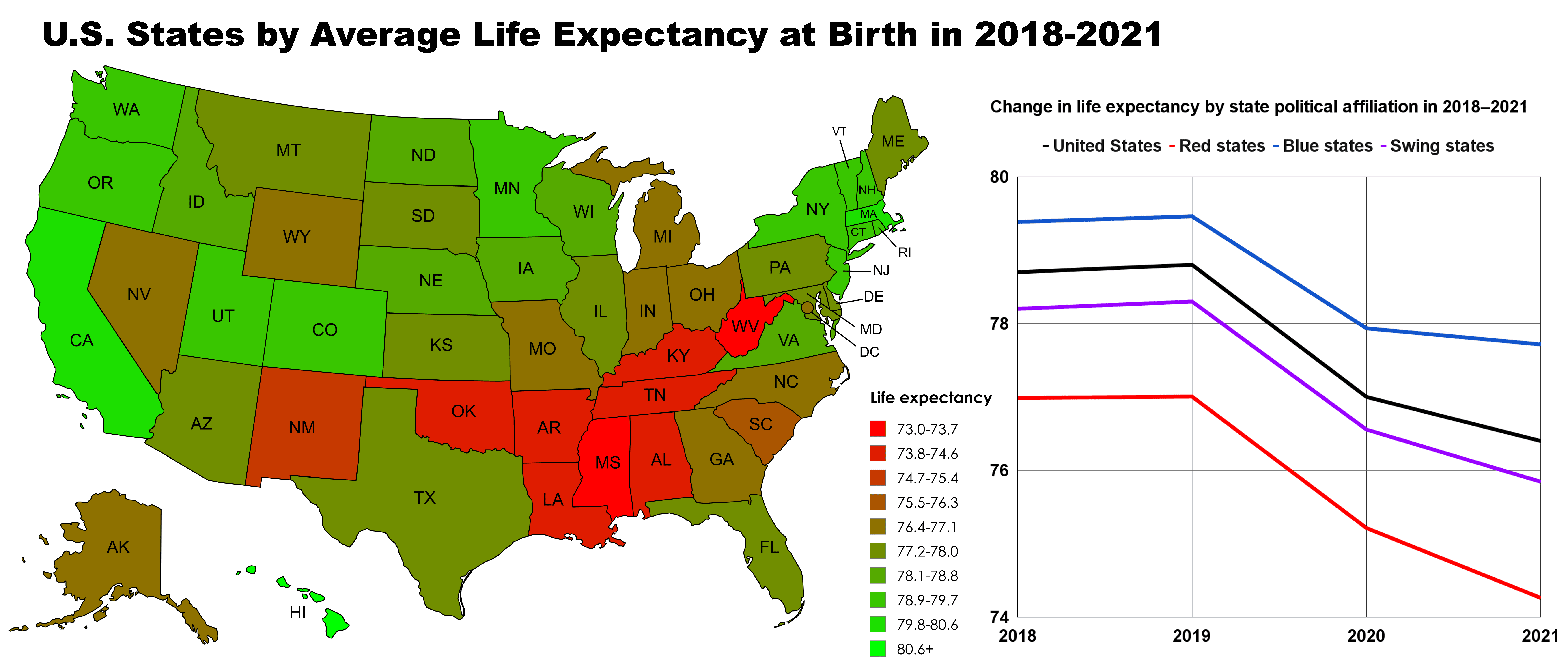
Tools used: Google Sheets, Mapchart, Photoshop
Posted by PerAsperaAdMars
![[OC] U.S. States by Life Expectancy at Birth in 2018-2021](https://www.europesays.com/wp-content/uploads/2025/07/c1puchp1i1cf1-1920x1024.png)
Data from the CDC: 2018, 2019, 2020, 2021
Map of states by party affiliation
Tools used: Google Sheets, Mapchart, Photoshop
Posted by PerAsperaAdMars
14 comments
How is California one of the top life expectancy states, if everything causes cancer in California?
Wait is this saying thats the life expectancy of people born between 2018 and 2021?
Too many confounding factors to make anything of this. E.g., race. Southern states are red, but southern states also have a much higher population of black people, and the unfortunate reality is that black people tend to have shorter lifespans. Also, older people are more conservative and older people were more likely to have their lives cut short by COVID.
This is data that really needs to be county-level not state-level, as its really an urban vs rural relationship more than a political affiliation one. Health and human behavior are driven by local factors more directly than state factors.
I would direct people interested in this map to see [Dwyer-Lindgren et al (2024) “Ten Americas: A Systematic Analysis of Life Expectancy Disparities in the United States” The Lancet 404(10469): p2299-2313.](https://www.thelancet.com/journals/lancet/article/PIIS0140-6736(24)01495-8/fulltext) who make a heroic attempt at disentangling place, race/ethnicity, income, education, and changing life expectancy. The summary chart is here but there’s a lot behind it that’s worth thinking about.
https://preview.redd.it/x8easicdu1cf1.jpeg?width=1974&format=pjpg&auto=webp&s=3e6a79a71964b25d981a7acfd1865e24a4f1fe25
Just looking at that map, it seems to correlate with my own observation of the prevalance of smoking in each state.
I wonder how it correlates with the availability of public health care plans.
Blue states are normally northern and cooler, people generally live longer in cooler climates than hot.
Every single map indicatesŌĆ”we have some issues in the Delta.
If I were presidentŌĆ”IŌĆÖm starting there with funding, pilot programs ŌĆ”all of it. IŌĆÖm just taking control of the area til every map of every data point gets back up.
Ya know there is a reddit channel called “people live in cities” where it shows maps that are biased in favor of dense city populations and doesn’t really give any new information.
there should be a channel that states “maps the show The south and Appalachia are messed up.”
As a color blind person with the most common color combination of color blindness (red-green) I am baffled by the common use of red and green mapping to show data? People who see typical red and green colors- does these colors just look best in contrast or what it the deal? Would more opposite color shades work better anyhow or is this really easy for everyone else to look at the shaded legend and find the right shade on the map?
IŌĆÖll never forget the time a right wing intellectual told me that ŌĆ£life expectancy is not a meaningful indicator of the health of a polity or stateŌĆØ because, no joke, a shorter life is evidence that people are closer to Jesus because theyŌĆÖre dying to get to him sooner.
ItŌĆÖs always the south that has the most fucked up statistics. Being hateful doesnŌĆÖt do shit but keep you poor, stupid, and ready for an early death!
https://preview.redd.it/ph747eilj7cf1.png?width=2779&format=png&auto=webp&s=70bd905b409d554e7fc90e76cd36800cbcc21dce
The chart above displays all 50 US states ranked by a composite quality-of-life score derived from normalized life expectancy, median household income, and health index. Blue bars represent states that voted Democratic in 2020; red bars represent Republican-voting states.
Cool. Lets let all those green states make our national health policy now.
Comments are closed.