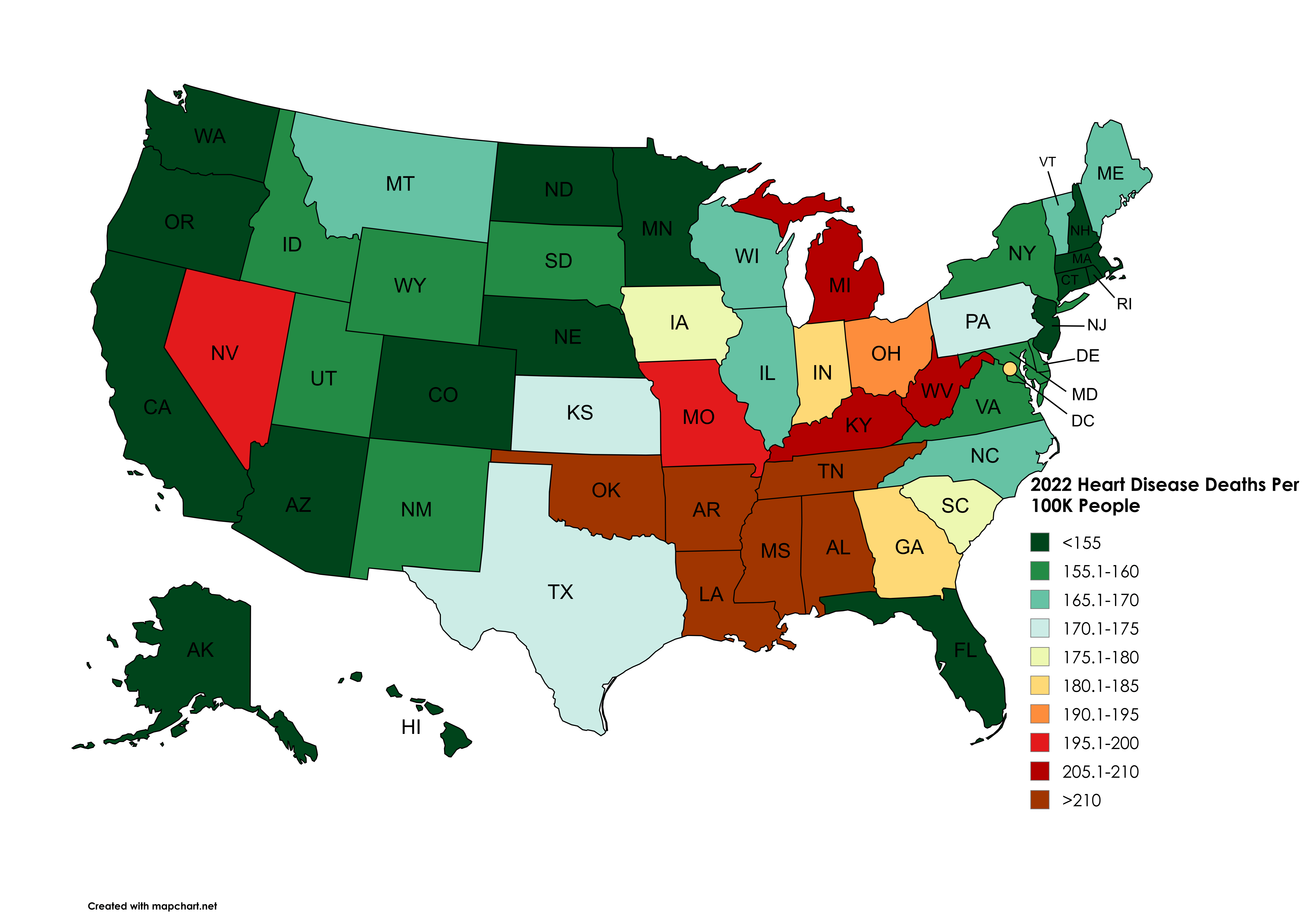
[OC] 2022 Heart Disease Deaths Per 100K People By U.S. State [Data: CDC ‘National Center for Health Statistics’ / Tool: Mapchart.net]
Posted by snakkerdudaniel
![[OC] 2022 Heart Disease Deaths Per 100K People By U.S. State [Data: CDC 'National Center for Health Statistics' / Tool: Mapchart.net]](https://www.europesays.com/wp-content/uploads/2025/07/8blipu7wwgcf1-1920x1024.png)
[OC] 2022 Heart Disease Deaths Per 100K People By U.S. State [Data: CDC ‘National Center for Health Statistics’ / Tool: Mapchart.net]
Posted by snakkerdudaniel
15 comments
No states in the 185.1-190 or 200.1-205 buckets so they are not used.
As someone who is partially colorblind, this map is quite aggravating. 155 and 205-210 look identical to me.
What’s going on in Nevada?
Edit: thank you all. Cocaine, lots of legal indoor smoking, lots of older people moving in for lower cost of living. Lots of good reasons for an increase in heart disease deaths in Nevada compared to all the surrounding states.
Does Detroit alone make Michigan worse than adjacent states?
I can’t look at these maps without thinking, “They partied so hard they never made it to heart disease.”
Cancer was the second leading cause of death in Florida this year by about 2000 less deaths than heart disease. It was followed by accidents.
is it controlled by age in each state?
whats wrong with Michigan?
Does “cocaine” count as “heart disease” in Nevada?
All the rest checks. “Fry it up!” South and Midwest.
Since black Americans are 30% more likely to die from heart disease than white Americans, I think you’re mostly just mapping black population density. I guess with a side of Appalachian poverty and Vegas-induced heart attacks. https://www.uchicagomedicine.org/forefront/heart-and-vascular-articles/heart-disease-and-racial-disparities
I agree with others. The color scheme could be improved.
The heat in AZ keep our arteries lubricated
would prefer if this was age adjusted
Florida is surprisingly low considering the proliferation of retirees.
California be like, “Calmer than you, Dude.”
This map, and so many like it, is why Minnesotans invented the term “upper midwest.”
Comments are closed.