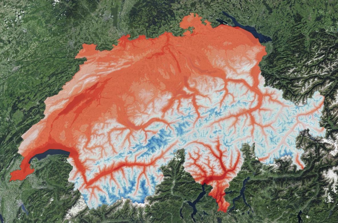
I found this temperature map while exploring the Federal Office of Topography’s swisstopo map app. It’s interesting to see the thermal contrasts across Switzerland.
The higher temperatures flow through the valleys like veins, surrounded by cooler mountain areas. Thought some of you might appreciate the visualization.
by RatioScripta
12 comments
Look at the heat creeping up the valley’s. No wonder all the glaciers are almost gone.
Or maybe it’s an altitude question? Incredible eh?
Looks exactly like an altitude map. What’s your point ?
Wow, you’ve figured out that we have mountains!
This is literally just an elevation map…
Just to add some info:
What you can see here is not “temperature flowing through the valleys”. It’s the daily high of the air temperature in July in the diurnal cycle during the standardisation period (1981-2010).
For those of you that like to play with climate data, here is a pretty neat summary with maps on average temperature, precipitation and CO2 concentration: [Climate data](https://interaktiv.derbund.ch/2020/daten-zum-klimawandel-in-der-schweiz/)
Love this map, now I can prove to my Swiss German friends that Geneva is indeed way hotter than other regions even though it is not in Ticino. 😁
Not exactly news that temperature decreases with altitude…..
Wow people in this comment section are miserable. I Wish that the next time you learn something new and fun you will also have someone tell you how “Oh you finally learned that too slowpoke.”.
Which one is the aorta ?
temperature decreases by about 0.5 °C to 1 °C per 100 m elevation
very important rule of thumb to know for any mountain hiker
Sushi
Without legend or a scale, nobody can forge any sort of opinion from such an image.
Comments are closed.