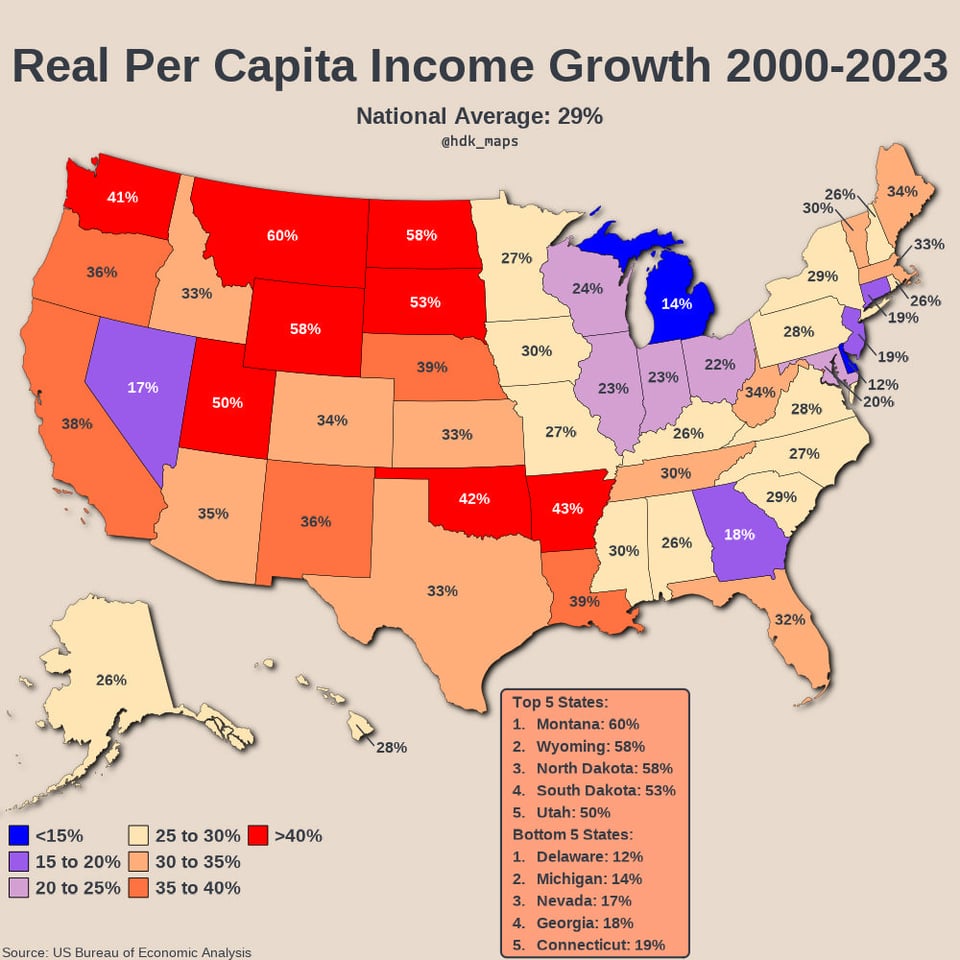
What causing the large growth in the mid-west? Natural gas production?
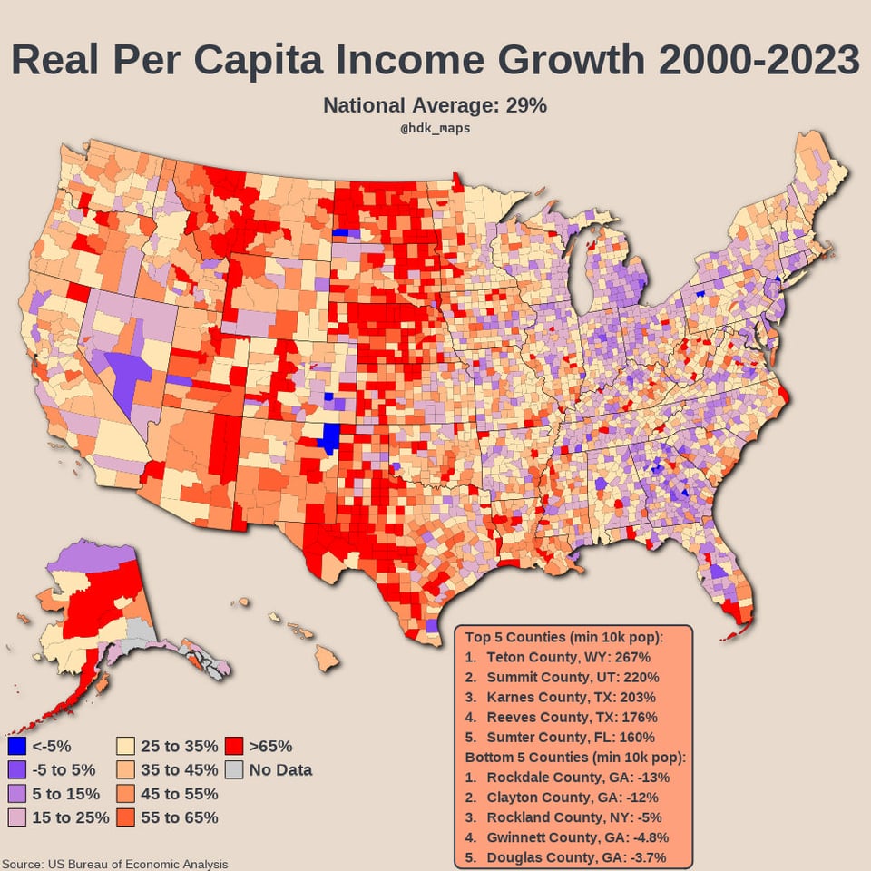
The random dark blue county in Pennsylvania is Forrest County, where a maximum security state prison makes up a large chunk of the county’s population. Other than that it’s a few small towns and hunting camps
In the same time period:
Average cost of living increased by 86%
SP500 went up 410%
Investing is not a choice. It’s mandatory if you don’t want to fall behind.
When you talk about these extremely poor rural areas, couldn’t opening just one good paying plant drastically increase the data?
What caused the income growth in the Great Plains?
I straight up don’t buy this (pun intended). This is suggesting that in general folks have 30-50% higher purchasing power now compared to 2000? If so, all this highlights is the inadequacy of published “inflation” and CPI metrics compared to reality.
So why are people moving to Atlanta in droves then?
another bullshit data. the minimum wage went up but it makes no difference because everything went up in price even more. The real problem is that people who were already making $20+ an hour saw very minimal increase, much less than the minimum wage earners
Teton co is where Jacksonhole is located and is a playground for billionaires who want to escape state taxes.
Is this indexed to US inflation or local? Because it’s fairly clear that the COL:Wages have NOT kept up on the west coast at all over the last 25 years while this chart would suggest otherwise.
What about by per large metro areas? Which areas grew the most vs. least? My guess would be Austin on most and Cleveland or Buffalo on least but I would love to see data.
This is an awful color map. It makes it seems like blue is decreasing.
Montana’s rate looks amazing, but we are still poor AF. Percentages aren’t everything.
This is NOT beautiful or insightful.
– Color scheme is random. Bright red = good??
– This totally disregards what actual median income is. Is South Dakota prospering? Or were they just way behind in 90s?
– How does income compare to cost of living?
Beautiful data helps the reader intuitively draw insightful conclusions from an analysis the creates clarity out of complexity.
This does neither.
Sorry to be harsh, but we REALLY need to up the standards for this sub
We already have data for 2025. Why show 2023? Are you promoting some republican agenda?
Teton county = Jackson, WY. AKA where the billionaires go to play.
I’m a little confused about the blue vs red color scheme. It’s not like it’s two sides, like positive and negative, and it seems like the red is better than the blue? Am I missing something or wouldn’t this be better as a single color gradient?
Can we throw up an inflation adjusted one, and maybe a price per parity adjusted one?
Given, compounding inflation over 20 years…and cost of goods increases over the past 10-15 years; trade wars, tariffs, actual wars, etc…
I don’t personally love the color choices. I’d prefer a Red/Green divergent color scheme. Green being the increase in growth and red being the lack thereof
Who in their right mind would use red on a financial graph to show growth? This is insane.
Montana just getting boned as higher income workers who could live and work remote came in. The average Montanan has not seen their income rise enough to even keep up without roommates. My housing costs dropped moving from Montana to Phoenix.
And in that same time period inflation has driven up prices by 77%. Meaning when adjusted for inflation, we as a country have taken a 27% pay cut since 2000
26 comments
Data: [https://apps.bea.gov/regional/downloadzip.htm](https://apps.bea.gov/regional/downloadzip.htm)
Tools: R (packages: dplyr, ggplot2, sf, usmap, tools, ggfx, grid, scales)
I made these low res because I think it looks cool, but I’m not sure if anyone else agrees. I’d be interested to hear your thoughts.
What makes “real” per-capital income growth “real”?
For context . . .
[List of U.S. states and territories by income – Wikipedia](https://en.wikipedia.org/wiki/List_of_U.S._states_and_territories_by_income)
What causing the large growth in the mid-west? Natural gas production?
The random dark blue county in Pennsylvania is Forrest County, where a maximum security state prison makes up a large chunk of the county’s population. Other than that it’s a few small towns and hunting camps
In the same time period:
Average cost of living increased by 86%
SP500 went up 410%
Investing is not a choice. It’s mandatory if you don’t want to fall behind.
When you talk about these extremely poor rural areas, couldn’t opening just one good paying plant drastically increase the data?
What caused the income growth in the Great Plains?
I straight up don’t buy this (pun intended). This is suggesting that in general folks have 30-50% higher purchasing power now compared to 2000? If so, all this highlights is the inadequacy of published “inflation” and CPI metrics compared to reality.
So why are people moving to Atlanta in droves then?
another bullshit data. the minimum wage went up but it makes no difference because everything went up in price even more. The real problem is that people who were already making $20+ an hour saw very minimal increase, much less than the minimum wage earners
Teton co is where Jacksonhole is located and is a playground for billionaires who want to escape state taxes.
Is this indexed to US inflation or local? Because it’s fairly clear that the COL:Wages have NOT kept up on the west coast at all over the last 25 years while this chart would suggest otherwise.
What about by per large metro areas? Which areas grew the most vs. least? My guess would be Austin on most and Cleveland or Buffalo on least but I would love to see data.
This is an awful color map. It makes it seems like blue is decreasing.
Montana’s rate looks amazing, but we are still poor AF. Percentages aren’t everything.
This is NOT beautiful or insightful.
– Color scheme is random. Bright red = good??
– This totally disregards what actual median income is. Is South Dakota prospering? Or were they just way behind in 90s?
– How does income compare to cost of living?
Beautiful data helps the reader intuitively draw insightful conclusions from an analysis the creates clarity out of complexity.
This does neither.
Sorry to be harsh, but we REALLY need to up the standards for this sub
We already have data for 2025. Why show 2023? Are you promoting some republican agenda?
Teton county = Jackson, WY. AKA where the billionaires go to play.
edit – i looked at the [wiki](https://en.m.wikipedia.org/wiki/List_of_U.S._states_by_the_number_of_billionaires) for billionaires in US and there’s 6/756 living in Wyoming. It does make for a funny statistic but maybe it’s not quite the billionaires. Probably those meddling millionaires.
I’m a little confused about the blue vs red color scheme. It’s not like it’s two sides, like positive and negative, and it seems like the red is better than the blue? Am I missing something or wouldn’t this be better as a single color gradient?
Can we throw up an inflation adjusted one, and maybe a price per parity adjusted one?
Given, compounding inflation over 20 years…and cost of goods increases over the past 10-15 years; trade wars, tariffs, actual wars, etc…
I don’t personally love the color choices. I’d prefer a Red/Green divergent color scheme. Green being the increase in growth and red being the lack thereof
Who in their right mind would use red on a financial graph to show growth? This is insane.
Montana just getting boned as higher income workers who could live and work remote came in. The average Montanan has not seen their income rise enough to even keep up without roommates. My housing costs dropped moving from Montana to Phoenix.
And in that same time period inflation has driven up prices by 77%. Meaning when adjusted for inflation, we as a country have taken a 27% pay cut since 2000
Wyoming is from billionaires moving in
Comments are closed.