The Bank of England has received thousands of responses to its appeal for ideas for the first major redesign of banknotes in 50 years.
by BigBeanMarketing

The Bank of England has received thousands of responses to its appeal for ideas for the first major redesign of banknotes in 50 years.
by BigBeanMarketing
30 comments
Just put Attenborough on the £20 I don’t care about the rest
I know what we’re like. There’ll be tons of suggestions to put Mr Blobby on a fiver and to change the official name of a tenner to Tenny McTenface
I really like how some of the Scottish notes have animals on them. It would be neat if we had illustrations that celebrated our wildlife and nature instead of dead people.
Hedgehog on the fiver.
Fox on the tenner.
Deer on the score.
Badger on the bullseye – as that’s how drivers clearly see them.
Jokes aside guys, it’s looking like they won’t have famous people on them any more and will stick to architecture, art, history, technology and nature.
What happens to old money???
Please do not take Jane Austen off the ten pound note.
I’ve always wondered why all of our notes look the same, whereas with coins we’re constantly bringing out variants. Why should ever £5 note have the same person, why not mix it up a bit?
Please not the sycamore fucking gap tree
I’m 44 and can remember multiple major redesigns in my lifetime.
Ideas are great, but can we then get a professional to draw it properly rather than just copy/pasting some God-awful primary school kid’s drawing like they did with the jubilee logo.
Let me guess – Poundy McPoundface?
It should be an illustration of a pub back bar with Quentin Crisp eating a bag of Walkers, laughing his arse off at something Bernard Manning is telling him while Manning’s hand is resting on Cilla Black’s thigh. Cilla is drinking a snowball.
Scenes from nature would be nice. Animals, some indigenous trees or plants maybe?
Banky McBanknote please.
They should do one of the ducks at teebay services
My design features the head of Iggy Pop and can only be used once.
Terry Pratchet and the Discworld please and thank you.
I wish I’d known about this sooner, I used to be a collector and still maintain an interest in this sort of stuff. I could have submitted some ideas drawing from all eras of our rich tradition of banknote designs.
One thing I’d love to see would be a revival of some Series A ideas in combination with more modern ones. The notes could retain the original black-on-white design – now with microprinting and with the hologram strip and UV ink and so on, with the denomination on the bottom-left being coloured according to how we normally colour notes (blue for £5, tan for £10, purple for £20, pink for £50), and with the king’s portrait as a backdrop behind the text in the middle, in the same colour. On the back can be a full-sized full-colour design based on the theme or person that particular note celebrates. Maybe including a QR code you can scan for more information or a mobile game or something.
Also they should absolutely revive £100 notes (dark green). And get rid of the damned stigma associated with their use.
A staggering 98.5% of them were tired, deeply unfunny attempts at humour
https://preview.redd.it/6vsqcgwhlzff1.jpeg?width=640&format=pjpg&auto=webp&s=dd78f425578f9c79b8feccfab4f79861432a7864
QUEEN MARYAM
Barry Chuckle on one side, Paul Chuckle on the other
Asking the British public to submit designs for a banknote, what could possibly go wrong.
Can I be controversial and say whatever they do they should go portrait instead of landscape.
Northern Ireland did it and they look really cool.
https://preview.redd.it/oxj7la4gqzff1.jpeg?width=874&format=pjpg&auto=webp&s=ccd587371c5d1fda30dcc55f8a8820cd4d5df4a9
https://preview.redd.it/tkbzmrvtszff1.jpeg?width=640&format=pjpg&auto=webp&s=9eb5da6b5e76c45bf3e216a336f25b8eaa60b0a4
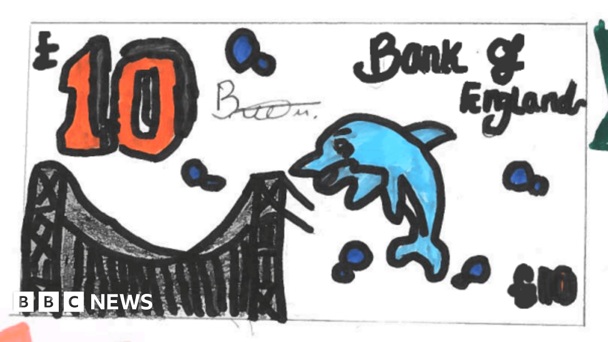
Just don’t hire this guy
Can’t remember the last time I touched physical money. They should depict scenes of modern day uses of banknotes. Paying a tax-dodging barber, buying a bookcase off Facebook Marketplace, putting a twenty in a birthday card, that sort of thing.
I thought that they changed the faces on bank notes only recently – Jane Austen, Winston Churchill, Turner etc.
Where’s the goatse one?
Fiver – Five (the band)
Tenner – Tennyson
Twenty – …(Q)twenty(n) Blake
Fifty – errr. 50Cent?
It needs to be monopoly money, so people think it’s worthless and will happily spend more of it, thus boosting the economy or something…
Stop making them out of plastic. The cotton ones were much better.
Comments are closed.