I wonder what it would look like if you put the least bursty sources on the bottom so they would appear less jaggy in the visualization
I HATE STACKED GRAPHS, GIVE ME A LINE GRAPH ITS NOT THAT HARD.
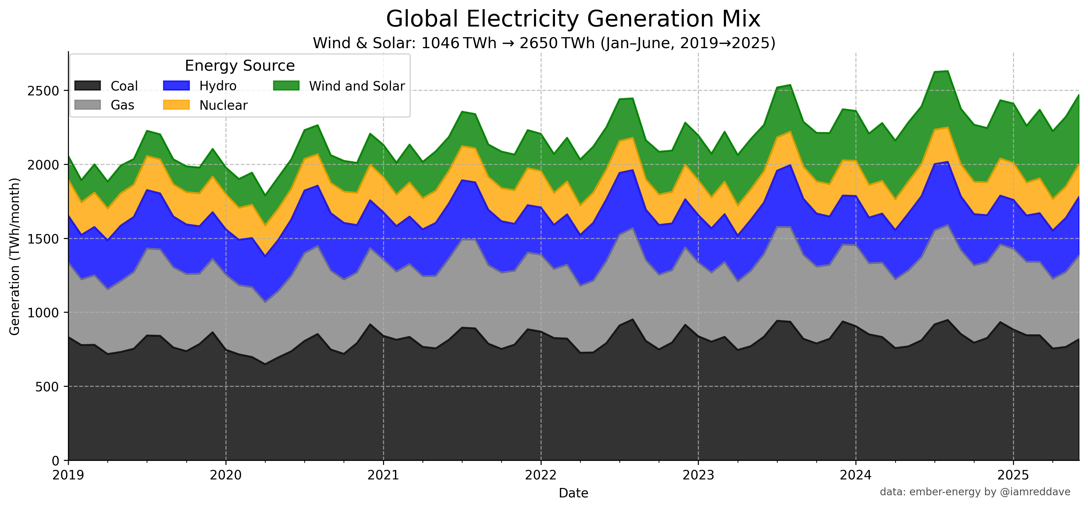
For real, it’s pretty to look at, but the data is unreadable all the smaller ones go up and down not because they are charging but because the ones below them are changing, which makes it impossible to tell what is going on.
An alternative is to have a line graph with each one represented as a line and another line to represent the total.
A stacked line graph isn’t a great choice for this since it makes it difficult to see changes in specific components over time. It’s also hard to tell how much of the seasonal changes are due to each one or how much it’s just coal pushing them up – ah, the other comment covers that, too.
I think this is a great chart. ItŌĆÖs simple, but tells a really powerful story. Essentially, since 2019 the use of fossil fuels hasnŌĆÖt really gone down, the growth in renewables is really just capturing the growth in demand over that period. Slightly depressing to know, but I feel like IŌĆÖve learning something.
No beginning and ending percentages?
That’s a heck of a lot of dirty coal being burned.
![World Electricity Sources [OC]](https://www.europesays.com/wp-content/uploads/2025/08/xw7u0mtr8fgf1-1920x1024.png)
8 comments
data from [https://ember-energy.org/](https://ember-energy.org/)
matplotlib python code
I wonder what it would look like if you put the least bursty sources on the bottom so they would appear less jaggy in the visualization
I HATE STACKED GRAPHS, GIVE ME A LINE GRAPH ITS NOT THAT HARD.
For real, it’s pretty to look at, but the data is unreadable all the smaller ones go up and down not because they are charging but because the ones below them are changing, which makes it impossible to tell what is going on.
An alternative is to have a line graph with each one represented as a line and another line to represent the total.
A stacked line graph isn’t a great choice for this since it makes it difficult to see changes in specific components over time. It’s also hard to tell how much of the seasonal changes are due to each one or how much it’s just coal pushing them up – ah, the other comment covers that, too.
I think this is a great chart. ItŌĆÖs simple, but tells a really powerful story. Essentially, since 2019 the use of fossil fuels hasnŌĆÖt really gone down, the growth in renewables is really just capturing the growth in demand over that period. Slightly depressing to know, but I feel like IŌĆÖve learning something.
No beginning and ending percentages?
That’s a heck of a lot of dirty coal being burned.
https://preview.redd.it/pkvsw9wmougf1.png?width=1128&format=png&auto=webp&s=32e1b2715f09d4da5eb2bb370669e0a9c1429b7b
Unstacked it, made first month same as last month.
Dataset: [https://ember-energy.org/data/electricity-data-explorer/?chart=trend](https://ember-energy.org/data/electricity-data-explorer/?chart=trend)
Comments are closed.