![[OC] Where People Live by Latitude](https://www.europesays.com/wp-content/uploads/2025/08/xutdw7yatbhf1-1920x1024.png)
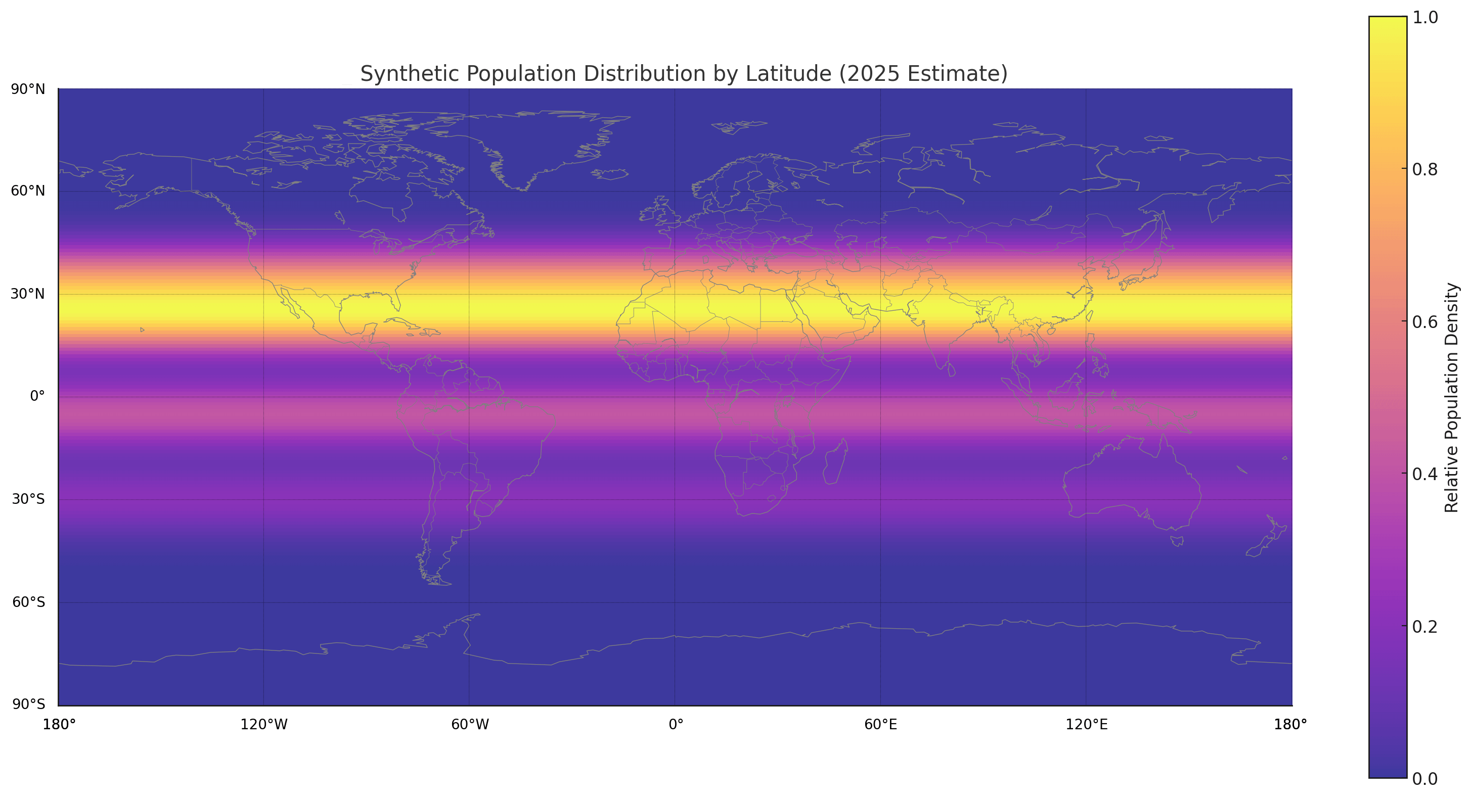
This visualization uses a model inspired by real-world global population patterns, especially those observed in datasets like GPWv4 (Gridded Population of the World) and LandScan.
Population values were simulated based on observed clustering near key latitudes such as 23°N (India, Bangladesh, southern China), 35°N (eastern China, Japan), the equator (sub-Saharan Africa and Indonesia), and -30°S (Brazil, South Africa).
The map was generated using Python with NumPy, Matplotlib, and Basemap.
I’m happy to share the code or update this with real data if there’s interest!
Posted by XsLiveInTexas