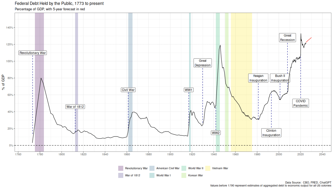
Many people have seen a graph of US debt-to-GDP since 1790. That data can be pulled from CBO and FRED. But it annoyed me that earlier data wasn’t available from the usual sources.
So I asked ChatGPT to see if earlier data was available, and use that to estimate aggregate debt to economic output for the US colonies before the Constitution was ratified. I then “verified” it with Grok. A more formal verification will have to wait until I have more free time (ChatGPT lists papers/books with the historical data).
I thought the data added a bit more historical context: Not once in our country’s history has the US ever been so deeply in debt.
The two previous peaks (WW2 and the American Revolution) could at least be rationalized due to war spending.
I’m not sure how to rationalize our current debt. It appears to be a combination of hegemonic spending to protect/enlarge our “empire” and deter future Great Powers conflict, and several decades of elected officials who borrow to keep the economy growing and voters placated on their grandchildren’s credit card.
In many ways it still feels like we have never really recovered from the 2009 financial crisis, and this graph seems to serve as another piece of evidence for that.
Let’s start with what happened with Reagan’s presidency as it looks like the trend increased during his reign.
Iraq/Afghanistan War left off of there
Hold on here. A Republican is president right now. We are not allowed to discuss national debt unless a Democrat is in office.
To deal with the debt after WW2 they raised the top marginal tax rate to 91%
That means the tax rate on income for the very highest earners was 91% … you can see how quickly that debt was paid off.
Today the top marginal tax rate is 37% and every time it’s revisited they slash the social safety net and cut it further.
You identify significant presidential inaugurations, why not include Obama in 2008?
You label raegens inauguration in 1980 as the start of an upwards trend and not the oil and gas crisis or Iranian revolution which was the cause of the recession in 1980. But labeled 2008 as the great recession instead of Obama’s inauguration. You should either choose to label presidencies or recessions, it’s clear you have a political bias in making this.
Now a chart for how much is debt held by foreign entities and how much is just domestic paper debt.
it is a pretty straight forward line graph but it is beautifully presented. GG OP.
Can someone explain to me like I am 5 years old…..debt to who?
What is a debt collector gonna do, repossess the nation? Run up the bill. Shoot anyone who tries to collect.
I’m not sure if another commenter mentioned it or not. If I’m understanding this correctly, the line can go down by paying down debt or have gdp grow or a combo of both.
Someone noted that, depite world events, after Nixon, the Debt:GDP ratio
– rose with Republican presidents and
– fell with Democrat ones.
=> Any theories to explain this?
Why are Reagon, Clinton, and Bush II the only significant administrations?
Conclusion: we need another Vietnam War to get the debt down
Reminds me of how the Buffet indicator is obsolete – most of our companies do a huge amount of their revenue internationally, so comparing to GDP is kind of pointless.
You’re missing a key entry and color,band for “trump” ;-). Nice chart.
The real problem isn’t those sharp moves upwards. Its the complete lack of trying to pay any of it back in the good times.
Love seeing some good ggplots
Lol, every uptick during Republican administrations labeled under the president.
Every uptick under Democrat administrations labeled under economic distress that they created.
23 comments
Many people have seen a graph of US debt-to-GDP since 1790. That data can be pulled from CBO and FRED. But it annoyed me that earlier data wasn’t available from the usual sources.
So I asked ChatGPT to see if earlier data was available, and use that to estimate aggregate debt to economic output for the US colonies before the Constitution was ratified. I then “verified” it with Grok. A more formal verification will have to wait until I have more free time (ChatGPT lists papers/books with the historical data).
I thought the data added a bit more historical context: Not once in our country’s history has the US ever been so deeply in debt.
The two previous peaks (WW2 and the American Revolution) could at least be rationalized due to war spending.
I’m not sure how to rationalize our current debt. It appears to be a combination of hegemonic spending to protect/enlarge our “empire” and deter future Great Powers conflict, and several decades of elected officials who borrow to keep the economy growing and voters placated on their grandchildren’s credit card.
In many ways it still feels like we have never really recovered from the 2009 financial crisis, and this graph seems to serve as another piece of evidence for that.
Let’s start with what happened with Reagan’s presidency as it looks like the trend increased during his reign.
Iraq/Afghanistan War left off of there
Hold on here. A Republican is president right now. We are not allowed to discuss national debt unless a Democrat is in office.
To deal with the debt after WW2 they raised the top marginal tax rate to 91%
That means the tax rate on income for the very highest earners was 91% … you can see how quickly that debt was paid off.
Today the top marginal tax rate is 37% and every time it’s revisited they slash the social safety net and cut it further.
You identify significant presidential inaugurations, why not include Obama in 2008?
You label raegens inauguration in 1980 as the start of an upwards trend and not the oil and gas crisis or Iranian revolution which was the cause of the recession in 1980. But labeled 2008 as the great recession instead of Obama’s inauguration. You should either choose to label presidencies or recessions, it’s clear you have a political bias in making this.
Now a chart for how much is debt held by foreign entities and how much is just domestic paper debt.
it is a pretty straight forward line graph but it is beautifully presented. GG OP.
Here’s [a graph](https://cdn.theatlantic.com/assets/media/img/3rdparty/2012/11/debt-and-gdp-main6.png) of US public debt as a percentage of GDP from [this article in the Atlantic](https://www.theatlantic.com/business/archive/2012/11/the-long-story-of-us-debt-from-1790-to-2011-in-1-little-chart/265185/) with data from the Congressional Budget Office. The numbers don’t quite much up, so maybe don’t trust LLMs to do your research for you.
This post also breaks [rules 3](https://www.reddit.com/r/dataisbeautiful/wiki/rules/rule3/) and [8](https://www.reddit.com/r/dataisbeautiful/wiki/rules/rule8/).
Can someone explain to me like I am 5 years old…..debt to who?
What is a debt collector gonna do, repossess the nation? Run up the bill. Shoot anyone who tries to collect.
I’m not sure if another commenter mentioned it or not. If I’m understanding this correctly, the line can go down by paying down debt or have gdp grow or a combo of both.
https://medium.com/@syedfiza96/embracing-the-chaos-night-shifts-career-crises-and-the-art-of-leaning-into-uncertainty-eeecce6cad26
Someone noted that, depite world events, after Nixon, the Debt:GDP ratio
– rose with Republican presidents and
– fell with Democrat ones.
=> Any theories to explain this?
Why are Reagon, Clinton, and Bush II the only significant administrations?
Conclusion: we need another Vietnam War to get the debt down
Reminds me of how the Buffet indicator is obsolete – most of our companies do a huge amount of their revenue internationally, so comparing to GDP is kind of pointless.
You’re missing a key entry and color,band for “trump” ;-). Nice chart.
The real problem isn’t those sharp moves upwards. Its the complete lack of trying to pay any of it back in the good times.
Love seeing some good ggplots
Lol, every uptick during Republican administrations labeled under the president.
Every uptick under Democrat administrations labeled under economic distress that they created.
So dishonest
Comments are closed.