![[OC] Electricity Generation by Population and Source](https://www.europesays.com/wp-content/uploads/2025/08/y6xmw5rp8lif1-1080x1024.png)

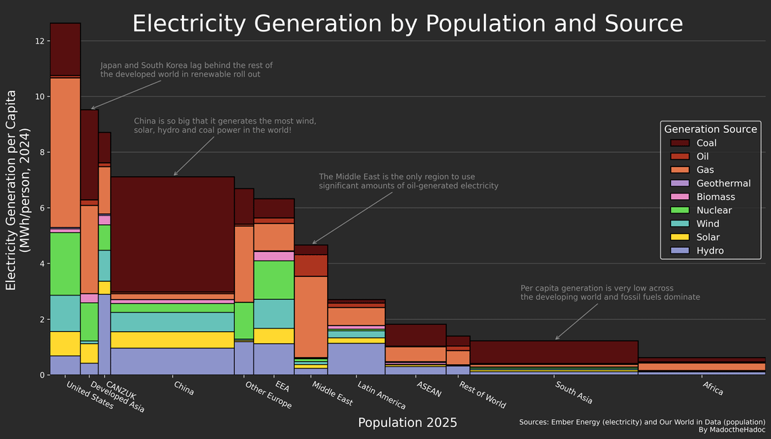
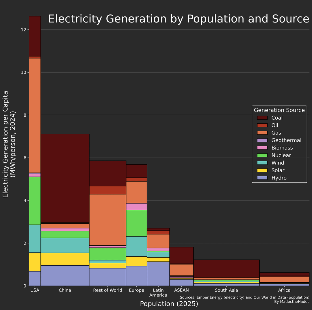

Improved version of something I posted a week ago, I hope this time the colors are much more readable.
I used the python Matplotlib library; the electricity data from Ember Energy and the populations come from Our World in Data.
There are plenty of interesting features on these graphs; the most notable is the size of China's generation, (particularly coal), Western Europe has multiples of China's GDP per capita but lower per capita electricity generation, China seems to run a very electricity intense economy.
Posted by MadoctheHadoc
9 comments
The population needs some form of index. Now it looks like random stretching of bars. Otherwise, well done
Colors look good but why are the stacked bars not the same width?
It’s cool but at the same time a little off. For solar and wind power specifically. Is this true power output or power output potential? For example wind…is this truly what was measured over a period then averaged or is this saying of all of the turbines were running at max capacity 24/7. As we all know the wind doesn’t blow the same every day allowing for max capacity. Same with the solar.
When it comes to China we see a huge difference between their actual dirty coal production and the renewable/nuclear image they like to generate.
Love it. Perfect use for this kind of chart.
Really weird to group CANZUK – we share cultural background and some other things but very different geographies and electrical grids
I think if deteriorates the usefulness of the chart as the Canada vs USA comparison is often useful for assessing policies in closely linked countries
Data that looks nice, and is actually still possible to extract information out of? Impossible! Well done.
Why would someone want to express energy production in par capita terms instead of total?
I can hardly see the dark brown coal against the black background.
Comments are closed.