African Union urges adoption of world map showing continent’s true size
https://www.reuters.com/world/africa/african-union-urges-adoption-world-map-showing-continents-true-size-2025-08-14/
African Union urges adoption of world map showing continent’s true size
https://www.reuters.com/world/africa/african-union-urges-adoption-world-map-showing-continents-true-size-2025-08-14/
44 comments
You can’t actually lay out a globe on a flat surface, something ALWAYS gets screwy.
They should rename the Gulf of Aden the “Gulf of Africa” while they’re at it.
As a navigator I hate this narrative that Mercator projection is somehow racist and makes Europe bigger on purpose… so ignorant
[removed]
Is *this* really the priority for Africa? Really?
Solution: instead of maps, we’ll carry globes.
“Are you saying the map is wrong?” – CJ Cregg
The thing is, every other division puts others at a disadvantage. That’s just the joke about a map of a round object.
And we can’t find two maps to display side by side so we can quickly comprehend? Yeah, lots of words, very important…. talking about a map that isn’t part of the article. I bet the AI could find two pictures to show me… damn. this is LAZY.
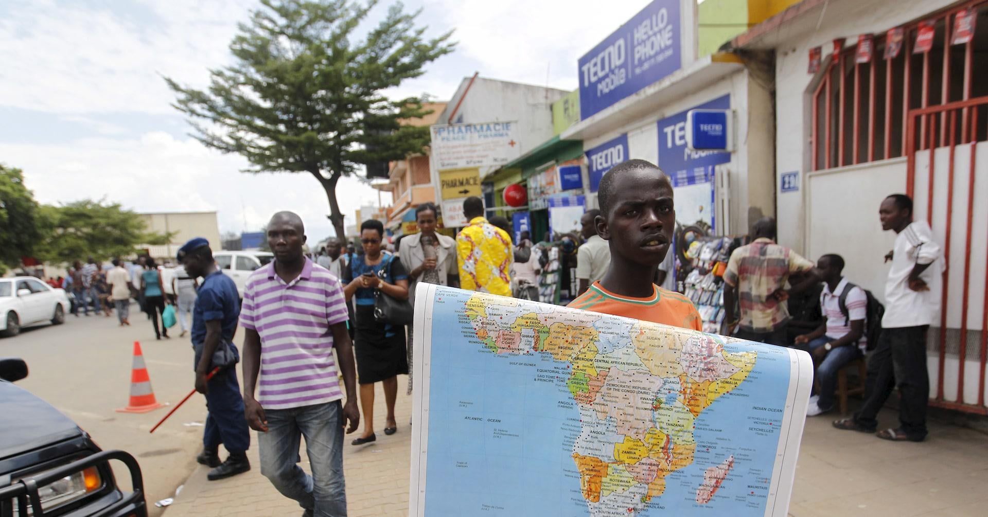
An entire article and not one image of the map they want to replace Mercator projection with.
A map as big as the entire world?
Let me google that for you: [Equal Earth projection – Wikipedia](https://en.wikipedia.org/wiki/Equal_Earth_projection)
[What the hell is that?](https://www.youtube.com/watch?v=vVX-PrBRtTY)
I think African Nations should deal with local corruption first before dealing with map projections.
That will show them.
Calling it a misinformation and a disinformation campaign is in itself disinformation, the Mercator projection is used because that makes the most sense for navigation, which is much more important than representing accurate scales. You can go the AuthaGraph projection route but that distorts directions pretty bad, last time I checked the most western shores of Africa weren’t to the north of the North Pole. Not to mention no school teaches that the Mercator projection would be to scale unless it’s some private school ran by flat-earthers, and pulling out a globe is also trivial today.
Has CJ Gregg been looped in on this ?
Just use the FE map, it be nice having Australia be its correct size compared to the rest of the landmasses, people will not be confused about Australia being its own continent when they see just how big it actually is already in school books.
It’s frustrating just how useless these news sites are that they can’t post a simple photo. Anyway, having found the projection on [Wikipedia](https://en.wikipedia.org/wiki/Equal_Earth_projection) it looks like they took the Natural Earth projection and distorted it even further.
It’s very reasonable that Africa would adopt whatever map they consider most suitable but it makes little sense for North America, Europe and Asia to do the same. Way too many population centers are crammed onto those contents and the current projection is honestly good enough for us. Not to mention that computers give us easy access to accurate reproductions of the globe.
[https://xkcd.com/977/](https://xkcd.com/977/)
I think we should use the Robinson for teaching. Mercator is not ‘racist’, as it’s ideal for navigating, but teaching from it exclusively does create a misconception about the size of countries nearer the equator. These tend to be non-first world so there are implications in how we think about geopolitics. For example, people are shocked at how large the middle-eastern countries are relative to European ones.
Darfur Genocide 2.0: *I sleep*
Mercator Globe distortion: *I demand change!*
Keep on picking the important fights, African Union
> AU aims to reclaim Africa’s global position, supports map change
The word reclaim means there used to be a time when Africa had a global position, which it never did. The proponents of the map change are racists who somehow think their continent is more important than others.
I can ***SOMEHOW*** get behind their reasoning but at the same time… [Globes](https://www.amazon.de/-/en/3010-Leuchtglobus-3-D-Oberfl%C3%A4che-Metallmeridian-3D-Oberfl%C3%A4che/dp/3934922694/ref=sr_1_29?crid=2ZRNPK43GLC7Z&dib=eyJ2IjoiMSJ9.Y3kSwxVIcAQnOlPDSUrluNKSzIIKFaHJxyxsniYrTEvdcw667iheSVH8nymB2oXM_qS1nnTQGqcorSLt6Bn1WVlY1D6TfkbY_4QAfRVpKafzcvQFbjl3BYjil6nhTrx02Ty7WB2Sh9mlZJcKvsQ6-F981yZNgJxLZ2deLhxv4giGgFlggIbjp3V3g8JqLYBjqqiAVCeVJYe_5Ke3Q4c3Ofr-CobOSA1rZdDcQ955sQaom5x91eMYGkZewn3SkAPZ3rQAcwlXg8AsNU14XYZa4htF6TpY-sdV3L9xo9p6p9U.iHnwnqXfu-N4_iX-fExQCKeVFIy9p62iWt5pqINP-qU&dib_tag=se&keywords=globe&qid=1755205453&sprefix=globe%2Caps%2C86&sr=8-29) for use in School exist ( heck… If you’re cheap use an [inflatable Globe Beachball](https://www.amazon.de/-/en/VAEIORP-Inflatable-Geography-Science-Education/dp/B0D4V1PKFD/ref=sr_1_21?crid=2ZRNPK43GLC7Z&dib=eyJ2IjoiMSJ9.Y3kSwxVIcAQnOlPDSUrluNKSzIIKFaHJxyxsniYrTEvdcw667iheSVH8nymB2oXM_qS1nnTQGqcorSLt6Bn1WVlY1D6TfkbY_4QAfRVpKafzcvQFbjl3BYjil6nhTrx02Ty7WB2Sh9mlZJcKvsQ6-F981yZNgJxLZ2deLhxv4giGgFlggIbjp3V3g8JqLYBjqqiAVCeVJYe_5Ke3Q4c3Ofr-CobOSA1rZdDcQ955sQaom5x91eMYGkZewn3SkAPZ3rQAcwlXg8AsNU14XYZa4htF6TpY-sdV3L9xo9p6p9U.iHnwnqXfu-N4_iX-fExQCKeVFIy9p62iWt5pqINP-qU&dib_tag=se&keywords=globe&qid=1755205453&sprefix=globe%2Caps%2C86&sr=8-21)! ) and who the fuck still uses a regular Map to amuse themselves about how Earth looks like when [Google Earth](https://earth.google.com/) exists ( because no one – ***absolutely no one*** – cares how big continents are when looking for how to get from their home to their new work place 1.64km away )?
The whole story gets worse the more you read it. Seems the reporter didn’t understand why Google had used Mercator and almost makes it sound nefarious that it is still available as an option.
Mercator isn’t some nefarious plot. It’s the only projection that keeps shapes intact.
The projection the African Union should have reached for was the only correct one, the globe.
Otherwise, just use one of the many Africa-centric map projections that shows Africa and not much else. The shape will be close, there might be some distortion, but it should be useful to teach African geography.
But by asking international organizations to switch to their preferred map, that’s just silly. If you feel inadequate because the map used for navigation doesn’t show your country’s relative size correctly, that’s not a problem the rest of us can fix.
split the difference: Dymaxion map
Nah, I’m fine with the map. It’s not important enough to go changing it because the African Union thinks we should.
There is no way to display the surface of a sphere in 2 dimensions without distorting something – we learned this in grade school. If you want to see a mostly non-distorted representation of Earth, look at a globe.
So your continent looks bigger than it already is? *golf clap* Every kid in grade school learns how large Africa is. It YHuuuuge
Africa out here like George Costanza after swimming.
Idk all I know is Africa is pretty big. Big enough that they decided to blow a hole through the Suez than sail around it.
The African Union is clearly focusing on Africa’s most pressing issues.
How about no.
There’s a good clip from West Wing that talks on this
How is this going to solve poverty in Africa?
Maps should scale countries by nominal GDP.
I humbly admit that Africa’s relative size is larger than I thought it was
I’m all for it. Maps should be accurate to what they’re showing.
Also, Greenland is enormous on the current map. I don;t know the name, but I like the one where there are big V-cutouts on the oceans between the continents.
There is still some skewing, but its MUCH more accurate.
The size of a country isn’t a very important detail anyways. It’s not like we all unanimously think Russia is the best country because is it’s size
I remember this episode of The West Wrong.
How come Africa is so lucky as to be in the middle of the map? See how the like when they are on the edge!
https://blog.mapchart.net/maps/make-a-pacific-centered-world-map/
I think about that episode of the West Wing all the time.
It’s bothered me since I first learned about it, the Mercator projection was useful when it was initially invented, it’s served its purpose, we should be using more accurate representations of the real world nowadays.
The most important issue in Africa
Mayhap the AU will start demanding reparations over this
Comments are closed.