![[OC] Spend on software will exceed $1 trillion for the first time in 2026](https://www.europesays.com/wp-content/uploads/2025/08/h46njo0w22kf1-1920x1024.png)
In 2011, the popular VC firm Andreessen Horowitz said "Software will eat the world" which is still their tagline.
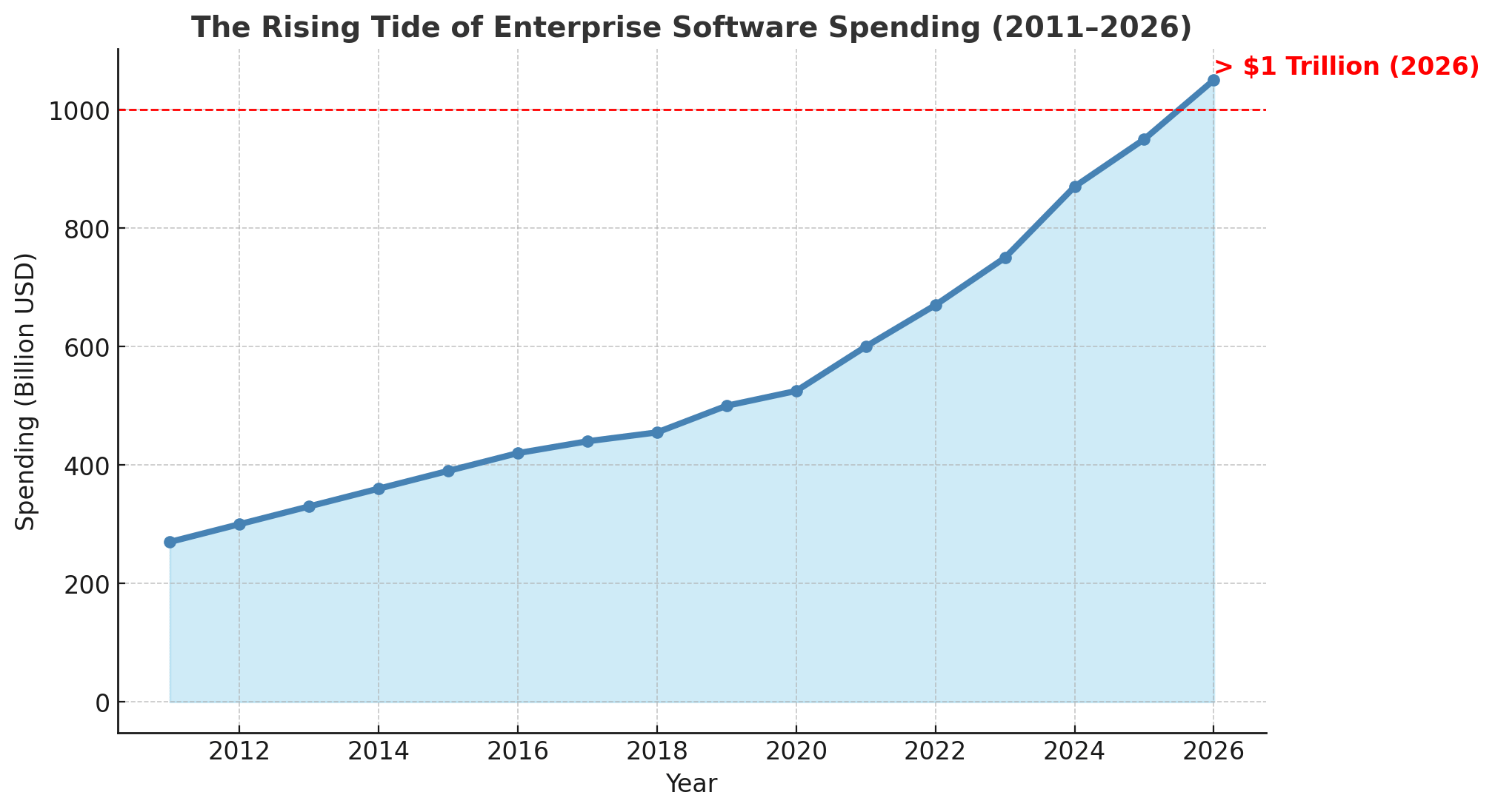
In a recent email by Cubbie, a company which ranks the top software products, showed breakdown of spend by different software categories.
So, I put together a historical chart showing the rise of software, shown through the lens of how much companies are actually spending on it globally. I factored in the likely spend given the rise of workforce increases next year and the ongoing shift toward AI tools, which are obviously accelerating software adoption.
Tools used: Python / Matplotlib
Posted by XsLiveInTexas
10 comments
But how is “software” classified? Smartphone OSs are software, apps are software, CRM systems are software, manufacturing uses software, games are technically software. Where’s the line? What are the categories included or excluded?
This seems low? I get that I’m a human and understanding large numbers is not something my monkey brain is good at, but the number seems low to me.
Wow BTC market cap is more than software spending. Interesting. Though not remotely apples to apples. BTC is a theoretical timestamp number and software spend is real flow of value over a time period.
We spend about the same amount of money on the pentagon every year
The expenditure is sure to follow.
And yet our politicians will still prioritize manufacturing.
We do what we can to stay on open source.
We need to send ourselves back to the bronze age
Now that’s a pretty cool feat.
Did you factor in inflation?
Comments are closed.