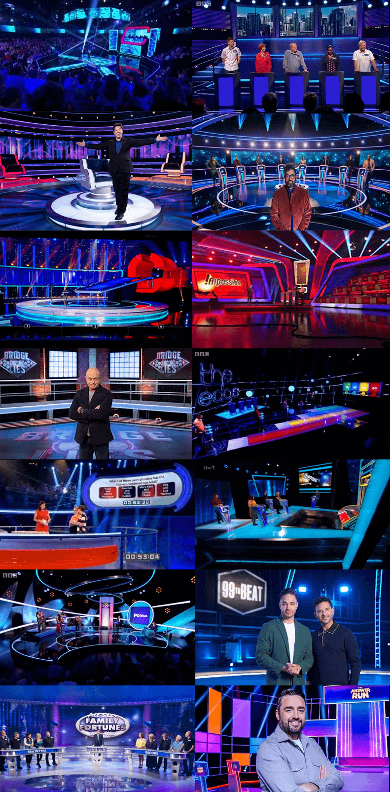
Compared to game shows from 30+ years ago they kinda bland colour wise
I mean expecting quality out of day time, scheduled television is absolutely insane
even more bruising, some of them have stephen mulhern.
Instead of going out to night clubs, people stay in to watch night clubs.
Wouldn’t surprise me if a few of them are filmed in the same location
I’VE BEEN SAYING THIS AND NOBODY BELIEVED MY WORDS!
They literally could be recorded in the same studio and I wouldn’t even notice. It’s just making things boring to look at. Feels like every british gameshow is trying their best to be The Chase nowadays.
Yeah Red/Blue contrast and lots of lights and screens is the easiest way to dress a TV show to make it look slick.
Also there’s a class conformity effect. If all the successful shows look like this (even when the set isn’t literally built by the same company) then when you design your show, you’re gonna make it look the same to cut costs and minimise risk.
I reckon it’s a deliberate lighting choice meant to draw the audience’s attention to specific parts of the set. Somebody earns a living choosing which light colours to use.
Blue sets a ‘calm’ tone, to then contrast with Red to create tension and excitement.
Green could convey sickness, or be a ‘natural’ colour that is at odds with all the lights and technology.
Yellow would be too flippant, and undermine the sense of drama.
Orange would feel like a budget or hesitant red.
Purple would be of royalty and too regal for some to be ‘wasted’ on the hoi polloi of the average contestant.
Lilac is just purple, but with more discussion over whether it is purple or lilac etc.
Pink would be too cutesy.
White would look like the budget has run out.
Black would be too dark and sombre, too much a funeral dirge to be daytime/primetime tv.
Grey is redundant: simply look at any office block or cloud for that.
Any other colour is probably just a shade of the aforementioned and too unorthodox to be used.
Everything nowadays has to have the same aesthetic. Nightmode, all dark, pitch black. You see it for people designing their bedrooms, wardrobes and now we all see it on gameshows. This need to impress others rather than what we actually want, really baffles me. The need to be the same or what’s the current trend instead of creating a design and idea and what you like. Most people will only compliment it once, twice if that and that’s it. You’re left with it after that.
It’s why spending so much on branding and expensive clothing be it footwear or body wear, doesn’t make sense to me. Buy and create comfort, not aesthetics and uncomfort. You also became an advert for others who you’re trying to impress who actually don’t really care*that* much
They should have just given up after Going for Gold and Fifteen to One.
British gameshows post- Going for Gold are like some parable about someone who sees the face of god and then spends their years wasting away trying to capture the heavenly visage in increasingly erratic and unconvincing art, not realising they are doomed to failure.
Norway, you’re playing catch up.
I feel Who Wants To Be Millionaire was the start of this mundane look.
Gameshow design peaked with Supermarket Sweep.
It’s a lot easier to hide all the greebles associated with television studios if the studio is dimly lit. Way back when, they had to design the sets so that all the greebles were behind the camera, but now they use lighting to distract attention from them. This also allows for panorama panning shots, which couldn’t be done in the older style of studio layout.
I think a lot of people follow [colour psychology](https://en.wikipedia.org/wiki/Color_psychology), using the contrasting red/blue to build excitement and interest at certain times during the show.
Plus, now the trend has started, others follow suit.
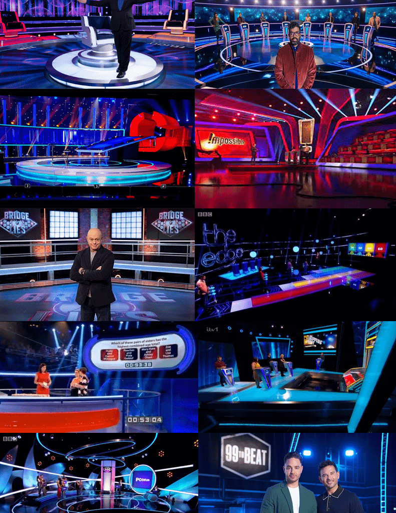
I imagine its just a practicality/economic thing. Sets are already black backdrops to help hide equipment or lighting rigs, and naturally easier to build sets that complement that. These things are usually set up and filmed over a few months before being taken down and set up for another show (Im just speculating here, but I wonder if the wheel and weakest link use the same set? They look kinda similar. Bridge of lies’ backdrop also looks suspiciously like the same warehouse used for Dragon’s Den)
Darkness also hides any obvious blemishes and generally makes things look more ‘serious’.
I suppose it’s a case of creating a sense of familiarity between different game shows. While the format may be different, the similar design gives the sense of comfortable familiarity, and instantly tells the viewer that it’s a gameshow.
Even Going For Gold had some twinkly pizazz amongst the G O L D
They pretty much all follow the same formula from ‘Who Wants to be a Millionaire?’ which perfected the dramatic suspense in a gameshow.
They use multicolour LEDs to quickly change the theme for different segments of the games or for emphasis of a dramatic effect. The choice of black is because it can reasonably complement the LED colours whilst not detracting from the presenter & contestant.
If they could put the show in an endless black void with some coloured lights to set the theme and put the contestants centre frame then that’s quality television.
There are still some great shows that go with a more colourful and traditional design, Game Changer has been fantastic.
26 comments
They were all absorbed into The Colour of Money
Compared to game shows from 30+ years ago they kinda bland colour wise
I mean expecting quality out of day time, scheduled television is absolutely insane
even more bruising, some of them have stephen mulhern.
Instead of going out to night clubs, people stay in to watch night clubs.
Wouldn’t surprise me if a few of them are filmed in the same location
I’VE BEEN SAYING THIS AND NOBODY BELIEVED MY WORDS!
They literally could be recorded in the same studio and I wouldn’t even notice. It’s just making things boring to look at. Feels like every british gameshow is trying their best to be The Chase nowadays.
Yeah Red/Blue contrast and lots of lights and screens is the easiest way to dress a TV show to make it look slick.
Also there’s a class conformity effect. If all the successful shows look like this (even when the set isn’t literally built by the same company) then when you design your show, you’re gonna make it look the same to cut costs and minimise risk.
Here’s an interesting read on this from a couple years ago: [Why Do TV Game Show Sets Look Like Spaceships? | Den of Geek](https://www.denofgeek.com/tv/why-do-tv-game-show-sets-look-like-spaceships/)
I reckon it’s a deliberate lighting choice meant to draw the audience’s attention to specific parts of the set. Somebody earns a living choosing which light colours to use.
Blue sets a ‘calm’ tone, to then contrast with Red to create tension and excitement.
Green could convey sickness, or be a ‘natural’ colour that is at odds with all the lights and technology.
Yellow would be too flippant, and undermine the sense of drama.
Orange would feel like a budget or hesitant red.
Purple would be of royalty and too regal for some to be ‘wasted’ on the hoi polloi of the average contestant.
Lilac is just purple, but with more discussion over whether it is purple or lilac etc.
Pink would be too cutesy.
White would look like the budget has run out.
Black would be too dark and sombre, too much a funeral dirge to be daytime/primetime tv.
Grey is redundant: simply look at any office block or cloud for that.
Any other colour is probably just a shade of the aforementioned and too unorthodox to be used.
Teal is criminally overlooked.
https://preview.redd.it/wsowt7okiclf1.jpeg?width=960&format=pjpg&auto=webp&s=c5c30158f95ba78ed5fb9bb8a7f2845a08a3b6c9
Man, Myth, Legend. And look at that studio.
https://preview.redd.it/d9ef5li0jclf1.jpeg?width=894&format=pjpg&auto=webp&s=25532abdc408d9a3f5a949b349c6ca304a753fea
Subconsciously instilling your allegiance to the red white and blue. 20 countries can’t be wrong.
Or the polyamorous pride flag
Always have
https://preview.redd.it/ukco76f1kclf1.jpeg?width=650&format=pjpg&auto=webp&s=066ca6cbf4cbd452b162343ae4c9573b6ec6ac98
The Chase one looks like an MRI scanner
Everything nowadays has to have the same aesthetic. Nightmode, all dark, pitch black. You see it for people designing their bedrooms, wardrobes and now we all see it on gameshows. This need to impress others rather than what we actually want, really baffles me. The need to be the same or what’s the current trend instead of creating a design and idea and what you like. Most people will only compliment it once, twice if that and that’s it. You’re left with it after that.
It’s why spending so much on branding and expensive clothing be it footwear or body wear, doesn’t make sense to me. Buy and create comfort, not aesthetics and uncomfort. You also became an advert for others who you’re trying to impress who actually don’t really care*that* much
They should have just given up after Going for Gold and Fifteen to One.
British gameshows post- Going for Gold are like some parable about someone who sees the face of god and then spends their years wasting away trying to capture the heavenly visage in increasingly erratic and unconvincing art, not realising they are doomed to failure.
Norway, you’re playing catch up.
I feel Who Wants To Be Millionaire was the start of this mundane look.
Gameshow design peaked with Supermarket Sweep.
It’s a lot easier to hide all the greebles associated with television studios if the studio is dimly lit. Way back when, they had to design the sets so that all the greebles were behind the camera, but now they use lighting to distract attention from them. This also allows for panorama panning shots, which couldn’t be done in the older style of studio layout.
I think a lot of people follow [colour psychology](https://en.wikipedia.org/wiki/Color_psychology), using the contrasting red/blue to build excitement and interest at certain times during the show.
Plus, now the trend has started, others follow suit.
I imagine its just a practicality/economic thing. Sets are already black backdrops to help hide equipment or lighting rigs, and naturally easier to build sets that complement that. These things are usually set up and filmed over a few months before being taken down and set up for another show (Im just speculating here, but I wonder if the wheel and weakest link use the same set? They look kinda similar. Bridge of lies’ backdrop also looks suspiciously like the same warehouse used for Dragon’s Den)
Darkness also hides any obvious blemishes and generally makes things look more ‘serious’.
I suppose it’s a case of creating a sense of familiarity between different game shows. While the format may be different, the similar design gives the sense of comfortable familiarity, and instantly tells the viewer that it’s a gameshow.
https://preview.redd.it/0yduqvgxoclf1.jpeg?width=432&format=pjpg&auto=webp&s=439cbf8583cd51ff771dc1ea0398d5f641566411
Even Going For Gold had some twinkly pizazz amongst the G O L D
They pretty much all follow the same formula from ‘Who Wants to be a Millionaire?’ which perfected the dramatic suspense in a gameshow.
They use multicolour LEDs to quickly change the theme for different segments of the games or for emphasis of a dramatic effect. The choice of black is because it can reasonably complement the LED colours whilst not detracting from the presenter & contestant.
If they could put the show in an endless black void with some coloured lights to set the theme and put the contestants centre frame then that’s quality television.
There are still some great shows that go with a more colourful and traditional design, Game Changer has been fantastic.
Comments are closed.